
autoplot.microbenchmark到底策划了什么?
autoplot.microbenchmark到底策划了什么?
提问于 2014-06-27 12:12:54
根据这些文档,microbenchmark:::autoplot“使用ggplot2生成一个更清晰的微基准时间图。”
凉爽的!让我们试试下面的示例代码:
library("ggplot2")
tm <- microbenchmark(rchisq(100, 0),
                     rchisq(100, 1),
                     rchisq(100, 2),
                     rchisq(100, 3),
                     rchisq(100, 5), times=1000L)
autoplot(tm)
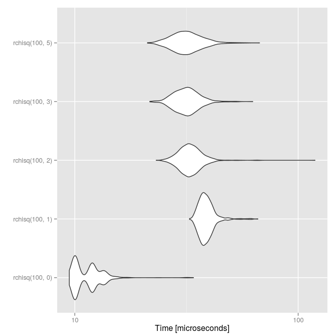
我在文档中没有看到任何关于the...squishy起伏的信息,但我从这个答案由函数创建者回答。中得到的最佳猜测是,这就像运行所需时间的一系列平滑的盒形图,上下四分位数连接在形状的主体上。也许吧?这些情节看上去太有趣了,不知道这里到底发生了什么。
这是什么阴谋?
回答 1
Stack Overflow用户
回答已采纳
发布于 2016-09-18 10:13:02
简单的回答是小提琴情节
它是一个盒子图,每边都有一个旋转的核密度图。
越长越有趣(?)回答。调用autoplot函数时,实际上是在调用
## class(ts) is microbenchmark
autoplot.microbenchmark
然后我们可以通过以下方式检查实际的函数调用
R> getS3method("autoplot", "microbenchmark")
function (object, ..., log = TRUE, y_max = 1.05 * max(object$time))
{
    y_min <- 0
    object$ntime <- convert_to_unit(object$time, "t")
    plt <- ggplot(object, ggplot2::aes_string(x = "expr", y = "ntime"))
## Another ~6 lines or so after this关键线是+ stat_ydensity()。看着?stat_ydensity,你来到了小提琴故事的帮助页。
页面原文内容由Stack Overflow提供。腾讯云小微IT领域专用引擎提供翻译支持
原文链接:
https://stackoverflow.com/questions/24451575
复制相关文章
相似问题
腾讯云开发者

Copyright © 2013 - 2026 Tencent Cloud. All Rights Reserved. 腾讯云 版权所有
深圳市腾讯计算机系统有限公司 ICP备案/许可证号:粤B2-20090059 ![]() 粤公网安备44030502008569号
粤公网安备44030502008569号
腾讯云计算(北京)有限责任公司 京ICP证150476号 | 京ICP备11018762号