
绘制python中的剖面图
我正试图为pandas.DataFrame的两列绘制概要图。我不认为这会直接发生在熊猫身上,但似乎也没有任何内容。我到处找过了,除了rootpy之外,找不到它。在我花时间自己写这篇文章之前,我想我会问是否有一个包含配置文件直方图的小包,也许在那里,它们是用不同的名称命名的。
如果您不知道我所说的“配置文件直方图”是什么意思,请查看根实现。http://root.cern.ch/root/html/TProfile.html
回答 5
Stack Overflow用户
发布于 2016-12-20 16:32:17
使用海航。来自@MaxNoe的数据
import numpy as np
import seaborn as sns

# just some random numbers to get started
x = np.random.uniform(-2, 2, 10000)
y = np.random.normal(x**2, np.abs(x) + 1)

sns.regplot(x=x, y=y, x_bins=10, fit_reg=None)
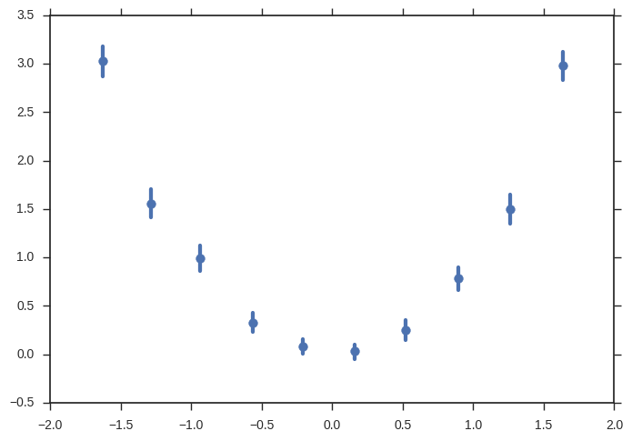
您可以做得更多(错误带来自引导,您可以更改y轴上的估计量,添加回归,.)
Stack Overflow用户
发布于 2016-06-22 21:11:18
您可以使用scipy.stats.binned_statistic轻松地做到这一点。
import scipy.stats
import numpy
import matplotlib.pyplot as plt

x = numpy.random.rand(10000)
y = x + scipy.stats.norm(0, 0.2).rvs(10000)

means_result = scipy.stats.binned_statistic(x, [y, y**2], bins=50, range=(0,1), statistic='mean')
means, means2 = means_result.statistic
standard_deviations = numpy.sqrt(means2 - means**2)
bin_edges = means_result.bin_edges
bin_centers = (bin_edges[:-1] + bin_edges[1:])/2.

plt.errorbar(x=bin_centers, y=means, yerr=standard_deviations, linestyle='none', marker='.')Stack Overflow用户
发布于 2016-06-22 21:46:19
虽然@Keith的回答似乎符合您的意思,但它是相当多的代码。我认为这可以做得更简单,所以一个人得到了关键的概念,并可以调整和建立在此基础上。
让我强调一件事:根调用ProfileHistogram并不是一种特殊的情节。它是,是一个错误的情节。这可以简单地在matplotlib中完成。
这是一种特殊的计算,而不是绘图库的任务。这是熊猫领域的事情,熊猫擅长这样的东西。这是根部的症状,就像巨大的单块堆,它需要有一个额外的类来处理。
所以,您要做的是:在某个变量x中进行离散化,并对每个bin计算另一个变量y中的值。
使用np.digitize、熊猫groupy和aggregate方法可以很容易地做到这一点。
把这一切结合在一起:
import pandas as pd
import matplotlib.pyplot as plt
import numpy as np

# just some random numbers to get startet
x = np.random.uniform(-2, 2, 10000)
y = np.random.normal(x**2, np.abs(x) + 1)
df = pd.DataFrame({'x': x, 'y': y})


# calculate in which bin row belongs base on `x`
# bins needs the bin edges, so this will give as 100 equally sized bins
bins = np.linspace(-2, 2, 101)
df['bin'] = np.digitize(x, bins=bins)
bin_centers = 0.5 * (bins[:-1] + bins[1:])
bin_width = bins[1] - bins[0]

# grouby bin, so we can calculate stuff
binned = df.groupby('bin')
# calculate mean and standard error of the mean for y in each bin
result = binned['y'].agg(['mean', 'sem'])
result['x'] = bin_centers
result['xerr'] = bin_width / 2

# plot it

result.plot(
    x='x',
    y='mean',
    xerr='xerr',
    yerr='sem',
    linestyle='none',
    capsize=0,
    color='black',
)
plt.savefig('result.png', dpi=300)
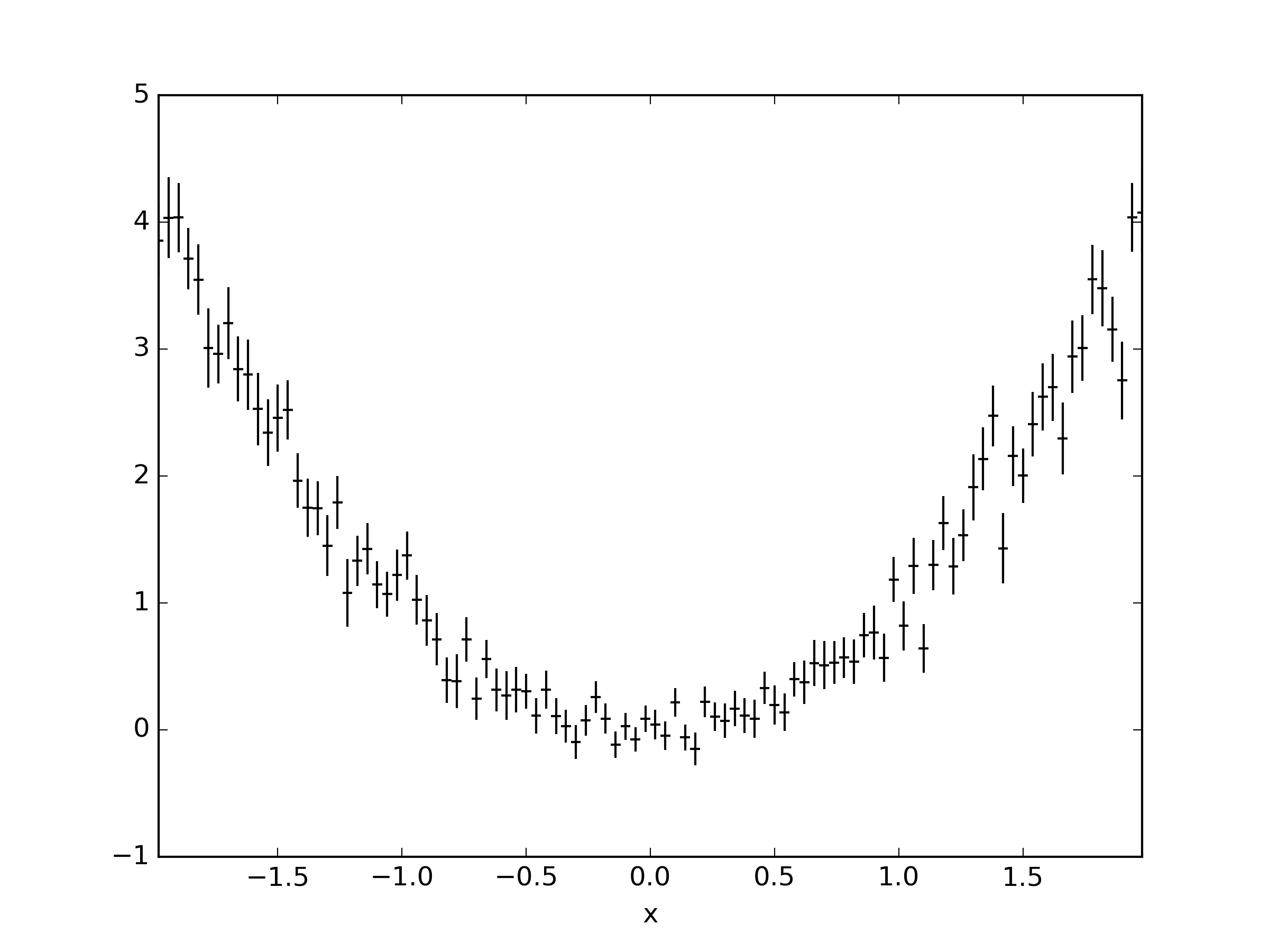
就像根一样;)
https://stackoverflow.com/questions/23709403
复制相似问题
腾讯云开发者

Copyright © 2013 - 2026 Tencent Cloud. All Rights Reserved. 腾讯云 版权所有
深圳市腾讯计算机系统有限公司 ICP备案/许可证号:粤B2-20090059 ![]() 粤公网安备44030502008569号
粤公网安备44030502008569号
腾讯云计算(北京)有限责任公司 京ICP证150476号 | 京ICP备11018762号