
在使用Matplotlib - Cmap - Python绘图时获得意外输出
我在我的项目中有一种方法,在该方法中,我验证一个像素是否具有所需的可靠性(按其作为边缘的分类),并在以下方案中绘制像素:
White -> pixel doesn't have the required reliability
Blue -> pixel has the required reliability and it was classified as not edge
Red -> pixel has the required reliability and it was classified as an edge
这是我的密码:
def generate_data_reliability(classification_mean, data_uncertainty, x_axis_label, y_axis_label, plot_title,
                                  file_path, reliability):
        """
        :classification_mean : given a set of images, how was the mean classification for each pixel
        :param data_uncertainty : the uncertainty about the classification
        :param x_axis_label : the x axis label of the data
        :param y_axis_label : the y axis label of the data
        :param plot_title : the title of the data
        :param file_path : the name of the file
        """
        plt.figure()
        # 0 -> certainty
        # 1 -> uncertainty
        r = 0
        b = 0
        w = 0
        has_reliability = numpy.zeros((data_uncertainty.rows, data_uncertainty.cols), float)
        for x, y in product(range(data_uncertainty.rows), range(data_uncertainty.cols)):
            # I the uncertainty is > then the required reliability, doesn't show it
            if data_uncertainty.data[x][y] > (1.0 - reliability):
                has_reliability[x][y] = 0.5
                w += 1
            else:
                has_reliability[x][y] = classification_mean.data[x][y]
                if has_reliability[x][y] == 1.0:
                    r += 1
                if has_reliability[x][y] == 0.0:
                    b += 1

        print reliability, w+r+b, w, r, b

        plt.title(plot_title)
        plt.imshow(has_reliability, extent=[0, classification_mean.cols, classification_mean.rows, 0], cmap='bwr')
        plt.xlabel(x_axis_label)
        plt.ylabel(y_axis_label)
        plt.savefig(file_path + '.png')
        plt.close()
这是我得到的指纹:
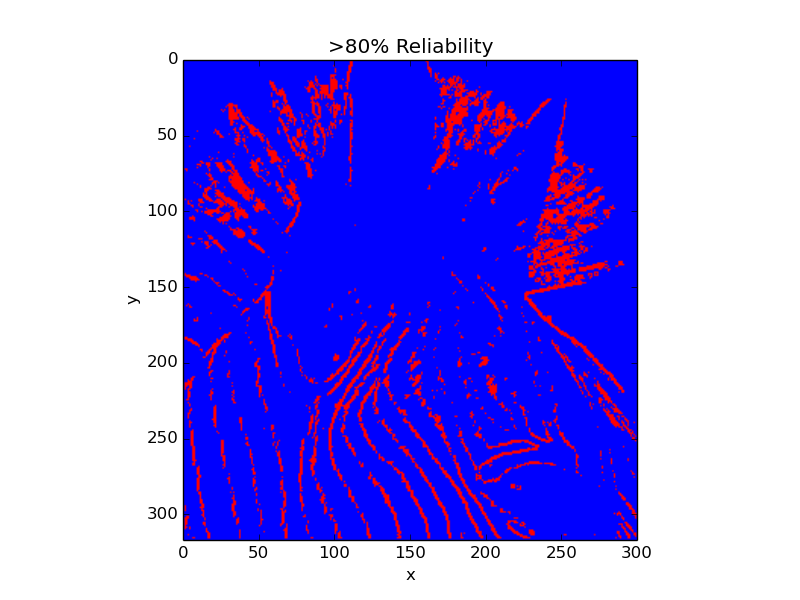
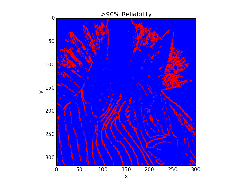
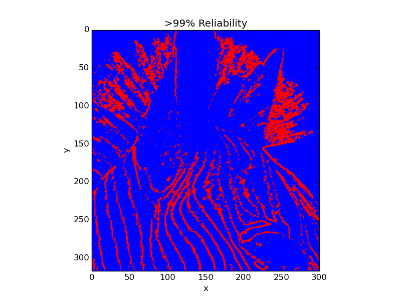
>>>> Prewitt
0.8 95100 10329 0 84771
0.9 95100 12380 0 82720
0.99 95100 18577 0 76523
可以看到,随着所需的可靠性越来越高,更少的像素具有这种可靠性(更多的像素将是白色的,并且没有一个是红色的)。
但这是我得到的情节:
我不知道为什么,如果我有较少的像素与期望的可靠性,我不会得到更多的白色像素,但这些红色的像素。我不会改变我的目标,去捣乱他们。面向对象
我被困在这个问题大约3个小时,不知道是什么问题是错的。
编辑:
在这个地图中,0是蓝色的,0.5是白色的,1是红色的,不是吗?我很确定问题是因为我使用的是一个不同的颜色地图,有时并且没有一个中心值。例如,在我在这里发布的情况下,我没有红色值,所以我的值在0.5到1之间。然后,matplotlib自动将我的最小值设置为红色,而我的最大值设置为蓝色。但是我怎么能这样做呢?我选择这个原因是想在方案中表示颜色: 0=blue、0.5=white和1=red (我的值总是为0、0.5或1)。
任何帮助都是非常非常感谢的。
提前谢谢你。
回答 2
Stack Overflow用户
发布于 2014-04-12 18:54:36
嗯,我可以用一个定制的彩色地图来实现我想要的。这是代码:
@staticmethod
    def generate_data_reliability(classification_mean, data_uncertainty, x_axis_label, y_axis_label, plot_title,
                                  file_path, reliability):
    """
    :param data_uncertainty : the uncertainty about the data
    :param x_axis_label : the x axis label of the data
    :param y_axis_label : the y axis label of the data
    :param plot_title : the title of the data
    :param file_path : the name of the file
    """
    color_map = mpl.colors.ListedColormap(['blue', 'white', 'red'])
    # From 0 to 0.24 -> blue
    # From 0.25 to 0.4 -> white
    # From 0.5 to 1.0 -> red
    bounds = [0.0, 0.25, 0.5, 1.0]
    norm = mpl.colors.BoundaryNorm(bounds, color_map.N)

    plt.figure()
    # 0 -> certainty
    # 1 -> uncertainty
    r = 0
    b = 0
    w = 0
    has_reliability = numpy.zeros((data_uncertainty.rows, data_uncertainty.cols), float)
    for x, y in product(range(data_uncertainty.rows), range(data_uncertainty.cols)):
        # I the uncertainty is > then the required reliability, doesn't show it
        if data_uncertainty.data[x][y] > (1.0 - reliability):
            has_reliability[x][y] = 0.4
        else:
            has_reliability[x][y] = classification_mean.data[x][y]

    plt.title(plot_title)
    plt.imshow(has_reliability, extent=[0, classification_mean.cols, classification_mean.rows, 0],
               interpolation='nearest', cmap=color_map, norm=norm)
    plt.xlabel(x_axis_label)
    plt.ylabel(y_axis_label)
    plt.savefig(file_path + '.png')
plt.close()Stack Overflow用户
发布于 2014-04-13 06:24:07
正如您在编辑中提到的,这个问题是由自动缩放颜色条范围造成的。通过使用vmin和vmax关键字参数来调用imshow(),您可以强制显示颜色映射的范围。
就你的情况而言,这将是:
plt.imshow(has_reliability, vmin=0.0, vmax=1.0, extent=[0, classification_mean.cols, classification_mean.rows, 0], cmap='bwr')这样,你的数据范围不会影响你的彩色地图的缩放!但是,创建您自己的颜色图(如您自己的答案中所显示的)将为您提供更多的长期控制,而且我认为您提供的示例没有在值范围内给出一个梯度(例如,默认的颜色映射在0.5到1.0之间的值中混合了不同数量的红色和白色),这可能是您真正想要的!
https://stackoverflow.com/questions/23024787
复制相似问题
腾讯云开发者

Copyright © 2013 - 2026 Tencent Cloud. All Rights Reserved. 腾讯云 版权所有
深圳市腾讯计算机系统有限公司 ICP备案/许可证号:粤B2-20090059 ![]() 粤公网安备44030502008569号
粤公网安备44030502008569号
腾讯云计算(北京)有限责任公司 京ICP证150476号 | 京ICP备11018762号