
R数据处理
R数据处理
提问于 2014-04-04 16:31:20
我有以下数据框架:
head(d,20)

                                        place        total      error       value
348                         Telecolumbus_GmbH          2          2           2
349                                telefonica          5          2           2
350                 SOCO_SoftCom_Datensysteme          1          2           2
351                          SWU_TeleNet_GmbH          1          2           2
352                                      dtag          5          2           2
353                                      dtag         23          2          14
354 Fachhochschule_Braunschweig/Wolfenbuettel          1          2           2
355       Unitymedia_dynamic_customer_IP_pool          3          2           2
356                                   EWE-TEL          3          2           2
357               QSC_AG_Dynamic_IP_Addresses          4          2           2
358                                telefonica          1          2           2
359                                telefonica          1          2           2
360                                      dtag          2          2           2
361                      Northern_Access_GmbH          2          2           2
362            WT-CMTS-PPPOE-PRIVATE-CUSTOMER          2          2           2
363                                      dtag         17          2           2
364                                DHCP_Space          5          2           2
365   Kabel_Deutschland_Breitband_Customer_14          3          2           2
366                                      dtag          5          2           2
367 Kabel_Deutschland_Breitband_Customer_20 6 2 2我想做一个基本的条形图,其中place在x轴上,y轴有%(值/总数),根据每个位置的和。
我使用了以下方法,但它没有给出适当的%值,因为我无法找到适当的合并%,比如place "dtag“
ggplot(data = d,aes(x = factor(place),y = value/total)) + geom_bar(stat='identity') + theme(axis.text.x = element_text(angle = 90, hjust = 0.5))回答 1
Stack Overflow用户
回答已采纳
发布于 2014-04-04 17:04:43
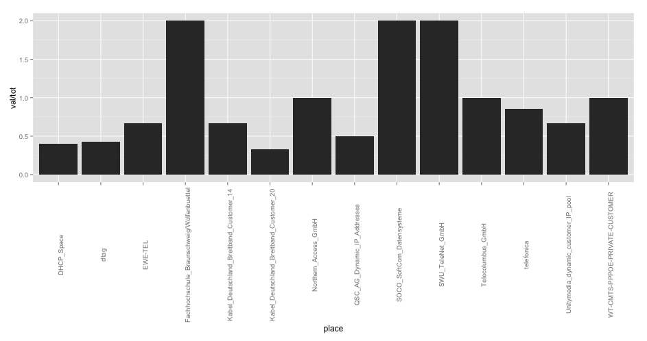
首先,您应该使用plyr包总结数据,然后创建一个barplot:
require(plyr)
require(ggplot2)

# summarise your dataframe into a new one
d2 <- ddply(d, .(place), summarise,
             tot = sum(total),
             err = sum(error),
             val = sum(value))

# create the plot
ggplot(data = d2, aes(x = place, y = val/tot)) +
  geom_bar(stat='identity') +
  theme(axis.text.x = element_text(angle = 90, hjust = 0.5))
作为另一种选择,你可以这样做:
# create a new variable first
d2$ratio <- d2$val / d2$tot

# create the plot
ggplot(data = d2, aes(x = place, y = ratio)) +
  geom_bar(stat='identity') +
  theme(axis.text.x = element_text(angle = 90, hjust = 0.5))
第一种方法的结果(两种绘图解决方案的结果相同):
页面原文内容由Stack Overflow提供。腾讯云小微IT领域专用引擎提供翻译支持
原文链接:
https://stackoverflow.com/questions/22868216
复制相关文章
相似问题
腾讯云开发者

Copyright © 2013 - 2026 Tencent Cloud. All Rights Reserved. 腾讯云 版权所有
深圳市腾讯计算机系统有限公司 ICP备案/许可证号:粤B2-20090059 ![]() 粤公网安备44030502008569号
粤公网安备44030502008569号
腾讯云计算(北京)有限责任公司 京ICP证150476号 | 京ICP备11018762号