
引导:行/Cols布局问题
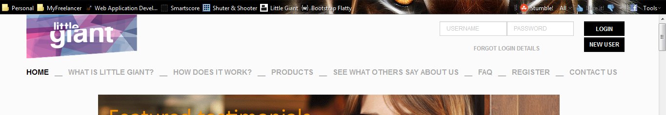
我希望我的布局看起来就像我在屏幕截图1中那样,但是我希望中间的额外空间(我做了一个空白-sm-5)成为一个缓冲区,这样当浏览器大小改变时,登录表单就不会被压缩和混乱(屏幕快照2)。我也有“重新调整”内部行/科尔覆盖其下面内容的问题。请参见屏幕截图3&4以及附带的代码。任何解决办法都是最受欢迎的。我正在使用引导平面(http://wrapbootstrap.com/preview/WB0P6NR1N)。
JSFiddle:http://jsfiddle.net/QzTU9/8/
应该是这样的,但是中心空间充当了一个“调整大小的缓冲区”:
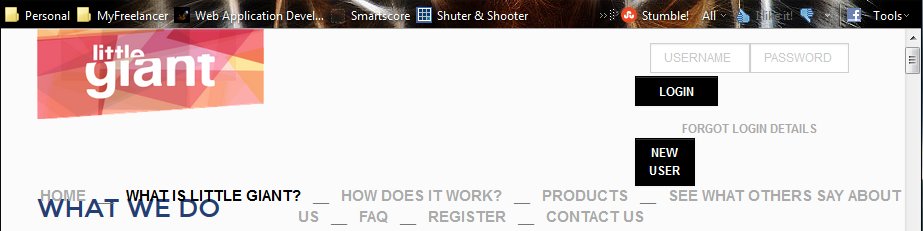
使浏览器尺寸变小:
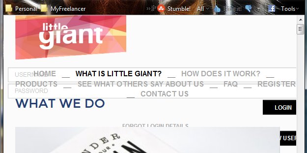
更小,看看文本和区域是如何重叠的:
代码:
<div id="topHeader" style="position: fixed;">
<div class="row" style="height: 85px;">
<div class="col-sm-3">
{% if app.request.get('_route') == 'home' %}<img src="{{asset('images/logo/logo3.png')}}" style="max-height: 90px; max-width: 100%;">
{% elseif app.request.get('_route') == 'products' %}<img src="{{asset('images/logo/logo3.png')}}" style="max-height: 90px;">
{% elseif app.request.get('_route') == 'register' %}<img src="{{asset('images/logo/logo3.png')}}" style="max-height: 90px;">
{% elseif app.request.get('_route') == 'who_we_are' %}<img src="{{asset('images/logo/logo1.png')}}" style="max-height: 90px;">
{% elseif app.request.get('_route') == 'contact' %}<img src="{{asset('images/logo/logo1.png')}}" style="max-height: 90px;">
{% elseif app.request.get('_route') == 'testimonials' %}<img src="{{asset('images/logo/logo1.png')}}" style="max-height: 90px;">
{% elseif app.request.get('_route') == 'how' %}<img src="{{asset('images/logo/logo2.png')}}" style="max-height: 90px;">
{% elseif app.request.get('_route') == 'faq' %}<img src="{{asset('images/logo/logo2.png')}}" style="max-height: 90px;">
{% else %}<img src="{{asset('images/logo/logo4.png')}}" style="max-height: 90px;">{% endif %}
</div>
<div class="col-sm-5"></div>
<div class="col-sm-4">
<form role="form" class="form form-horizontal form-login" id="loginForm" style="font-size: 10px;">
<br>
<div class="row">
<div class="col-sm-1"></div>
<div class="col-sm-4">
<div class="form-group">
<input type="text" id="username" name="_username" class="form-control small-input" placeholder="USERNAME" data-validation-error-msg="Please enter username" data-validation="length" data-validation-length="min1">
</div>
</div>
<div class="col-sm-4">
<div class="form-group">
<input type="text" id="password" name="_password" class="form-control small-input" placeholder="PASSWORD" data-validation-error-msg="Please enter password" data-validation="length" data-validation-length="min1">
</div>
</div>
<div class="col-sm-3" style="text-align: right; padding-right: 0px;"><button style="width: 83px;" class="btn btn-default small-input"> LOGIN </button></div>
</div>
<div class="row">
<div class="col-sm-1"></div>
<div class="col-sm-8 text-center"><br style="font-size: 6px;"><a style="font-size: 12px;" onclick="$('#forgotPassword').modal('show');">FORGOT LOGIN DETAILS</a>
</div>
<div class="col-sm-3" style="text-align: right; padding-right: 0px;">
<a class="btn btn-default btn-sm" href="{{url('register')}}"> NEW USER </a>
</div>
</div>
</form>
</div>
</div>
<br>
<div class="row">
<div class="col-sm-12 text-center" style="font-size: 88%;">
<span {% if app.request.get('_route') == 'home' %} style="color: black; font-weight: bold;" {%endif%}>
{% if app.request.get('_route') != 'home' %}<a href="{{url('home')}}">HOME</a>
{%else%} HOME {%endif%}
</span> __
<span {% if app.request.get('_route') == 'who_we_are' %} style="color: black; font-weight: bold;" {%endif%}>
{% if app.request.get('_route') != 'who_we_are' %}<a href="{{url('who_we_are')}}">WHAT IS LITTLE GIANT?</a>
{%else%} WHAT IS LITTLE GIANT? {%endif%}
</span> __
<span {% if app.request.get('_route') == 'how' %} style="color: black; font-weight: bold;" {%endif%}>
{% if app.request.get('_route') != 'how' %}<a href="{{url('how')}}">HOW DOES IT WORK?</a>
{%else%} HOW DOES IT WORK? {%endif%}
</span> __
<span {% if app.request.get('_route') == 'products' %} style="color: black; font-weight: bold;" {%endif%}>
{% if app.request.get('_route') != 'products' %}<a href="{{url('products')}}">PRODUCTS</a>
{%else%} PRODUCTS {%endif%}
</span> __
<span {% if app.request.get('_route') == 'testimonials' %} style="color: black; font-weight: bold;" {%endif%}>
{% if app.request.get('_route') != 'testimonials' %}<a href="{{url('testimonials')}}">SEE WHAT OTHERS SAY ABOUT US</a>
{%else%} SEE WHAT OTHERS SAY ABOUT US {%endif%}
</span> __
<span {% if app.request.get('_route') == 'faq' %} style="color: black; font-weight: bold;" {%endif%}>
{% if app.request.get('_route') != 'faq' %}<a href="{{url('faq')}}">FAQ</a>
{%else%} FAQ {%endif%}
</span> __
<spa {% if app.request.get('_route') == 'register' %} style="color: black; font-weight: bold;" {%endif%}>
{% if app.request.get('_route') != 'register' %}<a href="{{url('register')}}">REGISTER</a>
{%else%} REGISTER {%endif%}
</span> __
<span {% if app.request.get('_route') == 'contact' %} style="color: black; font-weight: bold;" {%endif%}>
{% if app.request.get('_route') != 'contact' %}<a href="{{url('contact')}}">CONTACT US</a>
{%else%} CONTACT US {%endif%}
</span>
</div>
</div>
</div>另一个示例-原始大小:

有点小--到目前为止一切都很好:
更小。原来的3列分裂( Column 4),互相下面。突然标题与其他文本重叠:
代码:
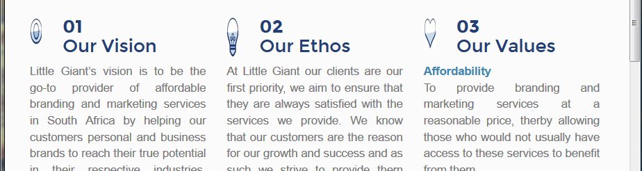
<br><h1>WHAT WE STAND FOR</h1>
<br>
<div class="row"><div class="col-sm-9"><h1>Little Giant’s mission is to provide a complete and comprehensive
spectrum of tailor-made branding and marketing services of the highest quality
to individuals, small businesses, small to medium enterprises and all those
that usually cannot afford such services.</h1></div></div>
<br>
<div class="row">
    <div class="col-sm-4">
        <div class="row" style="height: 60px;">
            <div class="col-sm-2 text-center"><img src="{{asset('images/icons/eye.jpg')}}" style="height:40px; max-width: 100%; max-height: 100%;"></div>
            <div class="col-sm-10"><h1><strong>01</strong><br>Our Vision</h1></div>
        </div>
        <div class="row">
            <div class="col-sm-12" style="text-align: justify;">
                Little Giant’s vision is to be the go-to provider
                of affordable branding and marketing services
                in South Africa by helping our customers personal
                and business brands to reach their true potential
                in their respective industries, thereby creating
                a comprehensive network of interconnected
                ‘little giants’.
            </div>
        </div>
    </div>
    <div class="col-sm-4">
        <div class="row" style="height: 60px;">
            <div class="col-sm-2 text-center"><img src="{{asset('images/icons/lightbulb.jpg')}}" style="height:60px; max-width: 100%; max-height: 100%;"></div>
            <div class="col-sm-10"><h1><strong>02</strong><br>Our Ethos</h1></div>
        </div>
        <div class="row">
            <div class="col-sm-12" style="text-align: justify;">
                At Little Giant our clients are our first priority, we
                aim to ensure that they are always satisfied with the
                services we provide. We know that our customers
                are the reason for our growth and success and as
                such we strive to provide them with the quality of
                work, support and professionalism that they expect.
                <br><br>
                We will always ensure that our staff are the best in
                their field and that they will only submit work of the
                standard we require at Little Giant. Through this we
                hope to maintain a reputation as the market leader
                in affordable branding and marketing services.
            </div>
        </div>
    </div>
    <div class="col-sm-4">
        <div class="row" style="height: 60px;">
            <div class="col-sm-2 text-center"><img src="{{asset('images/icons/heart.jpg')}}" style="height:48px; max-width: 100%; max-height: 100%;"></div>
            <div class="col-sm-10"><h1><strong>03</strong><br>Our Values</h1></div>
        </div>
        <div class="row">
            <div class="col-sm-12" style="text-align: justify;">
                <span class="text2" style="font-weight: bold;">Affordability</span>
                <br>
                To provide branding and marketing services at a
                reasonable price, therby allowing those who would
                not usually have access to these services to benefit
                from them.
                <br><br>
                <span class="text2" style="font-weight: bold;">Quality</span>
                <br>
                Though we provide our products and services at
                a lower cost than the industry standard we do not
                compromise on our standards of quality, providing
                real value and quality to our customers.
                <br><br>
                <span class="text2" style="font-weight: bold;">Enduring partnerships</span>
                <br>
                At Little Giant, we are not simply interested in getting
                our customers' credit card details and payments and
                then severing ties. We envision creating enduring
                partnerships with all of our 'little giants' in which
                we create real value through our network of support,
                collaboration and mutual interests to help all of our
                clients to reach their true potential.
                <br><br>
                <span class="text2" style="font-weight: bold;">Personalized Service</span>
                <br>
                We provide only the highest quality, tailor-made
                solutions for our clients, by looking at their unique
                businesses, their needs and problems and creating
                highly personalised solutions for them.
            </div>
        </div>
    </div>
</div>我遇到的另一个问题是,我用position: fixed在div中添加了前2行,以便将其作为标题保存在页面顶部,但是当滚动“内容”时,标题开始的位置并没有被切断。我设置了不透明度: 1,但我的整个标题都是白色的。很多问题,我知道.
回答 2
Stack Overflow用户
发布于 2014-03-14 12:33:02
对于第二个例子,删除固定高度60 of。当图像和头标签堆叠时,60‘t是不够的。
这将修复您看到的重叠,因为下一个文本块开始于上一行顶部以下的60 fix (尽管您的h1标记继续低于60 fix的高度)。
   <div class="row" style="height: 60px;">
        <div class="col-sm-2 text-center"><img src="{{asset('images/icons/heart.jpg')}}" style="height:48px; max-width: 100%; max-height: 100%;"></div>
        <div class="col-sm-10"><h1><strong>03</strong><br>Our Values</h1></div>
    </div>
http://jsfiddle.net/QzTU9/9/
Stack Overflow用户
发布于 2014-03-14 12:34:33
试着移除所有那些行内风格的老板。错误会自动消失..。
> Here Is the fiddle : http://jsfiddle.net/chermanarun/QzTU9/10/https://stackoverflow.com/questions/22403631
复制相似问题
腾讯云开发者

Copyright © 2013 - 2026 Tencent Cloud. All Rights Reserved. 腾讯云 版权所有
深圳市腾讯计算机系统有限公司 ICP备案/许可证号:粤B2-20090059  粤公网安备44030502008569号
腾讯云计算(北京)有限责任公司 京ICP证150476号 | 京ICP备11018762号