
pcolormesh ()和contourf()不工作
尊敬的专家们,我带着我两个月前提出的一个问题回来了,从那以后,我一直在努力解决这个问题,但没有成功。这与基本地图上等高线的叠加有关。我看过许多关于这方面的例子,例如这里的示例:http://nbviewer.ipython.org/github/Unidata/tds-python-workshop/blob/master/matplotlib.ipynb --数据的示例出现在我之前的一篇文章中,这里是:Contours with map overlay on irregular grid in python。在准备好数据之后,这里有一些绘图方法:
# Setting the plot size and text
fig = plt.figure(figsize=(10,8))

lev = [15, 20, 25, 30, 35, 40,45]
norm1 = colors.BoundaryNorm(lev, 256)

# Draw filled contours

# 1. pcolor does not show the filled contours
#cs = plt.pcolor(x,y,zi, cmap = cm.jet, norm = norm1)

# 2. pcolormesh does not show the filled contours
#cs = plt.pcolormesh(x,y,zi, shading = "flat", cmap=cmap)

# 3. contourf does not show the filled contours
#cs = plt.contourf(xi, yi, zi) #, levels=np.linspace(zi.min(),zi.max(),5))
cs = plt.contourf(xi, yi, zi, cmap = cm.jet, levels = lev, norm = norm1)

# 4. Draw line contours with contour()
#cs = m.contour(x,y,zi,linewidths=1.2)              # This works

plt.scatter(data.Lon, data.Lat, c=data.Z, s=100,
            vmin=zi.min(), vmax=zi.max())           # Does not work at all

# Color bar
#cbar = m.colorbar(fig,location='right',pad="10%")
fig.colorbar(cs)

# Plot a title
plt.figtext(.5,.05,'Figure 1. Mean Rainfall Onset Dates',fontsize=12,ha='center')

plt.show()
很抱歉,我不能贴出情节的例子,但是:
- 首先,
pcolor,pcolormesh和contourf给出了一张地图,没有任何填充的轮廓,但有一个彩色条。 - 上面没有地图对象的绘图给出了填充的等高线,包括散点图(没有地图背景)。
- 等高线给出了等高线叠加的地图:
我很困惑,因为这是一个例子,复制粘贴的例子,在上面引用的链接。
任何关于这一问题的可能原因的暗示都将不胜感激。
回答 2
Stack Overflow用户
发布于 2014-02-19 21:48:58
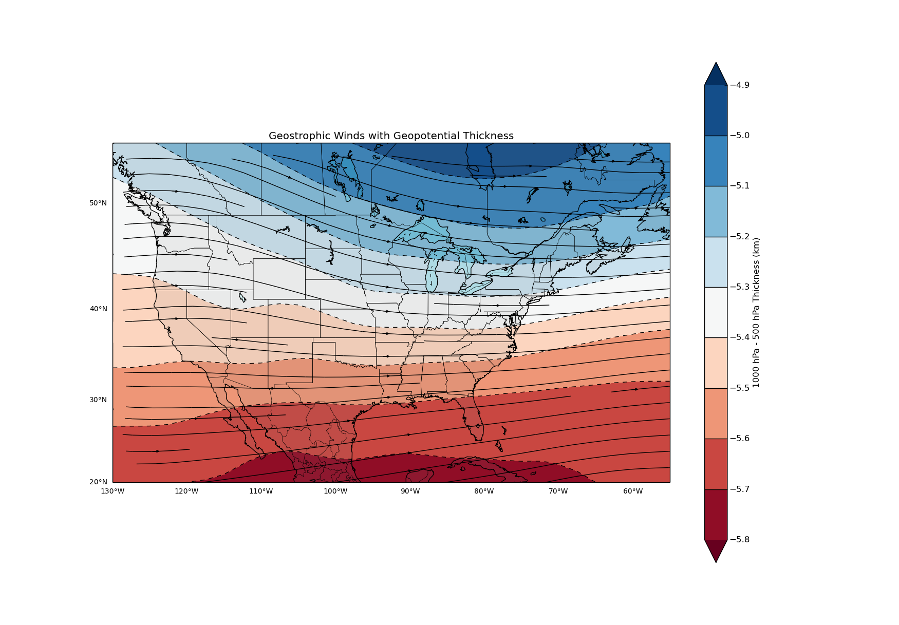
您需要使用基本地图来绘制等高线和使用matplotlib.pyplot。有关我的一些代码,请参阅我的示例。
#Set basemap and grid
px,py=n.meshgrid(x,y)

m=Basemap(projection='merc',llcrnrlat=20,urcrnrlat=55,
   llcrnrlon=230,urcrnrlon=305,resolution='l')

X,Y=m(px,py)


#Draw Latitude Lines
#labels[left,right,top,bottom]  1=True 0=False
parallels = n.arange(0.,90,10.)
m.drawparallels(parallels,labels=[1,0,0,0],fontsize=10,linewidth=0.)

# Draw Longitude Lines
#labels[left,right,top,bottom]  1=True 0=False
meridians = n.arange(180.,360.,10.)
m.drawmeridians(meridians,labels=[0,0,0,1],fontsize=10,linewidth=0)

#Draw Map
m.drawcoastlines()
m.drawcountries()
m.drawstates()
m.fillcontinents(color='grey',alpha=0.1,lake_color='aqua')

#Plot Contour lines and fill
levels=[5.0,5.1,5.2,5.3,5.4,5.6,5.7,5.8,5.9,6.0]
cs=m.contourf(px,py,thickness,levels,cmap=p.cm.RdBu,latlon=True,extend='both')
cs2=m.contour(px,py,thickness,levels,latlon=True,colors='k')

#Plot Streamlines
m.streamplot(px,py,U,V,latlon=True,color='k')

#Add Colorbar
cbar = p.colorbar(cs)
cbar.add_lines(cs2)
cbar.ax.set_ylabel('1000 hPa - 500 hPa Thickness (km)')

#Title
p.title('Geostrophic Winds with Geopotential Thickness')


p.show()
Stack Overflow用户
发布于 2014-02-07 12:30:33
不知道你的数据看起来如何,回答你的问题有点困难,但我还是会尝试的。例如,您可能需要用直方图网格化您的数据,然后将结果轮廓化。
例如,如果您对绘制具有坐标(x,y)和要用于颜色的第三个属性(z)的点的2D等高线感兴趣,那么您可以尝试这样做
from numpy import *

H=histogram2d(x,y,weights=z)

contourf(H[0].T,origin='lower')但是,就像我说的,如果你没有给出你的数据的细节,你很难理解你在寻找什么。有关更多示例demo.html,请参阅matplotlib指南
https://stackoverflow.com/questions/21562587
复制相似问题
腾讯云开发者

Copyright © 2013 - 2026 Tencent Cloud. All Rights Reserved. 腾讯云 版权所有
深圳市腾讯计算机系统有限公司 ICP备案/许可证号:粤B2-20090059 ![]() 粤公网安备44030502008569号
粤公网安备44030502008569号
腾讯云计算(北京)有限责任公司 京ICP证150476号 | 京ICP备11018762号