
IE8引起了许多有关CSS的问题。
IE8引起了许多有关CSS的问题。
提问于 2013-11-28 10:29:13
8有一些问题(再次)。
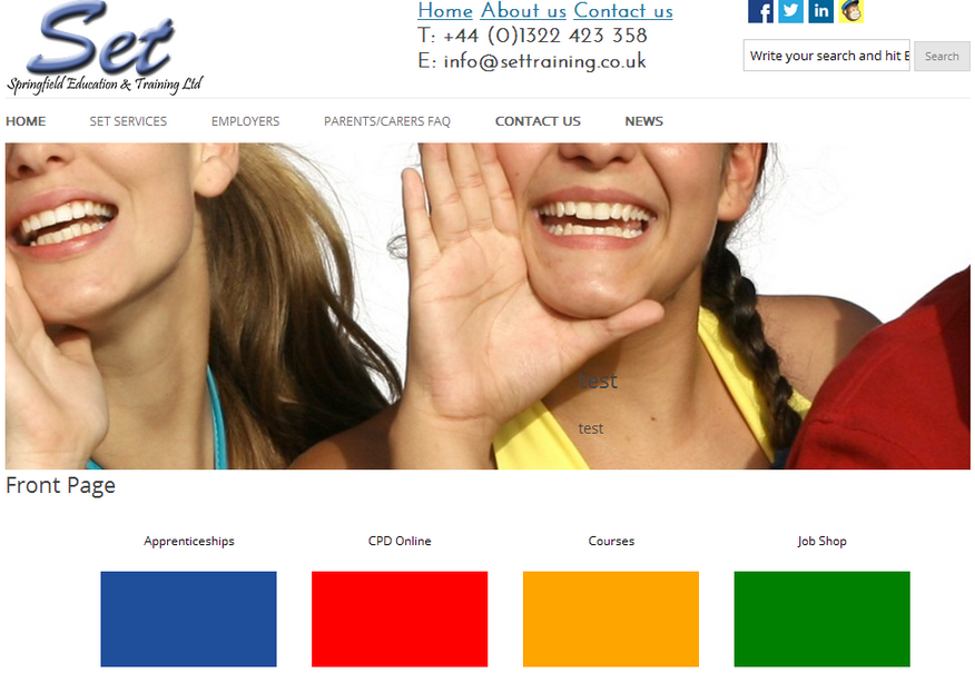
问题1:
当试图缩小浏览器时,菜单是不合适的,并悬停在特定的元素(即搜索栏)上。
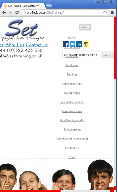
问题2:
当试图缩小浏览器时,菜单是不合适的,并悬停在特定的元素(即搜索栏)上。
我添加了Doctype,并且尝试了分离元素,但我不太清楚它的错误所在?
    <!DOCTYPE html>
<!--[if IE 7]>
<html class="ie ie7" lang="en-US">
<![endif]-->
<!--[if IE 8]>
<html class="ie ie8" lang="en-US">
<![endif]-->
<!--[if !(IE 7) | !(IE 8)  ]><!-->
<html lang="en-US">
<!--<![endif]-->
<head>
<link href='http://fonts.googleapis.com/css?family=Baumans' rel='stylesheet' type='text/css'>
<link href='http://fonts.googleapis.com/css?family=Josefin+Sans' rel='stylesheet' type='text/css'>
<meta charset="UTF-8" />
<meta name="viewport" content="width=device-width" />
<title>Set Training | Just another WordPress site</title>回答 1
Stack Overflow用户
发布于 2013-11-28 10:42:20
首先,您正在使用固定宽度,例如,这个id #right_header_container的宽度为550 id,使用%.您是否尝试过使用非语义或任何其他网格系统来处理较小的屏幕/设备,我建议您看看http://unsemantic.com/。
页面原文内容由Stack Overflow提供。腾讯云小微IT领域专用引擎提供翻译支持
原文链接:
https://stackoverflow.com/questions/20263555
复制相关文章
相似问题
腾讯云开发者

Copyright © 2013 - 2026 Tencent Cloud. All Rights Reserved. 腾讯云 版权所有
深圳市腾讯计算机系统有限公司 ICP备案/许可证号:粤B2-20090059  粤公网安备44030502008569号
腾讯云计算(北京)有限责任公司 京ICP证150476号 | 京ICP备11018762号