
使用CSS的跨浏览器友好响应标志
我试图让这个标志符合所有的分辨率和浏览器,同时保持在绝对中心(垂直和水平)的#container。如果分辨率小于320 in,我希望公司名称消失,徽标位于#container的中心。不能使用jQuery、Javascript或任何其他框架。只有HTML和CSS。
正在进行中的示例:http://jsfiddle.net/cd9mF/1/
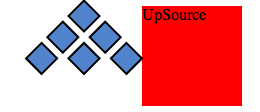
链接到实际徽标图像:http://snag.gy/jO2Py.jpg

注:"u“和"r”拟重叠,这不是一个错误;)
CSS
*, *:before, *:after {
  box-sizing: border-box;
}
body {
  background: #678;
  height: 100%;
  width: 100%;
}
#container {
  background: #eee;
  padding: 40px 50px 85px;
  margin: 100px auto 0;
  text-align: center;
  width: 70%;
}
#d-container {
  float: left;
  margin-left:110px;
  width: 50%;
  z-index:1;
}
#t-container {
  float: left;
  margin: -10px 0 0 -170px;
  width: 50%;
  z-index:2;
}
.diamond {
  background: #5284CD;
  border: 2px solid #000;
  display: inline-block;
  height: 20px;
  margin: -5px 10px 0 0;
  width: 20px;
  /* Rotate */
  -webkit-transform: rotate(-45deg);
  -moz-transform: rotate(-45deg);
  -ms-transform: rotate(-45deg);
  -o-transform: rotate(-45deg);
  transform: rotate(-45deg);
}
#l-text:before {
  content:"UpSou";
  display: inline;
  font: 400 56px/100% Arial, Helvetica, sans-serif;
  float: left;
  letter-spacing: -6px;
}
#r-text:before {
  content:"rce";
  display: inline;
  font: 400 56px/100% Arial, Helvetica, sans-serif;
  float: left;
  letter-spacing: -3px;
}
#trade:before {
  content:"\00ae";
  display: inline;
  font: 400 20px/100% sans-serif;
  float: left;
  letter-spacing: -3px;
}
@media only screen and (max-width: 320px) {
    #l-text, #r-text, #trade {
        display: none;
    }
    .diamond {
        margin: -2px 3px 0 0 ;
    }
}<!DOCTYPE html>
<html lang="en">
<head>
<meta http-equiv="X-UA-Compatible" content="IE=edge,chrome=1" />
<meta charset="utf-8" />
<title>UpSource® logo made using CSS3</title>
<link rel="stylesheet" href="upsourcelogo.css" />
</head>
<body>
<div id="container">
<div id="d-container">
<div class="diamond"></div>
<br />
<div class="diamond"></div>
<div class="diamond"></div>
<br />
<div class="diamond"></div>
<div class="diamond"></div>
<div class="diamond"></div>
</div>
<div id="t-container">
<div id="l-text"></div>
<div id="r-text"></div>
<div id="trade"></div>
</div>
</div>
</body>
</html>回答 2
Stack Overflow用户
发布于 2013-11-07 19:58:47
如果您只想使用css列表来使用css绘制Logo,则必须做的第一件事如下:
*, *:before, *:after {
  box-sizing: border-box;
}

#logo{
    width:100px;
    height:100px;
    margin:20px auto;
    background:red;
    position:relative;
}

#logo:before {
content: '';
position: absolute;
top: 0;
left: -68px;
background: #5284CD;
display: inline-block;
height: 20px;
width: 20px;
-webkit-transform: rotate(-45deg);
-moz-transform: rotate(-45deg);
-ms-transform: rotate(-45deg);
-o-transform: rotate(-45deg);
transform: rotate(-45deg);
-webkit-box-shadow: 0 0 0 2px black,0 30px 0 #5284CD, 0 30px 0 2px black, 0 60px #5284CD, 0 60px 0 2px black,-30px 0 #5284CD,-30px 0 0 2px black,-60px 0 #5284CD,-60px 0 0 2px black,-30px 30px #5284CD,-30px 30px 0 2px black;
-moz-box-shadow: 0 0 0 2px black,0 30px 0 #5284CD, 0 30px 0 2px black, 0 60px #5284CD, 0 60px 0 2px black,-30px 0 #5284CD,-30px 0 0 2px black,-60px 0 #5284CD,-60px 0 0 2px black,-30px 30px #5284CD,-30px 30px 0 2px black;
box-shadow: 0 0 0 2px black,0 30px 0 #5284CD, 0 30px 0 2px black, 0 60px #5284CD, 0 60px 0 2px black,-30px 0 #5284CD,-30px 0 0 2px black,-60px 0 #5284CD,-60px 0 0 2px black,-30px 30px #5284CD,-30px 30px 0 2px black;
}演示:http://jsfiddle.net/NtGtK/1/
<figure id=logo>UpSource</figure>现在看起来是这样的
现在,您有一个css徽标,您可以移动图形取决于您想要的成就。
请注意,您可以在媒体查询中在#logo:before上使用#logo:before缩放2D,类似于
@media only screen and (max-width: 320px) {
    #logo:before {
    /*set the position with left and top*/
    -webkit-transform: rotate(-45deg) scale(0.7,0.7);/* please zoom me */
    -moz-transform: rotate(-45deg) scale(0.7,0.7);
    transform: rotate(-45deg) scale(0.7,0.7);
    }
}
对于性能,您可以添加后台可见性,因为您使用的是转换。
backface-visibility:hidden;
-webkit-backface-visibility:hidden; /* Chrome and Safari */
-moz-backface-visibility:hidden; /* Firefox */
-ms-backface-visibility:hidden; /* Internet Explorer */Stack Overflow用户
发布于 2013-11-07 20:07:32
感谢库格兰对CSS的回答(从不伤害他们的CSS技能;)
感谢推荐SVG的人,乔希·鲍威尔和Kazzkiq。
对于未来的读者来说,这里有一个SVG的粗略版本(我第一次尝试SVG,如果有更好的方法,请原谅)
SVG
<svg xmlns="http://www.w3.org/2000/svg" version="1.1">
<rect width="20" height="20" style="fill:#5284CD;stroke-width:1;stroke:rgb(0,0,0)" transform="rotate(-45 50 -50)" />
<rect width="20" height="20" style="fill:#5284CD;stroke-width:1;stroke:rgb(0,0,0)" transform="rotate(-45 62 -20)" />
<rect width="20" height="20" style="fill:#5284CD;stroke-width:1;stroke:rgb(0,0,0)" transform="rotate(-45 80 -63)" />
<rect width="20" height="20" style="fill:#5284CD;stroke-width:1;stroke:rgb(0,0,0)" transform="rotate(-45 92 -33)" />
<rect width="20" height="20" style="fill:#5284CD;stroke-width:1;stroke:rgb(0,0,0)" transform="rotate(-45 74 10)" />
<rect width="20" height="20" style="fill:#5284CD;stroke-width:1;stroke:rgb(0,0,0)" transform="rotate(-45 110 -76)" />
<text x="115" y="52" fill="#000">Upsou</text>
<text x="266" y="52" fill="#000">rce</text>
<text class="trade" x="341" y="25" fill="#000">®</text>
</svg>CSS
body {
    font: 400 56px/100% Arial, Helvetica, sans-serif;
}
.trade {
    font-size: 20px;
}更新小提琴:http://jsfiddle.net/cd9mF/3/
https://stackoverflow.com/questions/19844035
复制相似问题
腾讯云开发者

Copyright © 2013 - 2026 Tencent Cloud. All Rights Reserved. 腾讯云 版权所有
深圳市腾讯计算机系统有限公司 ICP备案/许可证号:粤B2-20090059  粤公网安备44030502008569号
腾讯云计算(北京)有限责任公司 京ICP证150476号 | 京ICP备11018762号