
我想在jquery中的一个html元素后面添加一个html元素?在Css中有可能吗?
我想在jquery中的一个html元素后面添加一个html元素?在Css中有可能吗?
提问于 2013-11-06 09:38:53
我有一个标签设计。由向下箭头标识的活动选项卡。我只想在鼠标悬停时创建这个箭头。我不想把箭头放在所有标签上。请看下面的图片。在css (可能在伪类之后或之前)或jquery中是否有可能。
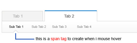
谢谢。
回答 4
Stack Overflow用户
回答已采纳
发布于 2013-11-06 10:03:29
下面是一个如何使用边境戏法的示例
#menu
{
    height: 50px;
    width: 100%;
    border:1px solid #d0d0d0;
    /*gradient generator ftw*/
    background-image: linear-gradient(bottom, rgb(249,249,249) 45%, rgb(255,255,255) 72%);
    background-image: -o-linear-gradient(bottom, rgb(249,249,249) 45%, rgb(255,255,255) 72%);
    background-image: -moz-linear-gradient(bottom, rgb(249,249,249) 45%, rgb(255,255,255) 72%);
    background-image: -webkit-linear-gradient(bottom, rgb(249,249,249) 45%, rgb(255,255,255) 72%);
    background-image: -ms-linear-gradient(bottom, rgb(249,249,249) 45%, rgb(255,255,255) 72%);

    background-image: -webkit-gradient(
        linear,
        left bottom,
        left top,
        color-stop(0.45, rgb(249,249,249)),
        color-stop(0.72, rgb(255,255,255))
    );
}


#menu a
{
    height: 100%;
    width: 100px;
    position: relative;
    display: inline-block;
    text-align: center;
    line-height: 300%;
    text-decoration: none;
    color: #848484;
}

#menu a:hover
{
    color: black;
}

#menu a:hover:before
{
  content: '';
  position: absolute;
  bottom: -1px;
  left: 40%;
  border-left: 10px solid transparent;
  border-right: 10px solid transparent;
  border-bottom: 10px solid white;
  z-index: 1;
}

#menu a:hover:after
{
  content: '';
  position: absolute;
  bottom: -1px;
  left: 40%;
  border-left: 11px solid transparent;
  border-right: 11px solid transparent;
  border-bottom: 11px solid #d0d0d0;
}:after伪类是箭头的边框,:before伪类是箭头本身。
如您所见,:after伪类只是位于:before伪类之下的另一个箭头。随着宽度1 1px更大,您可以看到它突出,将作为一个边框。
Stack Overflow用户
发布于 2013-11-06 09:41:39
形状可以使用*之后和:之前伪元素添加。
Stack Overflow用户
发布于 2013-11-06 09:48:38
就我个人而言,我不确定CSS的功能,但是使用JQuery .hover()绝对是可能的
JS
$( "li.menu_item" ).hover(
 function() {
  $( this ).append( $( "<span class='arrow'></span>" ) );
 }, function() {
  $( this ).find( "span:last" ).remove();
 }
);页面原文内容由Stack Overflow提供。腾讯云小微IT领域专用引擎提供翻译支持
原文链接:
https://stackoverflow.com/questions/19808484
复制相关文章
相似问题
腾讯云开发者

Copyright © 2013 - 2026 Tencent Cloud. All Rights Reserved. 腾讯云 版权所有
深圳市腾讯计算机系统有限公司 ICP备案/许可证号:粤B2-20090059  粤公网安备44030502008569号
腾讯云计算(北京)有限责任公司 京ICP证150476号 | 京ICP备11018762号