
左面透明箭头
左面透明箭头
提问于 2013-10-08 07:25:13
回答 4
Stack Overflow用户
回答已采纳
发布于 2013-10-08 07:57:47
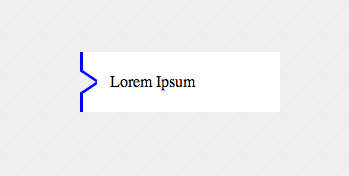
只要有一个元素,你就可以做到这一点,我必须去工作,希望这能帮上忙
<div>Lorem Ipsum</div> 风格:
   div{
        width:200px;
        height:60px;
        margin:100px;
        background-color:transparent;
        color:black;
        position:relative;
        text-indent:30px;
        line-height:60px;
        box-shadow:inset 20px 0 0 200px white;
        overflow:hidden;
        -webkit-box-shadow: inset -164px 0 0 20px white;
        -moz-box-shadow: inset -164px 0 0 20px white;
        box-shadow: inset -164px 0 0 20px white;
    }
    div:before{
        content: '';
    position: absolute;
    left: 0px;
    top: 4px;
    width: 14px;
    border-bottom: 3px solid blue;
    border-left: 3px solid blue;
    height: 18px;
        background-color:white;
    -webkit-transform: skew(0deg,34deg);
        -moz-transform: skew(0deg,34deg);
    transform: skew(0deg,34deg);
    }
    div:after{
    content: '';
    position: absolute;
        background-color:white;
    left: 0px;
    bottom: 4px;
    width: 14px;
    border-top: 3px solid blue;
    border-left: 3px solid blue;
    height: 18px;
    -webkit-transform: skew(0deg,-34deg);
        -moz-transform: skew(0deg,-34deg);
    transform: skew(0deg,-34deg);
    }
    body{
        background-color: #EEEEEE;
        khtml-background-size: 10px 10px;
    -webkit-background-size: 10px 10px;
    -moz-background-size: 10px 10px;
    -ms-background-size: 10px 10px;
    -o-background-size: 10px 10px;
    background-size: 10px 10px;
    background-image: -khtml-linear-gradient(135deg, rgba(255, 255, 255, .15) 25%, transparent 25%, transparent 50%, rgba(255, 255, 255, .15) 50%, rgba(255, 255, 255, .15) 75%, transparent 75%, transparent);
    background-image: -webkit-gradient(linear, left top, right bottom, color-stop(.25, rgba(255, 255, 255, .15)), color-stop(.25, transparent), color-stop(.5, transparent), color-stop(.5, rgba(255, 255, 255, .15)), color-stop(.75, rgba(255, 255, 255, .15)), color-stop(.75, transparent), to(transparent));
    background-image: -webkit-linear-gradient(135deg, rgba(255, 255, 255, .15) 25%, transparent 25%, transparent 50%, rgba(255, 255, 255, .15) 50%, rgba(255, 255, 255, .15) 75%, transparent 75%, transparent);
    background-image: -moz-linear-gradient(135deg, rgba(255, 255, 255, .15) 25%, transparent 25%, transparent 50%, rgba(255, 255, 255, .15) 50%, rgba(255, 255, 255, .15) 75%, transparent 75%, transparent);
    background-image: -ms-linear-gradient(135deg, rgba(255, 255, 255, .15) 25%, transparent 25%, transparent 50%, rgba(255, 255, 255, .15) 50%, rgba(255, 255, 255, .15) 75%, transparent 75%, transparent);
    background-image: -o-linear-gradient(135deg, rgba(255, 255, 255, .15) 25%, transparent 25%, transparent 50%, rgba(255, 255, 255, .15) 50%, rgba(255, 255, 255, .15) 75%, transparent 75%, transparent);
    background-image: linear-gradient(135deg, rgba(255, 255, 255, .15) 25%, transparent 25%, transparent 50%, rgba(255, 255, 255, .15) 50%, rgba(255, 255, 255, .15) 75%, transparent 75%, transparent);
        width:100%;
        height:100%;

}Stack Overflow用户
发布于 2013-10-08 07:31:14
背景不牢固,这使得它很难。特别是因为你的箭头不是90度,所以我想不会那么光滑。但是看看这个问题:
Stack Overflow用户
发布于 2013-10-08 07:54:38
使用创建带有div透明边界的三角形的技术。两次尝试可能会对你有所帮助,
HTML
<div class="button">
    <div class="wrapper">
        <div class=" top-side "></div>
        <div class="arrow-right "></div>
        <div class="arrow-right2 "></div>
        <div class="bottom-side "></div>
    </div>
</div>
CSS
.button {
    width: 400px;
    background-color:orange;
}
.wrapper{
    background-color:blue;
    width:2px;
}
.arrow-right {
    width: 0;
    height: 0;
    border-top: 5px solid transparent;
    border-bottom: 5px solid transparent;
    border-left: 15px solid white;
    position:absolute;
    z-index:2;
}
.arrow-right2 {
    position:relative;
    top:-1px;
    z-index:1;
    width: 0;
    height: 0;
    border-top: 6px solid transparent;
    border-bottom: 6px solid transparent;
    border-left: 18px solid blue;
}
.top-side {
    height:7px;
    width:2px;
    background-color:blue;
}
.bottom-side {
    height:7px;
    width:2px;
    background-color:blue;
}也可以检查http://jsfiddle.net/FkPYb/1/
你可以通过调整它们得到更好的结果。
页面原文内容由Stack Overflow提供。腾讯云小微IT领域专用引擎提供翻译支持
原文链接:
https://stackoverflow.com/questions/19241591
复制相关文章
相似问题
腾讯云开发者

Copyright © 2013 - 2026 Tencent Cloud. All Rights Reserved. 腾讯云 版权所有
深圳市腾讯计算机系统有限公司 ICP备案/许可证号:粤B2-20090059  粤公网安备44030502008569号
腾讯云计算(北京)有限责任公司 京ICP证150476号 | 京ICP备11018762号