
按钮,录音机,被切断
按钮,录音机,被切断
提问于 2013-08-06 17:40:52
我真的很困惑,为什么我的一些文本框和按钮被切断,谁能帮我解决这个问题吗?谢谢!!
XAML代码
<Grid>
        <TabControl>
            <TabItem Name="tabHome">
                <TabItem.Header>
                    <Label Content="Home" MouseLeftButtonDown="tabHome_Click"/>
                </TabItem.Header>
                <Grid>
                    <Button Content="Parse" Height="23" x:Name="btn_parse" Width="75" Click="buttonParse_Click" Margin="180,10,180,176"/>
                    <TextBox IsReadOnly="True"  x:Name="txtbox_filepath" Height="25" Width="135" Margin="151,52,150,132" />
                    <Button Content="Reset" Height="23" x:Name="btn_reset" Width="75" Margin="180,122,180,64" Click="buttonReset_Click"/>
                </Grid>
            </TabItem>
            <TabItem Name="tabConfig">
                <TabItem.Header>
                <Label Content="Configuration" MouseLeftButtonDown="tabConfig_Click"/>
                </TabItem.Header>
                <ScrollViewer>
                    <StackPanel Name="panelConfig">
                    </StackPanel>
                </ScrollViewer>
            </TabItem>
<Grid>
截图
如您所见,按钮和文本框在角处被切断。
谢谢你的帮助我很感激。
回答 4
Stack Overflow用户
回答已采纳
发布于 2013-08-06 17:47:16
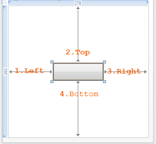
当您给出像这个Margin="180,10,180,176"这样的保证金值时,这意味着控件必须从左到右分别放置180个dip和10个dip,从右边180个,从底部176个到父控件。由于保证金值高,您的控件被剪裁了。
注: dip设备独立像素.
最好为RowDefinitions创建Grid,并将控件放在具有合理边距值的单独行中,如下所示。
<Grid>
    <TabControl>
        <TabItem Name="tabHome">
            <TabItem.Header>
                <Label Content="Home"/>
            </TabItem.Header>
            <Grid>
                <Grid.RowDefinitions>
                    <RowDefinition Height="Auto"/>
                    <RowDefinition Height="Auto"/>
                    <RowDefinition Height="Auto"/>
                </Grid.RowDefinitions>
                <Button Grid.Row="0" Content="Parse" Height="23" x:Name="btn_parse" Width="75" Margin="10" />
                <TextBox Grid.Row="1" IsReadOnly="True"  x:Name="txtbox_filepath" Height="25" Width="135" Margin="10" />
                <Button Grid.Row="2" Content="Reset" Height="23" x:Name="btn_reset" Width="75" Margin="10"/>
            </Grid>
        </TabItem>
        <TabItem Name="tabConfig">
            <TabItem.Header>
                <Label Content="Configuration"/>
            </TabItem.Header>
            <ScrollViewer>
                <StackPanel Name="panelConfig">
                </StackPanel>
            </ScrollViewer>
        </TabItem>
    </TabControl>
</Grid>Stack Overflow用户
发布于 2013-08-06 17:44:04
您正在为按钮显式设置Height和Width,但您使用的值太小。
如果您将其关闭,则该按钮应正确显示:
<Button Content="Parse" x:Name="btn_parse" Click="buttonParse_Click" Margin="180,10,180,176"/>
<Button Content="Reset" x:Name="btn_reset" Margin="180,122,180,64" Click="buttonReset_Click"/>请注意,如果您自己使用Grid或其他容器来设计布局,而不是使用Margin,那么您可以做得更好。
Stack Overflow用户
发布于 2013-08-06 17:43:31
删除Height、Width和Margin属性。
不要使用Visual设计器创建WPF UI。
看看http://wpftutorial.net/LayoutProperties.html
页面原文内容由Stack Overflow提供。腾讯云小微IT领域专用引擎提供翻译支持
原文链接:
https://stackoverflow.com/questions/18086895
复制相关文章
相似问题
腾讯云开发者

Copyright © 2013 - 2026 Tencent Cloud. All Rights Reserved. 腾讯云 版权所有
深圳市腾讯计算机系统有限公司 ICP备案/许可证号:粤B2-20090059 ![]() 粤公网安备44030502008569号
粤公网安备44030502008569号
腾讯云计算(北京)有限责任公司 京ICP证150476号 | 京ICP备11018762号