
在R中创建具有相同轴的多个散点图
我试图在R中的2x2排列中绘制四个散点图(我实际上是通过rpy2绘制的)。我希望每一个都有一个纵横比为1,但也是在相同的尺度,所以相同的X和Y蜱对所有的子图,以便他们可以比较。我试着用par做这件事
par(mfrow=c(2,2))
# scatter 1
plot(x, y, "p", asp=1)
# scatter 2
plot(a, b, "p", asp=1)
# ...
编辑:
下面是我现在拥有的一个直接的例子:
> par(mfrow=c(2,2))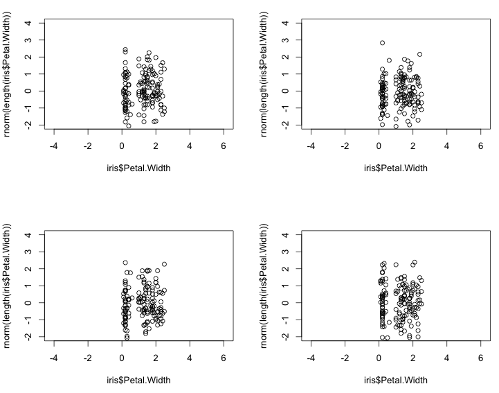
> for (n in 1:4) { plot(iris$Petal.Width, rnorm(length(iris$Petal.Width)), "p", asp=1) }这就产生了正确的散射类型,但有不同的尺度。将ylim和xlim设置为在上述对plot的每个调用中相同并不能解决问题。在每个轴上,你仍然会得到非常不同的刻度标记和滴答数,这使得散射点不必要地难以解释。我希望X和Y轴是相同的。例如,这是:
for (n in 1:4) { plot(iris$Petal.Width, rnorm(length(iris$Petal.Width)), "p", asp=1, xlim=c(-4, 6), ylim=c(-2, 4)) }
生成错误的结果:
确保在所有子图中使用相同的轴的最佳方法是什么?
我所寻找的只是一个像axis=same这样的参数,或者类似于par(mfrow=...)的参数,这听起来像是lattice的默认行为,目的是使每个子图中的轴共享和相同。
lgautier给出了很好的ggplot代码,但它要求预先知道轴。我想要澄清的是,我希望避免迭代每个子图中的数据,并计算出要绘制的正确的滴答。如果必须事先知道这一点,那么ggplot解决方案要比使用plot和显式绘图要复杂得多。
农业研究给出了一个具有晶格的解。这看起来最接近我想要的,因为你不需要显式地预先计算每个散射点的滴答位置,但是作为一个新用户,我无法弄清楚如何使格看起来像一个普通的图。我得到的最接近的是:
> xyplot(y~x|group, data =dat, type='p',
        between =list(y=2,x=2),
        layout=c(2,2), aspect=1,
               scales =list(y = list(relation='same'), alternating=FALSE))
产生的结果:
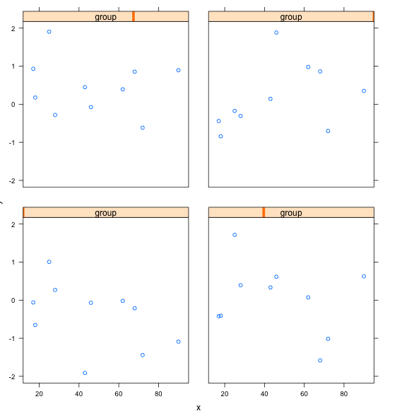
我怎么能让这个看起来像R基呢?我不想让这些group字幕出现在每个子图的顶部,也不希望在每个子图的右上方挂上未标记的滴答,我只想让散射点的每个x和y都贴上标签。我也不想为X和Y寻找一个共享的标签--每个子图都有自己的X和Y标签。在每个散射点中,轴标签必须是相同的,尽管在这里选择的数据没有意义。
除非有一种简单的方法使网格看起来像R基,听起来答案是没有办法做我试图在R中做的事情(令人惊讶),除非预先计算每个子图中每个滴答的确切位置,这需要预先迭代数据。
回答 3
Stack Overflow用户
发布于 2013-02-16 07:46:56
如果开始的话,ggplot2可能是最高的漂亮/容易比率。
使用rpy2的示例:
from rpy2.robjects.lib import ggplot2
from rpy2.robjects import r, Formula

iris = r('iris')

p = ggplot2.ggplot(iris) + \
    ggplot2.geom_point(ggplot2.aes_string(x="Sepal.Length", y="Sepal.Width")) + \
    ggplot2.facet_wrap(Formula('~ Species'), ncol=2, nrow = 2) + \
    ggplot2.GBaseObject(r('ggplot2::coord_fixed')()) # aspect ratio
# coord_fixed() missing from the interface,
# therefore the hack. This should be fixed in rpy2-2.3.3

p.plot()读到前面一个答案的评论,我发现你可能意味着完全不同的情节。对于R的默认绘图系统,par(mfrow(c(2,2))或par(mfcol(c(2,2)))将是最简单的方法,并保持纵横比,轴的范围,和刻痕的一致性,通过通常的方式这些是固定的。
在R中绘制最灵活的系统可能是grid。它并没有看上去那么糟糕,把它想象成一个场景图。使用rpy2、ggplot2和网格:
from rpy2.robjects.vectors import FloatVector

from rpy2.robjects.lib import grid
grid.newpage()
lt = grid.layout(2,2) # 2x2 layout
vp = grid.viewport(layout = lt)
vp.push()


# limits for axes and tickmarks have to be known or computed beforehand
xlims = FloatVector((4, 9))
xbreaks = FloatVector((4,6,8))
ylims = FloatVector((-3, 3))
ybreaks = FloatVector((-2, 0, 2))

# first panel
vp_p = grid.viewport(**{'layout.pos.col':1, 'layout.pos.row': 1})
p = ggplot2.ggplot(iris) + \
    ggplot2.geom_point(ggplot2.aes_string(x="Sepal.Length",
                                          y="rnorm(nrow(iris))")) + \
    ggplot2.GBaseObject(r('ggplot2::coord_fixed')()) + \
    ggplot2.scale_x_continuous(limits = xlims, breaks = xbreaks) + \
    ggplot2.scale_y_continuous(limits = ylims, breaks = ybreaks)
p.plot(vp = vp_p)
# third panel
vp_p = grid.viewport(**{'layout.pos.col':2, 'layout.pos.row': 2})
p = ggplot2.ggplot(iris) + \
    ggplot2.geom_point(ggplot2.aes_string(x="Sepal.Length",
                                          y="rnorm(nrow(iris))")) + \
    ggplot2.GBaseObject(r('ggplot2::coord_fixed')()) + \
    ggplot2.scale_x_continuous(limits = xlims, breaks = xbreaks) + \
    ggplot2.scale_y_continuous(limits = ylims, breaks = ybreaks)
p.plot(vp = vp_p)关于图形的rpy2文档中的更多文档,以及ggplot2和网格文档之后的文档。
Stack Overflow用户
发布于 2013-02-15 23:50:40
使用lattice和ggplot2,您需要对数据进行整形。例如:
- 创建4 data.frame(x=x1,y=y1)
- 为每个data.frame、group=1,2、.添加一个组列。
- 一次重新绑定4 data.frame
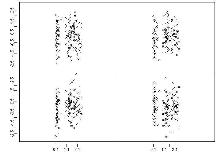
这里有一个使用lattice的示例
dat <- data.frame(x = rep(sample(1:100,size=10),4),
                  y = rep(rnorm(40)),
                  group = rep(1:4,each =10))

xyplot(y~x|group,       ## conditional formula to get 4 panels
       data =dat,       ## data
       type='l',        ## line type for plot
       groups=group,     ## group ti get differents colors
       layout=c(2,2))   ## equivalent to par or layout
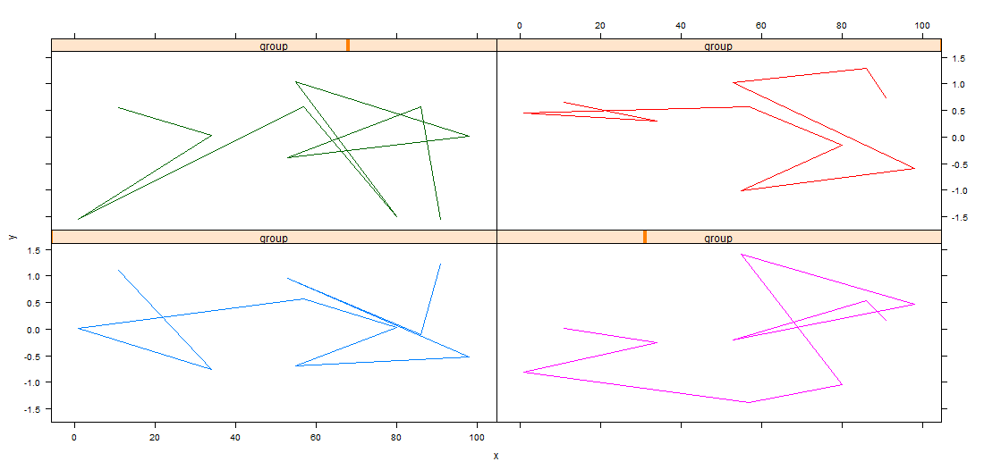
PS :没有必要设置圣具。在xyplot中,默认的封装设置是same (对于所有面板都是相同的)。您可以修改它,例如:
xyplot(y~x|group, data =dat, type='l',groups=group,
       layout=c(2,2), scales =list(y = list(relation='free')))
编辑
格绘图函数有大量参数,可以控制绘图的许多细节,例如,我在这里自定义:
- 用于标签和条的标题的文本。
- 轴号标签的大小和位置,
- 列和面板行之间的间隙的大小。 木素(y~x_x_群,data =dat,type='l',groups=group,x=2 =list(y=2,x=2),layout=c(2,2),layout=c= myStrip,scales =list(y = list(relation='same',alternating= c(3,3)
哪里
myStrip <- function(var.name,which.panel, which.given,...) {
  var.name <- paste(var.name ,which.panel)
  strip.default(which.given,which.panel,var.name,...)
  }
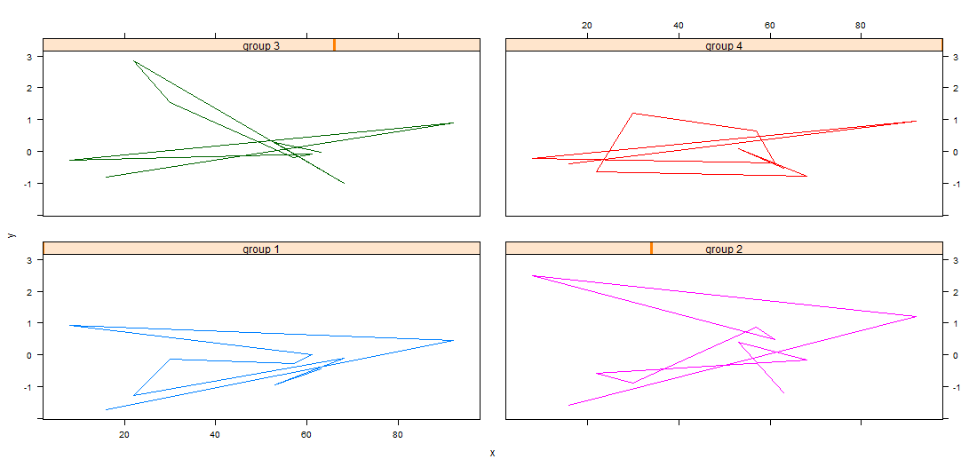
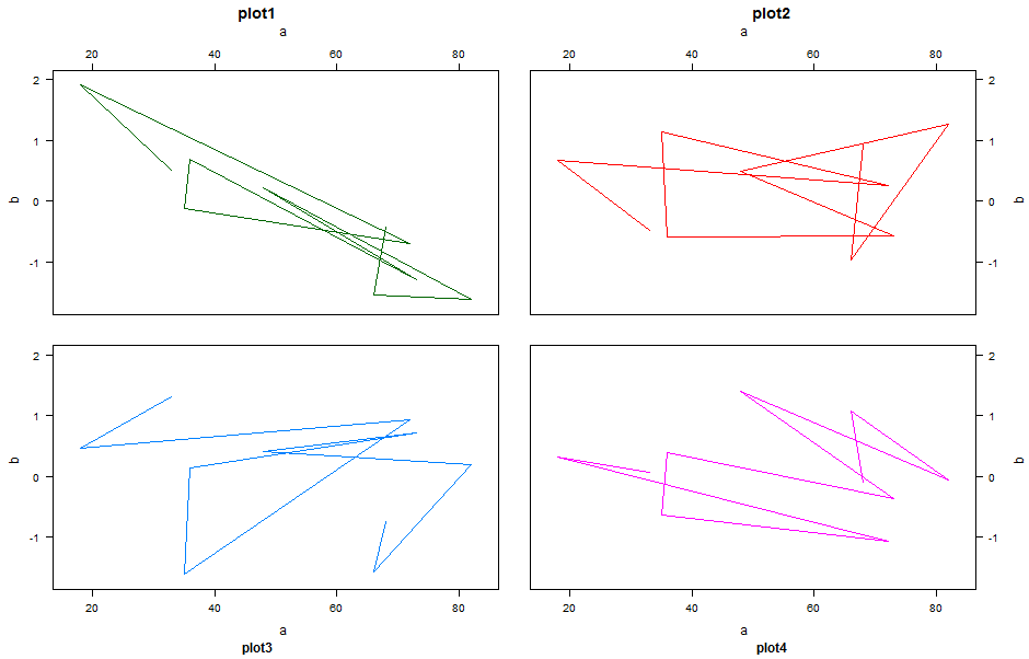
为了获得一个格子图形基-图形图,编辑,您可以尝试如下:
xyplot(y~x|group, data =dat, type='l',groups=group,
       between=list(y=2,x=2),
       layout=c(2,2),
       strip =FALSE,
       xlab=c('a','a'),
       xlab.top=c('a','a'),
       ylab=c('b','b'),
       ylab.right = c('b','b'),
       main=c('plot1','plot2'),
       sub=c('plot3','plot4'),
       scales =list(y = list(alternating= c(3,3)),
                    x = list(alternating= c(3,3))))
Stack Overflow用户
发布于 2014-09-10 20:15:15
虽然已经选择了一个答案,但这个答案使用的是ggplot而不是基数R,这正是OP想要的。虽然ggplot非常适合快速绘图,但对于发布来说,您通常希望比ggplot提供的更好地控制情节。这是基础阴谋最擅长的地方。
我建议阅读肖恩·安德森的解释关于通过巧妙地使用par可以工作的魔术,以及其他一些不错的技巧,比如使用layout()和split.screen()。
用他的解释,我想出了这个:
# Assume that you are starting with some data,
# rather than generating it on the fly
data_mat <- matrix(rnorm(600), nrow=4, ncol=150)
x_val <- iris$Petal.Width

Ylim <- c(-3, 3)
Xlim <- c(0, 2.5)

# You'll need to make the ylimits the same if you want to share axes


par(mfrow=c(2,2))
par(mar=c(0,0,0,0), oma=c(4,4,0.5,0.5))
par(mgp=c(1, 0.6, 0.5))
for (n in 1:4) {
  plot(x_val, data_mat[n,], "p", asp=1, axes=FALSE, ylim=Ylim, xlim=Xlim)
  box()
  if(n %in% c(1,3)){
    axis(2, at=seq(Ylim[1]+0.5, Ylim[2]-0.5, by=0.5))
  }
  if(n %in% c(3,4)){
    axis(1, at=seq(min(x_val), max(x_val), by=0.1))
  }
}
这里还有一些工作要做。就像在OP中一样,数据出现在中间。当然,它会很好地调整事物,这样就可以使用完整的绘图区域。
https://stackoverflow.com/questions/14904748
复制相似问题
腾讯云开发者

Copyright © 2013 - 2026 Tencent Cloud. All Rights Reserved. 腾讯云 版权所有
深圳市腾讯计算机系统有限公司 ICP备案/许可证号:粤B2-20090059 ![]() 粤公网安备44030502008569号
粤公网安备44030502008569号
腾讯云计算(北京)有限责任公司 京ICP证150476号 | 京ICP备11018762号