
背景梯度/图像上的对角线/纹理叠加
背景梯度/图像上的对角线/纹理叠加
提问于 2013-01-07 16:59:45
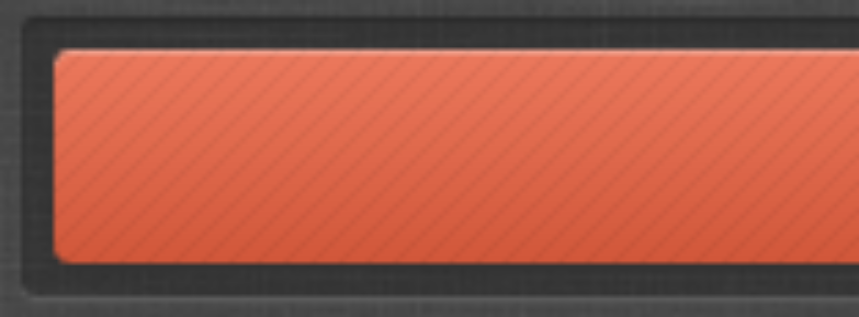
是否存在仅使用CSS复制以下纹理/填充的方法?我想要使用相同的对角线在顶部其他容器与不同的背景填充,所以我希望有可能有一个方法,在CSS中,而不必创建模式,并使用他们作为图像。
知道我该怎么做吗?我猜可能会是这样的:
<div id="gradientFill">
  <div class="linePattern">
    <!-- Content goes here -->
  </div>
</div>
有没有更好的解决办法?我不想在对角线上使用alpha/透明性时遇到问题,然后内容也是透明的。

解决方案发布在.下面
回答 2
Stack Overflow用户
回答已采纳
发布于 2013-01-07 18:05:07
一个正确的解决方案:
jsFiddle:如果你没有看到对角线,那是因为jsFiddle不太喜欢外部链接到来自imgur的托管图像。只需在另一个点击中复制并粘贴http://i.imgur.com/oIuK2.png,将其放到缓存中,然后重新加载Fiddle。
解决方案的关键是颜色背景的相对定位,以及纹理/线条叠加的绝对定位。对于将来访问此帖子的访问者,如果您想在图像上覆盖纹理,请应用:
职位:亲属
...to您的图像div,并且:
职位:绝对
...to你的覆盖div。
<div id="alert">
    Text goes here!
    <div class="lines"></div>
</div>#alert {
position:relative;
padding:10px;
box-shadow:0px 1px 1px #000, 0px 1px 1px #F5BFB1 inset;
background: #ea765a; /* Old browsers */
background: -moz-linear-gradient(top, #ea765a 0%, #d2583b 100%); /* FF3.6+ */
background: -webkit-gradient(linear, left top, left bottom, color-stop(0%,#ea765a), color-stop(100%,#d2583b)); /* Chrome,Safari4+ */
background: -webkit-linear-gradient(top, #ea765a 0%,#d2583b 100%); /* Chrome10+,Safari5.1+ */
background: -o-linear-gradient(top, #ea765a 0%,#d2583b 100%); /* Opera 11.10+ */
background: -ms-linear-gradient(top, #ea765a 0%,#d2583b 100%); /* IE10+ */
background: linear-gradient(to bottom, #ea765a 0%,#d2583b 100%); /* W3C */
filter: progid:DXImageTransform.Microsoft.gradient( startColorstr='#ea765a', endColorstr='#d2583b',GradientType=0 ); /* IE6-9 */
}
.lines {
position:absolute;
width:100%;
height:100%;
top:0;
left:0;
background:url(../img/lines.png);
opacity:0.05;
}Stack Overflow用户
发布于 2013-01-07 17:39:11
您可以在按钮上使用多个背景图像,因此可以使用背景大小在顶部平铺有条纹梯度的标准渐变:
.stripy {
    background-image:
      linear-gradient(45deg, rgba(255, 255, 255, 0.2) 25%, transparent 25%, transparent 50%, rgba(255, 255, 255, 0.2) 50%, rgba(255, 255, 255, 0.2) 75%, transparent 75%, transparent),
      linear-gradient(bottom, rgb(83,84,84) 0%, rgb(181,181,181) 100%);
    background-size:50px 50px, auto;
}
条纹有点厚,但经过一些试验,你应该可以得到你想要的东西。
页面原文内容由Stack Overflow提供。腾讯云小微IT领域专用引擎提供翻译支持
原文链接:
https://stackoverflow.com/questions/14200527
复制相关文章
相似问题
腾讯云开发者

Copyright © 2013 - 2026 Tencent Cloud. All Rights Reserved. 腾讯云 版权所有
深圳市腾讯计算机系统有限公司 ICP备案/许可证号:粤B2-20090059  粤公网安备44030502008569号
腾讯云计算(北京)有限责任公司 京ICP证150476号 | 京ICP备11018762号