
CSS3卡倒垫
CSS3卡倒垫
提问于 2012-10-19 15:07:14
我正在使用教程中的一些代码来定制一个卡片翻转转换,以显示给用户看的“卡片”列表。
我试着将它与我的设计相匹配,但我在div容器上遇到了问题--我不知道如何添加填充,而不需要从卡的中心移开翻转轴。我想要它在适当的位置翻转,但每次我加入填充,它移动翻转轴向上一点。
我在哪里可以添加造型到我的翻盖卡,使他们仍然正确的翻转?
<div class="flip">
    <div class="card">
        <div class="face front">
            <div class="padding">
                <table class="majorTable">
                    <tr>
                        <td width="6%" class="list-number">2.</td>
                        <td width="79%" class="major">Brain and Behavioral Sciences</td>
                        <td width="15%" rowspan="2" align="right"><div id="charts2" style="height:110px; width:110px;display:inline-block;"></div></td>
                    </tr>
                    <tr>
                        <td width="5%" class="list-number"></td>
                        <td width="95%" class="major-description align-top">The term behavioural sciences encompasses all the disciplines that explore the activities of and interactions among organisms in the natural world. It involves the systematic analysis and...</td>
                    </tr>
                </table>
            </div>
        </div>
        <div class="face back">

            <div class="padding">
                <table class="majorTable">
                    <tr>
                        <td width="100%" class="major-description align-top">Computer science or computing science (abbreviated CS or CompSci) designates the scientific and mathematical approach in computing. A computer scientist is a scientist who specialises in the theory of computation and the design of computers. Its subfields can be divided into practical techniques for its implementation and application in computer systems and purely theoretical areas.</td>
                    </tr>
                </table>
            </div>
        </div>
    </div>
</div> body {
background: #ccc;
}
.flip {
-webkit-perspective: 800;
width: 80%;
height: 130px;
position: relative;
margin: 50px auto;
}
.flip .card.flipped {
-webkit-transform: rotatex(180deg);
}
.flip .card {
width: 100%;
height: 100%;
-webkit-transform-style: preserve-3d;
-webkit-transition: 0.3s;
}
.flip .card .face {
width: 100%;
height: 100%;
position: absolute;
-webkit-backface-visibility: hidden ;
z-index: 2;
box-shadow:0px 0px 20px #555;
}
.flip .card .front {
position: absolute;
z-index: 1;
background: black;
color: white;
cursor: pointer;
}
.flip .card .back {
-webkit-transform: rotatex(180deg);
background: blue;
background: white;
color: black;
cursor: pointer;
}$('.flip').click(function(){
$(this).find('.card').addClass('flipped').mouseleave(function(){
$(this).removeClass('flipped');
});
return false;
});Here's a Fiddle with what I have now.
下面是我希望它看起来的代码:
.majorTable {
    width:100%;
}

.list-number {
    font-family: 'Source Sans Pro', sans-serif;
    font-size: 28px;
    font-weight:bold;
}

.major {
    font-family: 'Source Sans Pro', sans-serif;
    font-size: 28px;
    font-weight:bold;
}

.major-description {
    font-family: 'Source Sans Pro', sans-serif;
    font-size: 14px;
    line-height:2em;
    color:#555;
}

.cardButton {
    background:#F6F6F6;
    padding:10px;
    border:1px dashed #AAA;
}

.cardBorder {
    margin:15px 0 15px 0;
    border: 5px solid #F6F6F6;
} <div class="cardBorder">
<div class="cardButton">
<table class="majorTable">
<tr>
<td width="6%" class="list-number">1.</td>
<td width="79%" class="major">Computer Science</td>
<td width="15%" rowspan="2" align="right"><div id="charts1" style="height:110px; width:110px;display:inline-block;"></div></td>
</tr>
<tr>
<td width="6%" class="list-number"></td>
<td width="79%" class="major-description align-top">Computer science or computing science (abbreviated CS or CompSci) designates the scientific and mathematical approach in computing. A computer scientist is a scientist who specialises in the theory...</td>
</tr>
</table>
</div>
</div>
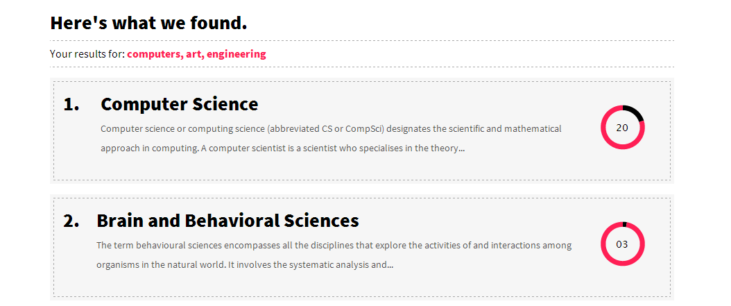
这是一张截图,说明我想如何设计卡片的样式。它基本上是两个嵌套的div --外部div的边框为5px,内部div的边框为虚线。
回答 1
Stack Overflow用户
回答已采纳
发布于 2012-10-19 15:29:00
向css中添加新的. class description类,填充为5px。如下所示:
.major-description {
   padding: 5px;
}下面是修改的花招:http://jsfiddle.net/KLqR3/1/
页面原文内容由Stack Overflow提供。腾讯云小微IT领域专用引擎提供翻译支持
原文链接:
https://stackoverflow.com/questions/12977140
复制相关文章
相似问题
腾讯云开发者

Copyright © 2013 - 2026 Tencent Cloud. All Rights Reserved. 腾讯云 版权所有
深圳市腾讯计算机系统有限公司 ICP备案/许可证号:粤B2-20090059  粤公网安备44030502008569号
腾讯云计算(北京)有限责任公司 京ICP证150476号 | 京ICP备11018762号