
在图中绘制职业生涯路径
在图中绘制职业生涯路径
提问于 2012-09-12 09:29:45
我有数据
test <- structure(list(
y2002 = c("freshman","freshman","freshman","sophomore","sophomore","senior"),
y2003 = c("freshman","junior","junior","sophomore","sophomore","senior"),
y2004 = c("junior","sophomore","sophomore","senior","senior",NA),
y2005 = c("senior","senior","senior",NA, NA, NA)),
.Names = c("2002","2003","2004","2005"),
row.names = c(c(1:6)),
class = "data.frame")
> test
2002 2003 2004 2005
1 freshman freshman junior senior
2 freshman junior sophomore senior
3 freshman junior sophomore senior
4 sophomore sophomore senior <NA>
5 sophomore sophomore senior <NA>
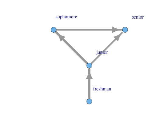
6 senior senior <NA> <NA>我想要创建一个图形,类似于下面丑陋的文本艺术:
freshman ---- junior ----------------------\

freshman ---- junior --- sophomore -------- senior

sophomore ================================/

senior ---------------------------------/
换句话说,我需要在一张图中显示到“高级”的可能路径,根据使用该路径的案例数给边赋予权重。
首先尝试这段代码生成一个图形,但不是类似于上面的文本艺术。
library(igraph)
elist <- lapply(seq_len(nrow(test)), function(i) {
  x <- as.character(test[i,])
  x <- unique(na.omit(x))
  x <- rep(x, each=2)
  x <- x[-1]
  x <- x[-length(x)]
  r <- matrix(x, ncol=2, byrow=TRUE)
  if (nrow(r) > 0) { r <- cbind(r, i) } else { r <- cbind(r, numeric()) }
  r
})

result <- as.data.frame(do.call(rbind, elist))
names(result) <- c("vertex","edge", "id")
categories <- data.frame(name=c("freshman","junior","sophomore","senior"))
g <- graph.data.frame(result,directed=T,vertices=categories)
g <- set.edge.attribute(g, "weight", value=runif(ecount(g))*10)
igraph.par("plot.layout", layout.reingold.tilford)
plot(g, vertex.label=categories$name, vertex.label.dist=7,
edge.width=get.edge.attribute(g,"weight"), edge.arrow.size=1.5)结果(不是我想要的)
**这个问题与this post有关*
** this post是解决这个问题的必要步骤*
回答 2
Stack Overflow用户
回答已采纳
发布于 2012-11-30 02:30:46
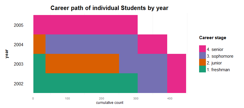
这是一个完全解决问题的办法。人们必须自下而上地阅读图表,同时要记住,每个人都被表示为一条代表他们职业道路的垂直线。是的,为了这个任务,我抛弃了iGraph。\o/
require(reshape2)

meltpath <- function(x){
  require(data.table)
  x <- melt(data = x, id.vars = 'id', measure.vars = names(x)[-1])
  names(x) <- c('id','year','category')
  x$year <- factor(x$year)
  id <- unique(x$id)
  idtable <- data.table(id = id, count = 1:length(id))
  x <- x[order(x$id), ]
  x <- merge(x, idtable, by='id')
  return(x)
}

carpath <- function(datatable, max_x = max(datatable$count)){
  require(ggplot2)
  p = ggplot(datatable, aes(x = count, y = year, fill = category)) +
    geom_tile() +
    scale_y_discrete(name = "year\n",
                     breaks = rev(levels(datatable$year))) +
    scale_x_continuous(name = "cumulative count",
                      limits = c(0,max_x)) +
    guides(fill = guide_legend(title="Career stage\n",
                               reverse=TRUE)) +
    theme(panel.grid.major = element_blank(),
         panel.background = element_blank(),
         axis.ticks = element_blank(),
         plot.title = element_text(vjust = 1.2, face="bold", size=20),
         axis.title.y = element_text(size=15, face="bold"),
         axis.text.y = element_text(size=15, colour="black"),
         legend.title = element_text(size = 15),
         legend.text = element_text(size = 15)) +
         scale_fill_brewer(palette = "Dark2") +
    ggtitle("Career path of individual Students by year")
  p
}

test <- structure(list(
  id = 1:6,
  y2002 = c("freshman","freshman","freshman","sophomore","sophomore","senior"),
  y2003 = c("freshman","junior","sophomore","sophomore","sophomore","senior"),
  y2004 = c("junior","sophomore","sophomore","senior","senior",NA),
  y2005 = c("senior","senior","senior",NA, NA, NA)),
                  .Names = c("id","2002","2003","2004","2005"),
                  row.names = c(c(1:6)),
                  class = "data.frame")
# Grow dataset
testg = data.frame()
for (i in rownames(test)) {
  test0 <- test[rep(i, each=abs(floor(rnorm(1)*100))),]
  testg <- rbind(testg, test0)
}
testg$id <- 1:nrow(testg)
# Munge
test0 <- testg
test1 <- melt(data = test0, id.vars = 'id', measure.vars = names(test0)[-1])
names(test1) <- c('id','year','category')
test1$category[test1$category == 'freshman'] <- 1
test1$category[test1$category == 'junior'] <- 2
test1$category[test1$category == 'sophomore'] <- 3
test1$category[test1$category == 'senior'] <- 4
test1$category <- factor(test1$category, levels=1:4, labels = c('1. freshman','2. junior','3. sophomore','4. senior'))
test1 <- test1[order(test1$category), ]
test1 <- dcast(test1, id ~ year)
test1 <- test1[order(test1$'2005',test1$'2004',test1$'2003',test1$'2002'), ]
test2 <- meltpath(test1)
carpath(test2)Stack Overflow用户
发布于 2012-09-12 10:46:56
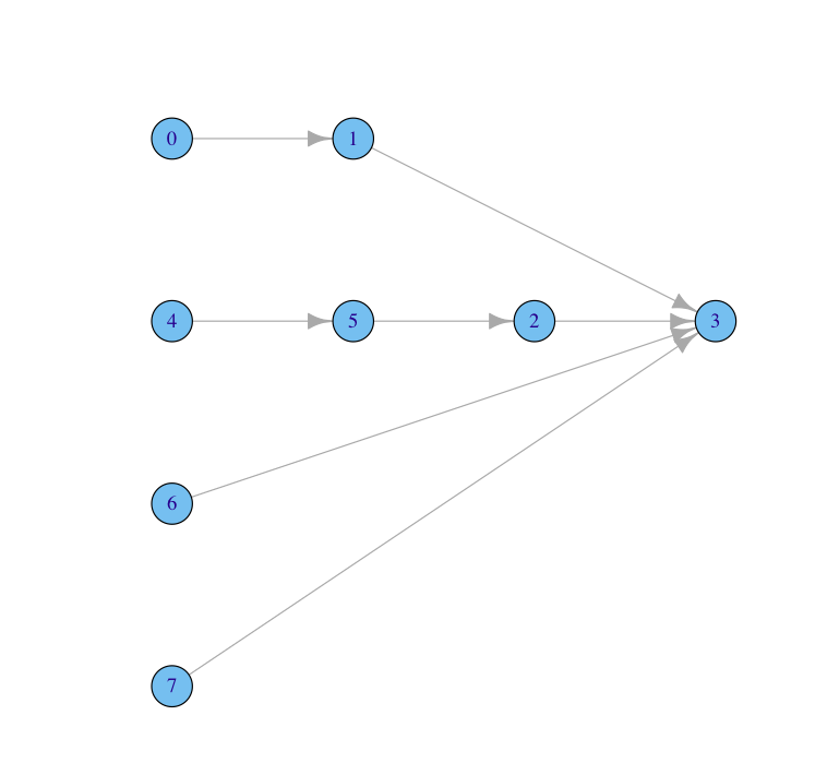
我不认为你完全明白你要做什么,在你的图表示意图中,你有8个节点。但是,在您生成的图中,您只有4个节点。这是因为在您创建的图表中,您只有4个节点。igraph将处理名称相同的节点(例如,两个大二学生作为同一个节点,但具有两个边)。
但是,一旦您制作了多个大二等节点的图。例如sophomore1和sophomore2。然后,您可以将需要它们的节点与layout放在一起,如下所示
 df<- read.table(text="vertex edge weight
 freshman junior 2
 junior    senior 2
 freshman2 junior2 2
 junior2 sophomore 2
 sophomore senior 2
 sophomore2 senior 3
 senior2   senior 2",header=TRUE)
 categories <-data.frame(name=c("freshman","junior","sophomore","senior","freshman2",
 "junior2","sophomore2","senior2"))

g <- graph.data.frame(df,directed=T,vertices=categories)
layOUT<-data.frame(x=c(1,2,3,4,1,2,1,1),y=c(4,4,3,3,3,3,2,1))
l<-as.matrix(layOUT)
plot(g,layout=l)
页面原文内容由Stack Overflow提供。腾讯云小微IT领域专用引擎提供翻译支持
原文链接:
https://stackoverflow.com/questions/12385103
复制相关文章
相似问题
腾讯云开发者

Copyright © 2013 - 2026 Tencent Cloud. All Rights Reserved. 腾讯云 版权所有
深圳市腾讯计算机系统有限公司 ICP备案/许可证号:粤B2-20090059 ![]() 粤公网安备44030502008569号
粤公网安备44030502008569号
腾讯云计算(北京)有限责任公司 京ICP证150476号 | 京ICP备11018762号