
imshow和histogram2d:不能让他们工作
imshow和histogram2d:不能让他们工作
提问于 2012-07-06 18:24:31
我正在学习Python,这是我的第一个问题。我读过与的使用有关的其他主题,但是没有发现任何有用的东西。对不起我的英语不好。
我在这里画了一组点,留下了图形:
现在我想看到点密度的图像,所以我使用了imshow和histogram2d,并在前面的链接中得到了右边的图像。
图像不对应于点的分布。这怎麽可能?我遵循了“帮助”中的说明,甚至更改了一些参数,但没有起任何作用:
守则是:
import numpy as np
import matplotlib.pyplot as plt
import matplotlib.cm as cm

j, h, k = np.loadtxt("test.dat", usecols=(2, 4, 6), \
    unpack=True)

# límites
xmin = -0.5
xmax =  3.0
ymin = -0.5
ymax =  4.0

# colores
j_h = j - h
h_k = h - k

# no todas las estrellas son graficadas
x1 = 0.5
y1 = 0.5
b  = 2.2
c  = y1 - b * x1

x = y = np.array([])

for xi, yi in zip(h_k, j_h):
    if xi < (yi - c) / b:
        x = np.append(x, xi)
        y = np.append(y, yi)

# gráfico
fig = plt.figure(figsize=(8, 7))

ax = fig.add_subplot(111)
#ax.plot(x, y, "go")
ax.set_xlabel(r"X", fontsize=14)
ax.set_ylabel(r"Y", fontsize=14)
ax.axis([xmin, xmax, ymin, ymax])

# imagen
rango = [[xmin, xmax], [ymin, ymax]]
binsx = int((xmax - xmin) / 0.05)
binsy = int((ymax - ymin) / 0.05)
binsxy = [binsx, binsy]

H, xedges, yedges = np.histogram2d(x, y, range=rango, bins=binsxy)

extent = [yedges[0], yedges[-1], xedges[0], xedges[-1]]
cp = ax.imshow(H, interpolation='bilinear', extent=extent, cmap=cm.jet)
fig.colorbar(cp)

plt.show()
所使用数据的链接如下:
https://dl.dropbox.com/u/10411539/python/test.dat
任何帮助都是非常感谢的!
回答 2
Stack Overflow用户
回答已采纳
发布于 2012-07-06 18:37:06
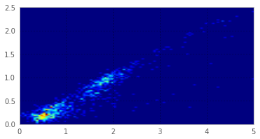
尝试不同的插值,并将矩阵转置到相同的轴上:
cp = ax.imshow(H.transpose()[::-1], interpolation='nearest', extent=extent, cmap=cm.jet)Stack Overflow用户
发布于 2012-07-06 18:37:14
这就是你想要的吗?如果要传递x和y坐标,可以使用pcolor (和pcolormesh)。
import urllib
import numpy as np
import matplotlib.pyplot as plt
f = urllib.urlopen('https://dl.dropbox.com/u/10411539/python/test.dat')
j, h, k = np.loadtxt(f, usecols=(2, 4, 6), \
    unpack=True)
j, h, k
j_h = j - h
h_k = h - k
H, xedges, yedges = np.histogram2d(j_h, h_k, bins=100)
plt.pcolor(xedges, yedges, H)
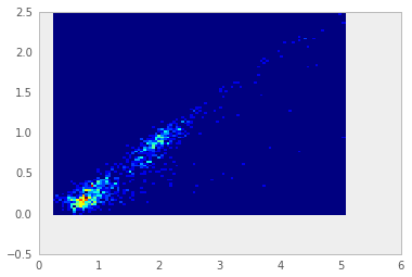
对于imshow,您必须反转第一个维度,因为imshow使用基于零的行、列索引到x,y。从上到下绘制。
plt.imshow(H[::-1,:], extent=(0,5, 0,2.5)) # typed in extent by hand.
页面原文内容由Stack Overflow提供。腾讯云小微IT领域专用引擎提供翻译支持
原文链接:
https://stackoverflow.com/questions/11367683
复制相关文章
相似问题
腾讯云开发者

Copyright © 2013 - 2026 Tencent Cloud. All Rights Reserved. 腾讯云 版权所有
深圳市腾讯计算机系统有限公司 ICP备案/许可证号:粤B2-20090059 ![]() 粤公网安备44030502008569号
粤公网安备44030502008569号
腾讯云计算(北京)有限责任公司 京ICP证150476号 | 京ICP备11018762号