
透明的空心的或切圆的
是否可以仅使用CSS就将切出一个空心圆圈?
我们都可以这样做:
但我们能这么做吗?
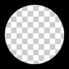
圈必须是中空透明的。因此,这个问题并不是通过在div上放置一个纯色圆来解决的。
回答 7
Stack Overflow用户
发布于 2014-10-21 08:16:52
您可以使用两种不同的技术实现一个透明的圆圈:
1.SVG
下面的示例使用内插svg。第一个片段使用掩模元件来裁剪透明圆圈,第二个空心圆圈是用路径元素制作的。圆圈由2 弧命令组成:
带有掩码元素的 :
body{background:url('https://farm9.staticflickr.com/8760/17195790401_ceeeafcddb_o.jpg');background-size:cover;}<svg viewbox="0 0 100 50" width="100%">
<defs>
<mask id="mask" x="0" y="0" width="80" height="30">
<rect x="5" y="5" width="90" height="40" fill="#fff"/>
<circle cx="50" cy="25" r="15" />
</mask>
</defs>
<rect x="0" y="0" width="100" height="50" mask="url(#mask)" fill-opacity="0.7"/>
</svg>
具有一个路径元素的 :
body{background: url('https://farm9.staticflickr.com/8760/17195790401_ceeeafcddb_o.jpg');background-size:cover;}
svg{
  display:block;
  width:70%;
  height:auto;
  margin:0 auto;
}
path{
  transition:fill .5s;
  fill:#E3DFD2;
}
path:hover{
  fill:pink;
}<svg viewbox="-10 -1 30 12">
<path d="M-10 -1 H30 V12 H-10z M 5 5 m -5, 0 a 5,5 0 1,0 10,0 a 5,5 0 1,0 -10,0z"/>
</svg>
在这种情况下使用SVG的主要优点是:
- 短码
- 您可以很容易地使用图像或渐变来填充圆形掩码。
- 保持形状的边界,并触发鼠标仅在填充端设置口罩(在示例中将透明的裁剪圆圈悬停)
- CSS只使用方框阴影
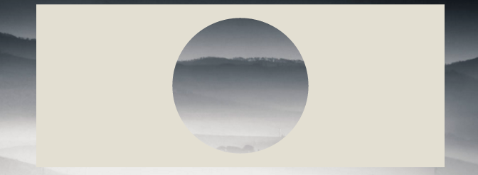
使用overflow:hidden;创建一个div,并在其中创建一个具有边界半径的圆形伪元素。给它一个巨大的盒子-阴影,没有背景:
div{
    position:relative;
    width:500px; height:200px;
    margin:0 auto;
    overflow:hidden;
}
div:after{
    content:'';
    position:absolute;
    left:175px; top:25px;
    border-radius:100%;
    width:150px; height:150px;
    box-shadow: 0px 0px 0px 2000px #E3DFD2;
}

body{background: url('https://farm9.staticflickr.com/8760/17195790401_ceeeafcddb_o.jpg');background-size:cover;}<div></div>
浏览器对框影的支持是IE9+ (参见http://caniuse.com/#feat=css-boxshadow )
同样的方法是使用边框而不是方框阴影。如果您需要支持不支持像IE8这样的框影的浏览器,这是很有趣的。技术是相同的,但是您需要用顶部和左边的值进行补偿,才能将圆圈保持在div的中心:
body{
    background: url('https://farm9.staticflickr.com/8760/17195790401_ceeeafcddb_o.jpg');
    background-size:cover;
}
div{
    position:relative;
    width:500px; height:200px;
    margin:0 auto;
    overflow:hidden;
}
div:after{
    content:'';
    position:absolute;
    left:-325px; top:-475px;
    border-radius:100%;
    width:150px; height:150px;
    border:500px solid #E3DFD2;
}<div></div>
Stack Overflow用户
发布于 2011-11-27 15:26:46
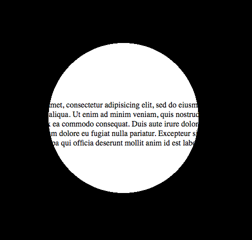
它可以使用径向梯度背景和指针事件(允许鼠标通过圆圈层进行交互,例如文本选择)。这是演示页面和一个截图:
这就是它的代码:
body {
  margin: 0;
  padding: 0;
}

.underneath {
  padding: 0;
  margin: 265px 0 0 0;
  width: 600px;
}

.overlay {
  top: 0;
  left: 0;
  position: absolute;
  width: 600px;
  height: 600px;
  background: -moz-radial-gradient(transparent 150px, rgba(0, 0, 0, 1) 150px);
  background: -webkit-radial-gradient(transparent 150px, rgba(0, 0, 0, 1) 150px);
  background: -ms-radial-gradient(transparent 150px, rgba(0, 0, 0, 1) 150px);
  background: -o-radial-gradient(transparent 150px, rgba(0, 0, 0, 1) 150px);
  pointer-events: none;
  /* send mouse events beneath this layer */
}<body>
<p class="underneath">
Lorem ipsum dolor sit amet, consectetur adipisicing elit, sed do eiusmod tempor incididunt ut labore et dolore magna aliqua. Ut enim ad minim veniam, quis nostrud exercitation ullamco laboris nisi ut aliquip ex ea commodo consequat. Duis aute irure dolor
in reprehenderit in voluptate velit esse cillum dolore eu fugiat nulla pariatur. Excepteur sint occaecat cupidatat non proident, sunt in culpa qui officia deserunt mollit anim id est laborum.
</p>
<div class="overlay"></div>
</body>
Stack Overflow用户
发布于 2016-01-06 21:57:48
关于web的回答,我想补充一点,您可以始终使用translate(-50%,-50%)对div进行居中,所以使用具有更好的浏览器支持的border-property是没有问题的。
div{
    position:relative;
    width:500px;
    height:200px;
    margin:0 auto;
    overflow:hidden;
}
div:after{
    content:'';
    position:absolute;
    left:50%;
    top: 50%;
    transform: translate(-50%,-50%);
    border-radius:50%;
    width:150px; height:150px;
    border: 1000px solid rebeccapurple;
}

body{background: url('https://farm9.staticflickr.com/8760/17195790401_ceeeafcddb_o.jpg');background-size:cover;}<div></div>
通过这种技术,您可以获得真正的创造性:
document.addEventListener( "DOMContentLoaded", function(){
	setInterval(function(){
		if(document.getElementById("moving").style.height === "500px"){
			document.getElementById("moving").style.height = "0px";
		} else {
			document.getElementById("moving").style.height = "500px";
		}
	}, 2000);
});#container {
width: 500px;
margin: 0 auto;
border: 1px solid black;
overflow:hidden;
position: relative;
}
#circle{
position:relative;
height:150px;
margin:0 auto;
clear:left;
overflow:hidden;
}
#circle::before, #circle::after {
content:'';
border-radius:50%;
position: absolute;
left: 50%;
top: 50%;
transform: translate(-50%,-50%);
}
#circle::before {
height: 140px;
width: 140px;
background: rebeccapurple;
}
#circle::after{
width:150px;
height:150px;
border: 2000px solid rebeccapurple;
}
#line {
margin: 0 auto;
width: 6px;
height: 200px;
position: relative;
}
#line::before, #line::after {
content: " ";
background-color: rebeccapurple;
height: 200px;
width:2000px;
position:absolute;
}
#line::before {
right: 100%;
}
#line::after {
left: 100%;
}
#moving {
height: 0px;
width: 100%;
background: blue;
transition: 2s height;
position: absolute;
top: 0px;
z-index: -1;
}
body{
background: url('https://farm9.staticflickr.com/8760/17195790401_ceeeafcddb_o.jpg');background-size:cover;
}<div id="container">
<div id="circle"></div>
<div id="line"></div>
<div id="circle"></div>
<div id="moving"></div>
</div>
https://stackoverflow.com/questions/8286550
复制相似问题
腾讯云开发者

Copyright © 2013 - 2026 Tencent Cloud. All Rights Reserved. 腾讯云 版权所有
深圳市腾讯计算机系统有限公司 ICP备案/许可证号:粤B2-20090059  粤公网安备44030502008569号
腾讯云计算(北京)有限责任公司 京ICP证150476号 | 京ICP备11018762号