
在matplotlib/gnu图中绘制标号区间
我有一个数据样本,如下所示:
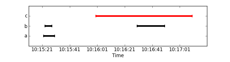
a 10:15:22 10:15:30 OK
b 10:15:23 10:15:28 OK
c 10:16:00 10:17:10 FAILED
b 10:16:30 10:16:50 OK
我想要的是以以下方式绘制上述数据:
captions ^
  |
c |         *------*
b |   *---*    *--*
a | *--*
  |___________________
time >根据数据点的OK/FAILED状态使用线条的颜色。标签(a/b/c/...)可以重复也可以不重复。
正如我从gnuplot和matplotlib的文档中收集的那样,这种类型的绘图在后者中应该更容易完成,因为它不是一个标准的绘图,需要进行一些预处理。
问题是:
- 在任何一种工具中,是否有一种标准的方法来制作这样的情节?
- 如果没有,我应该如何绘制这些数据(指向相关工具/文档/函数/示例的指针--类似于这里描述的东西)?
回答 4
Stack Overflow用户
发布于 2011-10-07 09:25:55
更新:现在包括处理数据示例和使用mpl日期功能。
import matplotlib.pyplot as plt
from matplotlib.dates import DateFormatter, MinuteLocator, SecondLocator
import numpy as np
from StringIO import StringIO
import datetime as dt

### The example data
a=StringIO("""a 10:15:22 10:15:30 OK
b 10:15:23 10:15:28 OK
c 10:16:00 10:17:10 FAILED
b 10:16:30 10:16:50 OK
""")

#Converts str into a datetime object.
conv = lambda s: dt.datetime.strptime(s, '%H:%M:%S')

#Use numpy to read the data in.
data = np.genfromtxt(a, converters={1: conv, 2: conv},
                     names=['caption', 'start', 'stop', 'state'], dtype=None)
cap, start, stop = data['caption'], data['start'], data['stop']

#Check the status, because we paint all lines with the same color
#together
is_ok = (data['state'] == 'OK')
not_ok = np.logical_not(is_ok)

#Get unique captions and there indices and the inverse mapping
captions, unique_idx, caption_inv = np.unique(cap, 1, 1)

#Build y values from the number of unique captions.
y = (caption_inv + 1) / float(len(captions) + 1)

#Plot function
def timelines(y, xstart, xstop, color='b'):
    """Plot timelines at y from xstart to xstop with given color."""
    plt.hlines(y, xstart, xstop, color, lw=4)
    plt.vlines(xstart, y+0.03, y-0.03, color, lw=2)
    plt.vlines(xstop, y+0.03, y-0.03, color, lw=2)

#Plot ok tl black
timelines(y[is_ok], start[is_ok], stop[is_ok], 'k')
#Plot fail tl red
timelines(y[not_ok], start[not_ok], stop[not_ok], 'r')

#Setup the plot
ax = plt.gca()
ax.xaxis_date()
myFmt = DateFormatter('%H:%M:%S')
ax.xaxis.set_major_formatter(myFmt)
ax.xaxis.set_major_locator(SecondLocator(interval=20)) # used to be SecondLocator(0, interval=20)

#To adjust the xlimits a timedelta is needed.
delta = (stop.max() - start.min())/10

plt.yticks(y[unique_idx], captions)
plt.ylim(0,1)
plt.xlim(start.min()-delta, stop.max()+delta)
plt.xlabel('Time')
plt.show()
Stack Overflow用户
发布于 2019-06-22 06:53:49
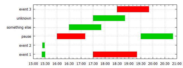
gnuket5.2版本,创建唯一的密钥列表
@CiroSantilli的解决方案的主要区别在于,可以从第1列自动创建唯一键列表,并且可以通过定义的函数Lookup()访问索引。引用的gnuplot演示已经使用了一个唯一项的列表,但是在OP的例子中有重复的项。
创建这样一个独特的项目列表不存在于gnuplot中,所以您必须自己实现它。代码需要gnuplot >=5.2。很可能很难找到在gnuket4.4(OP的问题)下工作的解决方案,因为当时还没有实现一些有用的特性:do for-loops、summation、数据库锁、.(如果有一些解决办法,则可以为gnuket4.6提供一个版本)。
编辑:早期版本使用with vectors和linewidth 20来绘制条形图,但是linewidth 20也向x方向扩展,这在这里是不可取的。因此,现在使用with boxxyerror。
是的,它可以做得更短更清晰。
脚本:
### Time chart with gnuplot (requires gnuplot>=5.0)
reset session

$Data <<EOD
# category        start      end        status
"event 1"         10:15:22   10:15:30   OK
"event 2"         10:15:23   10:15:28   OK
pause             10:16:00   10:17:10   FAILED
"something else"  10:16:30   10:17:50   OK
unknown           10:17:30   10:18:50   OK
"event 3"         10:18:30   10:19:50   FAILED
pause             10:19:30   10:20:50   OK
"event 1"         10:17:30   10:19:20   FAILED
EOD

# create list of unique items
uniqueList = ''
item(col)           = ' "'.strcol(col).'"'
isInList(list,col)  = strstrt(uniqueList,item(col))  # returns a number >0 if found
addToList(list,col) = list.item(col)
stats $Data u (!isInList(uniqueList,1) ? uniqueList = addToList(uniqueList,1) : 0) nooutput

timeCenter(col1,col2) = (timecolumn(col1,myTimeFmt)+timecolumn(col2,myTimeFmt))*0.5
timeDeltaT(col1,col2) = (timecolumn(col1,myTimeFmt)-timecolumn(col2,myTimeFmt))*0.5
Lookup(col)           = int(sum [i=1:words(uniqueList)] (strcol(col) eq word(uniqueList,i)) ? i : 0)
myColor(col)          = strcol(col) eq "OK" ? 0x00cc00 : 0xff0000
myBoxWidth            = 0.6

myTimeFmt = "%H:%M:%S"
set format x "%M:%S" timedate
set yrange [0.5:words(uniqueList)+0.5]
set grid x,y

plot $Data u (timeCenter(2,3)):(Lookup(1)):(timeDeltaT(2,3)):(0.5*myBoxWidth): \
             (myColor(4)):ytic(1) w boxxyerror fill solid 1.0 lc rgb var notitle
### end of script
结果:
Stack Overflow用户
发布于 2022-01-05 04:42:38
@tillsten的答案不再适用于Python3,我做了一些修改,我希望它能有所帮助。
import matplotlib.pyplot as plt
from matplotlib.dates import DateFormatter, MinuteLocator, SecondLocator
import numpy as np
import pandas as pd
import datetime as dt
import io

### The example data
a=io.StringIO("""
caption start stop state
a 10:15:22 10:15:30 OK
b 10:15:23 10:15:28 OK
c 10:16:00 10:17:10 FAILED
b 10:16:30 10:16:50 OK""")

data = pd.read_table(a, delimiter=" ")

data["start"] = pd.to_datetime(data["start"])
data["stop"] = pd.to_datetime(data["stop"])

cap, start, stop = data['caption'], data['start'], data['stop']

#Check the status, because we paint all lines with the same color
#together
is_ok = (data['state'] == 'OK')
not_ok = np.logical_not(is_ok)

#Get unique captions and there indices and the inverse mapping
captions, unique_idx, caption_inv = np.unique(cap, 1, 1)

#Build y values from the number of unique captions.
y = (caption_inv + 1) / float(len(captions) + 1)

#Plot function
def timelines(y, xstart, xstop, color='b'):
    """Plot timelines at y from xstart to xstop with given color."""
    plt.hlines(y, xstart, xstop, color, lw=4)
    plt.vlines(xstart, y+0.03, y-0.03, color, lw=2)
    plt.vlines(xstop, y+0.03, y-0.03, color, lw=2)

#Plot ok tl black
timelines(y[is_ok], start[is_ok], stop[is_ok], 'k')
#Plot fail tl red
timelines(y[not_ok], start[not_ok], stop[not_ok], 'r')

#Setup the plot
ax = plt.gca()
ax.xaxis_date()
myFmt = DateFormatter('%H:%M:%S')
ax.xaxis.set_major_formatter(myFmt)
ax.xaxis.set_major_locator(SecondLocator(interval=20)) # used to be SecondLocator(0, interval=20)

#To adjust the xlimits a timedelta is needed.
delta = (stop.max() - start.min())/10

plt.yticks(y[unique_idx], captions)
plt.ylim(0,1)
plt.xlim(start.min()-delta, stop.max()+delta)
plt.xlabel('Time')
plt.show()https://stackoverflow.com/questions/7684475
复制相似问题
腾讯云开发者

Copyright © 2013 - 2026 Tencent Cloud. All Rights Reserved. 腾讯云 版权所有
深圳市腾讯计算机系统有限公司 ICP备案/许可证号:粤B2-20090059 ![]() 粤公网安备44030502008569号
粤公网安备44030502008569号
腾讯云计算(北京)有限责任公司 京ICP证150476号 | 京ICP备11018762号