
CSS问题- 960.gs
CSS问题- 960.gs
提问于 2009-10-22 14:37:42
我已经决定将表格从Web中释放出来,但是我突然在CSS上遇到了很多麻烦。
我入侵了960.gs,我只使用8列创建了自己的网格,如下所示:
.grid {
    margin-left: auto;
    margin-right: auto;
    width: 960px;
}
.grid ._01,
.grid ._02,
.grid ._03,
.grid ._04,
.grid ._05,
.grid ._06,
.grid ._07,
.grid ._08 {
    display: inline;
    float: left;
    margin: 10px;
    position: relative;
}
.grid ._01 {
    width: 100px;
}
.grid ._02 {
    width: 220px;
}
.grid ._03 {
    width: 340px;
}
.grid ._04 {
    width: 460px;
}
.grid ._05 {
    width: 580px;
}
.grid ._06 {
    width: 700px;
}
.grid ._07 {
    width: 820px;
}
.grid ._08 {
    width: 940px;
}
.grid .clear {
    clear: both;
    display: block;
    height: 0px;
    overflow: hidden;
    visibility: hidden;
    width: 0px;
}
下面是HTML:
<div class="grid">
    <div class="_05">
        <img src="../logo.png" alt="" width="450" height="60" vspace="50" />
    </div>
    <div class="_03" align="center">
      <form id="form1" name="form1" method="post" action="">
        <p>
          <label>Email
            <input type="text" name="textfield" id="textfield" style="margin-right: 0;" />
          </label>
        </p>
        <p>
          <label>Password
            <input type="text" name="textfield2" id="textfield2" />
          </label>
        </p>
      </form>
    </div>
    <div class="clear"></div>
    <div class="_05">
        <div class="box">
            <h2>grid, _05, box, h2</h2>
            <div class="content">grid, _05, box, content</div>
        </div>
    </div>
    <div class="_03">
        <div class="box green">
        <h2>grid, _03, box, h2</h2>
            <div class="content">
              <p>grid</p>
              <p>_03</p>
              <p>box</p>
              <p>content</p>
            </div>
        </div>
    </div>
    <div class="clear"></div>
    <div class="_05">
        <div class="box yellow">
            <h2>grid, _05, box, h2</h2>
            <div class="content">grid, _05, box, content</div>
        </div>
    </div>
    <div class="_03">
        <div class="box red">
            <h2>grid, _03, box, h2</h2>
            <div class="content">
              <p>grid</p>
              <p>_03</p>
              <p>box</p>
              <p>content</p>
            </div>
        </div>
    </div>
    <div class="clear"></div>
</div>
我怎么才能做这个.
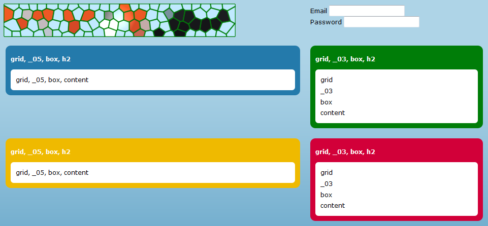
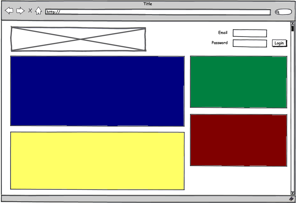
看起来更像这样?特别是,我怎样才能更改黄色框的位置和顶部的登录表单?
谢谢您的所有投入!
回答 1
Stack Overflow用户
发布于 2009-10-22 23:43:58
因为您只是在学习CSS,所以我建议您放弃框架,从头开始编写代码。
幸运的是,我对工作感到厌烦,无所事事:)我为你编写了整件事的代码。你可以在http://kevinvancrawford.com/temp/test.html看到它
标记:
<div id="container">
 <div id="head">
     <h1><a href="./test.html">Site Banner</a></h1>

        <form id="login">
         <label for="email">Email:</label>
            <input type="text" name="email" id="email" />

            <label for="password">Password:</label>
            <input type="password" name="password" id="password" />

            <input type="submit" value="Login" id="submit" />
        </form>
    </div><!--head-->

    <div id="body">
     <div id="primary">
         <div id="blue"></div>

            <div id="yellow"></div>
        </div><!--primary-->


        <div id="column">
         <div id="green"></div>

            <div id="red"></div>
        </div><!--column-->
    </div><!--body-->
</div><!--container-->
和CSS:
#container { width:960px; margin:1em auto; background-color:#EEEEEE; padding:20px 20px 0; }

#head, #login, #body { /* these elements all contain floats */
 overflow:hidden; /* This will clear the contained floats. "auto" works too */
 width:100%; /* Triggers hasLayout in IE, needed to clear floats */
}

#head h1 {
 float:left;
 margin:0;
 width:500px;
 height:80px;
 background:#000000 url(./img/logo.gif) no-repeat; /* Instead of using an <img> tag, we used CSS to replace the HTML text with an image. Good for SEO */
 position:relative;
}
#head h1 a {
 position:absolute;
 display:block;
 top:0; left:0;
 width:100%; height:100%;
 text-indent:-9999px; /* Hides the text. The properties above make the whole <H1> a link  */
 overflow:hidden;
}

#login { float:right; width:320px; padding:1em 0 0; }
#login label, #login input { float:left; display:block; margin:0 5px 5px 0; }
#login label { text-align:right; clear:left; width:80px; }
#login input { width:150px; }
#login #submit { width:auto; }

#primary { float:left; width:620px; margin-right:20px; }
#primary #blue { background-color:#000080; margin:20px 0; min-height:300px; }
#primary #yellow { background-color:#FFFF66; }

#column { float:right; width:320px; }
#column #green { background-color:#008040; }
#column #red { background-color:#800000; }

#yellow, #green, #red { min-height:200px; margin:20px 0; }
请问我是否希望我为你解释其中的任何一件事:)
另外,虽然我在本例中没有使用它,但我推荐Eric的reset.css。用谷歌搜索。
请注意,我所做的唯一折衷之处是,我没有将“登录”按钮对齐到右边,因为这将需要将所有这些元素都浮动到右边,而<input>s必须位于标记中的<label>s之前,我对此有保留。
干杯,
凯文
页面原文内容由Stack Overflow提供。腾讯云小微IT领域专用引擎提供翻译支持
原文链接:
https://stackoverflow.com/questions/1607698
复制相关文章
相似问题
腾讯云开发者

Copyright © 2013 - 2026 Tencent Cloud. All Rights Reserved. 腾讯云 版权所有
深圳市腾讯计算机系统有限公司 ICP备案/许可证号:粤B2-20090059  粤公网安备44030502008569号
腾讯云计算(北京)有限责任公司 京ICP证150476号 | 京ICP备11018762号