
西博恩:如何根据特点改变JointPlot中的斑点大小?
西博恩:如何根据特点改变JointPlot中的斑点大小?
提问于 2021-11-03 21:07:10
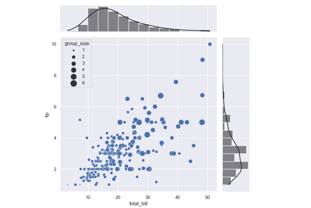
下面有密码。您可以看到JointPlot是绘制出来的。
但是我希望点的大小随列“大小”的值而变化。
因此,我将最后一行marker='o')改为marker='o', s = "size")。现在我有了错误消息AttributeError: 'Line2D' object has no property 's'。
我希望每个点的大小是不同的(即类似于这)。我如何修改我的代码以实现这一点?
import seaborn as sns
import numpy as np
from itertools import product
sns.set(style="darkgrid")

tips = sns.load_dataset("tips")
g = sns.jointplot("total_bill", "tip", data=tips, kind="reg",
                  xlim=(0, 60), ylim=(0, 12), color='k', size = 7)

#Clear the axes containing the scatter plot
g.ax_joint.cla()

# #Plot each individual point separately
for i,row in enumerate(tips.values):
    g.ax_joint.plot(row[0], row[1], color="blue", marker='o')
更新:
我也试着把两个情节直接结合起来,但仍然行不通。没有错误,但散点图只是贴在右边。
import seaborn as sns
import numpy as np
import matplotlib.pyplot as plt
from itertools import product
sns.set(style="darkgrid")

tips = sns.load_dataset("tips")

fig, ax = plt.subplots()

g = sns.jointplot("total_bill", "tip", data=tips, kind="reg",
                  xlim=(0, 60), ylim=(0, 12), color='k', size = 7)

#Clear the axes containing the scatter plot
g.ax_joint.cla()

ax2 = ax.twinx()

sns.scatterplot(
    data=tips, x="total_bill", y="tip", hue="size", size="size",
    sizes=(20, 200), legend="full"
)

plt.show()回答 1
Stack Overflow用户
回答已采纳
发布于 2021-11-03 21:45:46
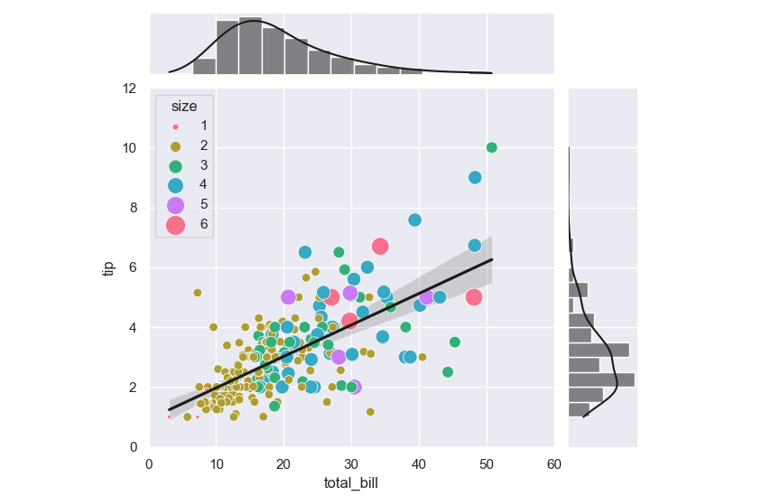
您可以在g.ax_joint上创建一个海运散点图。下面的代码已经用seABON0.11.2进行了测试(旧版本可能有一个名为“size”的列有问题)。
import seaborn as sns
import numpy as np

sns.set(style="darkgrid")

tips = sns.load_dataset("tips")
g = sns.jointplot(x="total_bill", y="tip", data=tips, kind="reg",
                  xlim=(0, 60), ylim=(0, 12), color='k')
g.ax_joint.cla()
sns.scatterplot(data=tips, x='total_bill', y='tip', size='size', sizes=(10, 200),
                ax=g.ax_joint)
正如注释中提到的,为了保持回归直线,可以使用sns.jointplot(..., scatter=False)。
g = sns.jointplot(x="total_bill", y="tip", data=tips, kind="reg", scatter=False,
                  xlim=(0, 60), ylim=(0, 12), color='k')
sns.scatterplot(data=tips, x='total_bill', y='tip',
                hue='size', palette='husl',
                size='size', sizes=(10, 200), legend='full',
                ax=g.ax_joint)
页面原文内容由Stack Overflow提供。腾讯云小微IT领域专用引擎提供翻译支持
原文链接:
https://stackoverflow.com/questions/69831735
复制相关文章
相似问题
腾讯云开发者

Copyright © 2013 - 2026 Tencent Cloud. All Rights Reserved. 腾讯云 版权所有
深圳市腾讯计算机系统有限公司 ICP备案/许可证号:粤B2-20090059 ![]() 粤公网安备44030502008569号
粤公网安备44030502008569号
腾讯云计算(北京)有限责任公司 京ICP证150476号 | 京ICP备11018762号