
如何修改facet_wrap条的宽度?
如何修改facet_wrap条的宽度?
提问于 2021-09-06 16:12:33
我有两个图表: FigA和FigB。都是小面包的。FigA是基于一个短的因子标签进行面化的,而FigB是基于一个更长的因子标签的。FigA和FigB共享一个x轴,因此我想要垂直显示它们(通过牛仔图),并将条形标签定位在绘图的右侧,并使用水平文本。
这导致在FigA的短条标签周围留下了大量的空白。
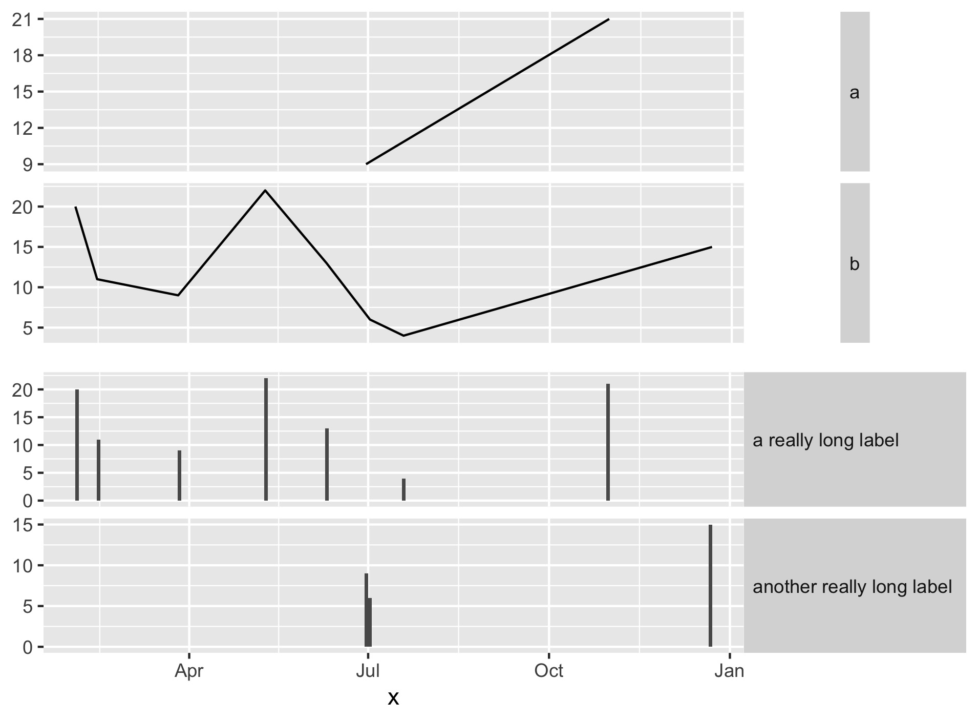
什么是最好的方式格式化条形标签背景,以便他们扩大,以填补可用的水平空间?
我一直在玩弄strip.background和strip.text的利润率、大小和其他参数,但到目前为止还没有产生预期的结果。我漏掉了什么明显的东西吗?
下面是一个最小的例子
(我意识到我可以用这个简单的例子来pivot_longer并生成一个图表,但是是否有一种方法可以直接修改条形标签以适应更复杂的情况):
library(tidyverse)
library(cowplot)
df <- data.frame(   shortCat = sample(c('a','b'), 10, replace=TRUE),
                    longCat = sample(c('a really long label','another really long label'), 10, replace=TRUE),
                    x = sample(seq(as.Date('2020/01/01'), as.Date('2020/12/31'), by="day"), 10),
                    y = sample(0:25, 10, replace = TRUE) )

figA <- df %>% ggplot( aes(x=x,y=y) ) +
    geom_line() +
    facet_wrap(vars(shortCat), ncol=1, strip.position ="right", scales="free_y") +
    theme(  axis.title.y=element_blank(),
            axis.title.x=element_blank(),
            axis.text.x=element_blank(),
            axis.ticks.x=element_blank(),
            strip.text.y.right = element_text(angle = 0, hjust=0) )

figB <- df %>% ggplot( aes(x=x,y=y) ) +
    geom_bar(stat="identity") +
    facet_wrap(vars(longCat), ncol=1, strip.position ="right", scales="free_y") +
    theme(  axis.title.y=element_blank(),
            strip.text.y.right = element_text(angle = 0, hjust=0) )

plot_grid(figA,figB, ncol=1, align="v")回答 1
Stack Overflow用户
回答已采纳
发布于 2021-09-06 16:57:05
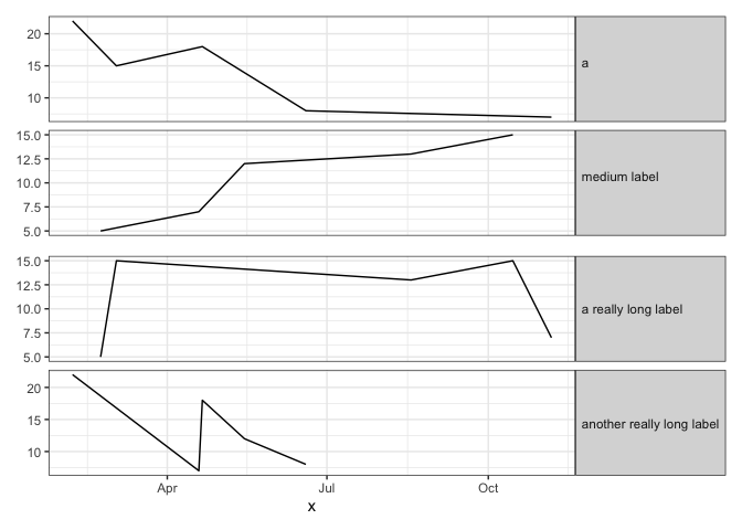
对于需要叠加两个单独的地块的情况,这里有一种匹配条带宽度的方法:
- 加载
ggtext包,它允许我们在单个条形标签中有多个文本颜色(使用html标签)。 - 获得最长条形标签的全文。将其作为第二行添加到短条标签中(我们将添加一个html标记来完成此操作)。这个文本将确保条带宽度在两个plots.
- However,中完全相同,我们不希望额外的文本行是可见的。因此,我们将添加一些html标记,将文本的颜色设置为与条带的背景填充颜色相同。
library(tidyverse)
library(patchwork) # For plot layout
library(ggtext) # For multiple text colors in strip labels
theme_set(theme_bw())

set.seed(2)
df <- data.frame(shortCat = sample(c('a','b'), 10, replace=TRUE),
                 longCat = sample(c('a really long label','another really long label'), 10, replace=TRUE),
                 x = sample(seq(as.Date('2020/01/01'), as.Date('2020/12/31'), by="day"), 10),
                 y = sample(0:25, 10, replace = TRUE) )

# Test method's robustness by making labels of different lengths
df = df %>%
  mutate(shortCat2 = gsub("b", "medium label", shortCat))

# Get text of longest label
pad = df$longCat[which.max(nchar(df$longCat))]

# Get colour of strip background
txt.col = theme_get()$strip.background$fill

# Set padding text to same colour as background, so it will be invisible
#  (you can set the color to "white" for a visual confirmation of what this does)
df$shortCat2 = paste0(df$shortCat2,  "<span style = 'color:",txt.col,";'><br>", pad ,"</span>")

figA = df %>%
  ggplot( aes(x=x,y=y) ) +
  geom_line() +
  facet_wrap(vars(shortCat2), ncol=1, strip.position ="right", scales="free_y") +
  theme(axis.title.y=element_blank(),
        axis.title.x=element_blank(),
        axis.text.x=element_blank(),
        axis.ticks.x=element_blank(),
        strip.text.y=element_textbox())

figA / figB
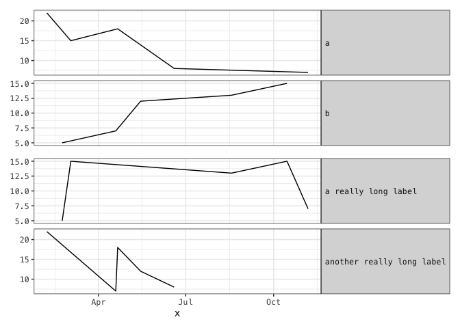
下面是另一种方法,我们在其中添加空白,将条形标签扩展到所需的宽度。它需要一个单空间字体,这使得它不那么灵活,但它不需要使用html标记,就像在前面的方法中一样。
# Identify monospaced fonts on your system
fonts = systemfonts::system_fonts()
fonts %>% filter(monospace) %>% pull(name)
#>  [1] "Menlo-Bold"                "Courier-Oblique"
#>  [3] "Courier-BoldOblique"       "AppleBraille"
#>  [5] "AppleBraille-Pinpoint8Dot" "AndaleMono"
#>  [7] "Menlo-BoldItalic"          "Menlo-Regular"
#>  [9] "CourierNewPS-BoldMT"       "AppleBraille-Outline6Dot"
#> [11] "GB18030Bitmap"             "Monaco"
#> [13] "AppleBraille-Outline8Dot"  "PTMono-Regular"
#> [15] "PTMono-Bold"               "AppleColorEmoji"
#> [17] "Menlo-Italic"              "CourierNewPS-ItalicMT"
#> [19] "Courier"                   "Courier-Bold"
#> [21] "CourierNewPSMT"            "AppleBraille-Pinpoint6Dot"
#> [23] "CourierNewPS-BoldItalicMT"

# Set theme to use a monospace font
theme_set(theme_bw() +
            theme(text=element_text(family="Menlo-Regular")))

figA <- df %>%
  mutate(shortCat = paste0(shortCat,
                           paste(rep(" ", max(nchar(longCat)) - 1), collapse=""))
  ) %>%
  ggplot( aes(x=x,y=y) ) +
  geom_line() +
  facet_wrap(vars(shortCat), ncol=1, strip.position ="right", scales="free_y") +
  theme(axis.title.y=element_blank(),
        axis.title.x=element_blank(),
        axis.text.x=element_blank(),
        axis.ticks.x=element_blank(),
        strip.text.y.right = element_text(angle = 0, hjust=0))

figB <- df %>% ggplot( aes(x=x,y=y) ) +
  geom_line() +
  facet_wrap(vars(longCat), ncol=1, strip.position ="right", scales="free_y") +
  theme(  axis.title.y=element_blank(),
          strip.text.y.right = element_text(angle = 0, hjust=0) )

figA / figB
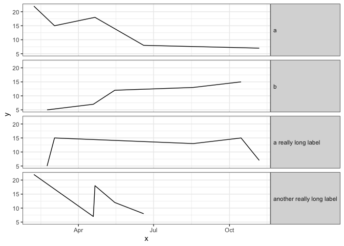
如果您可以将数据重新格式化为长格式并绘制一个单独的图,那么这是最简单的方法:
theme_set(theme_bw())

df %>%
  pivot_longer(matches("Cat")) %>%
  mutate(value = fct_relevel(value, "a", "b")) %>%
  ggplot(aes(x,y)) +
  geom_line() +
  facet_wrap(~value, ncol=1, strip.position="right") +
  theme(strip.text.y=element_text(angle=0, hjust=0))
页面原文内容由Stack Overflow提供。腾讯云小微IT领域专用引擎提供翻译支持
原文链接:
https://stackoverflow.com/questions/69077592
复制相关文章
相似问题
腾讯云开发者

Copyright © 2013 - 2026 Tencent Cloud. All Rights Reserved. 腾讯云 版权所有
深圳市腾讯计算机系统有限公司 ICP备案/许可证号:粤B2-20090059 ![]() 粤公网安备44030502008569号
粤公网安备44030502008569号
腾讯云计算(北京)有限责任公司 京ICP证150476号 | 京ICP备11018762号