
在多幅图上绘制多列群
在多幅图上绘制多列群
提问于 2021-06-24 17:30:38
我有这样的数据
ID    value_y   date_x      end_cutoff
1      75     2020-7-1      2021-01-17
1      73     2020-7-2      2021-01-17
1      74     2020-7-1      2021-06-05
1      71     2020-7-2      2021-06-05
2      111    2020-7-1      2021-01-17
2      112    2020-7-2      2021-01-17
2      113    2020-7-1      2021-06-05
2      115    2020-7-2      2021-06-05
我想绘制以下数据,以便满足以下要求:
- 每个ID有1张图
- 每个图有n行绘制(在本例中为2条,每个end_cutoff为1条)
因此,理想情况下,在本例中,我将有两个单独的情节,都有两行。
目前,这里是我的代码,但它将所有代码都绘制在相同的图上,而不是为每个ID绘制一个新的图。
 grouped = df_fit.groupby(['ID','end_cutoff'])
 fig, ax = plt.subplots()
 for (ID, end_cutoff), df_fit in grouped:
     ax.plot(df_fit['date_x'], df_fit['value_y'], label=ID+' '+str(end_cutoff.date()))
plt.show()回答 1
Stack Overflow用户
回答已采纳
发布于 2021-06-24 17:54:04
此解决方案将缺失的部分正确地添加到现有的code
- Format (日期列)中,将日期列添加到一个
datetime dtype中,并且只提取日期( date component. - Create )--一些子图等于唯一的
'ID'值的个数( - )--获取
uid中的ID索引,并使用该值索引并绘制到正确的ax
- This选项中,使用x-轴的
pandas.DataFrame.plot - The格式是
'%m-%d %H',因为点之间的时间很短。X轴将根据日期范围自动格式化.
import pandas as pd
import numpy as np
# dataframe
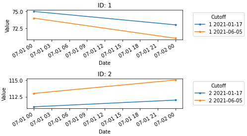
data = {'ID': [1, 1, 1, 1, 2, 2, 2, 2], 'value_y': [75, 73, 74, 71, 111, 112, 113, 115], 'date_x': ['2020-7-1', '2020-7-2', '2020-7-1', '2020-7-2', '2020-7-1', '2020-7-2', '2020-7-1', '2020-7-2'], 'end_cutoff': ['2021-01-17', '2021-01-17', '2021-06-05', '2021-06-05', '2021-01-17', '2021-01-17', '2021-06-05', '2021-06-05']}
df = pd.DataFrame(data)
# set date columns to a datetime dtype and extract only the date component since time isn't relevant
df['end_cutoff'] = pd.to_datetime(df['end_cutoff']).dt.date
df['date_x'] = pd.to_datetime(df['date_x']).dt.date
# create grouped
grouped = df.groupby(['ID','end_cutoff'])
# create subplots based on the number of unique ID values
uid = df.ID.unique()
fig, ax = plt.subplots(nrows=len(uid), figsize=(7, 4))
for (ID, end_cutoff), df_fit in grouped:
# get the index of the current ID, and use it to index ax
axi = np.argwhere(uid==ID)[0][0]
# plot to the correct ax based on the index of the ID
df_fit.plot(x='date_x', y='value_y', ax=ax[axi], label=f'{ID} {end_cutoff}',
xlabel='Date', ylabel='Value', title=f'ID: {ID}', marker='.', rot=30)
# place the legend outside the plot
ax[axi].legend(title='Cutoff', bbox_to_anchor=(1.05, 1), loc='upper left')
plt.tight_layout()
plt.show()
页面原文内容由Stack Overflow提供。腾讯云小微IT领域专用引擎提供翻译支持
原文链接:
https://stackoverflow.com/questions/68120319
复制相关文章
相似问题
腾讯云开发者

Copyright © 2013 - 2026 Tencent Cloud. All Rights Reserved. 腾讯云 版权所有
深圳市腾讯计算机系统有限公司 ICP备案/许可证号:粤B2-20090059 ![]() 粤公网安备44030502008569号
粤公网安备44030502008569号
腾讯云计算(北京)有限责任公司 京ICP证150476号 | 京ICP备11018762号