
如何在轴外添加geom_tile?
如何在轴外添加geom_tile?
提问于 2021-02-21 16:51:48
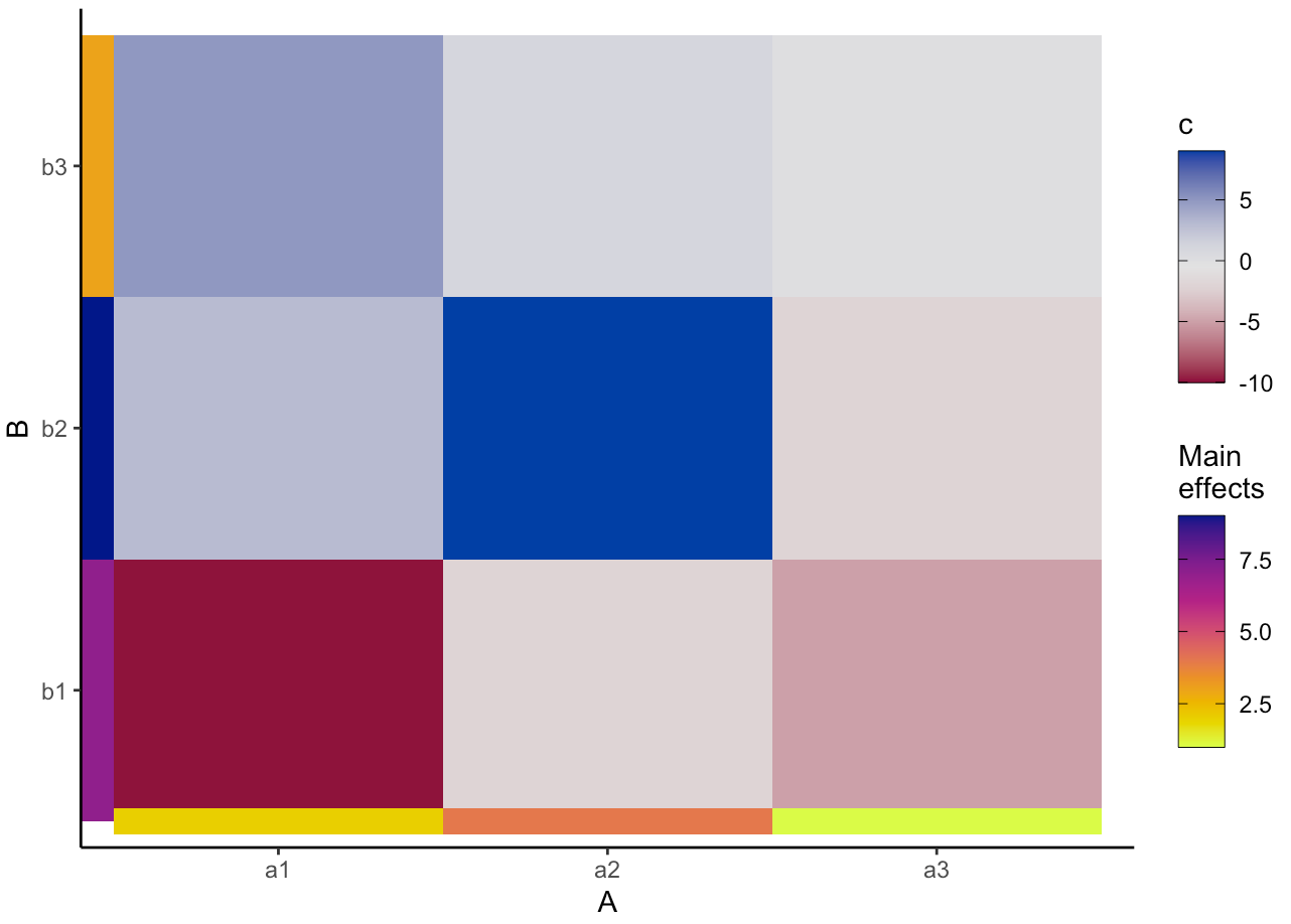
最近,我问this关于如何在ggplot的轴线上添加自定义条的问题。我用来制作这个情节的代码是:
library(ggnewscale)
library(tidyverse)

  df <- data.frame(
  a = paste0("a", c(1,1,1,2,2,2,3,3,3)),
  b = paste0("b", c(1,2,3,1,2,3,1,2,3)),
  c = c(-10, 3, 5, -2, 9, 1, -5, -2, 0)
)

z <- c(2, 4, 1, 7, 9, 3)

# set color palettes
library(colorspace)
pal <- rev(diverging_hcl(palette = "Blue-Red", n = 11))
palEdge <- rev(sequential_hcl(palette = "Plasma", n = 11))

# plot
library(ggplot2)

ggplot(df, aes(a, b)) +
  geom_tile(aes(fill = c)) +
  scale_fill_gradientn(
    colors = pal,
    guide = guide_colorbar(
      frame.colour = "black",
      ticks.colour = "black"
    ),
    name = "c"
  ) +
  theme_classic() +
  labs(x = "A", y = "B") +
  new_scale_fill() +
  geom_tile(
    data = tibble(a = paste0("a", 1:3), z = z[1:3]),
    aes(x = a, y = 0.5, fill = z, height = 0.1)
  ) +
  geom_tile(
    data = tibble(b = paste0("b", 1:3), z = z[4:6]),
    aes(x = 0.45, y = b, fill = z, width = 0.1)
  ) +
  scale_fill_gradientn(
    colors = palEdge,
    guide = guide_colorbar(
      frame.colour = "black",
      ticks.colour = "black"
    ),
    name = "Main\neffects"# for beta hat symbol
  )
这会产生如下所示的内容:
然而,我想知道是否有可能把这个彩色的条子移到情节之外。例如,在我在photoshop中做的模拟中:
编辑@teunbrand下面的答案是好的..。然而,我不得不编辑我的问题,以更准确地反映我的问题。因此,我似乎无法应用@teunbrand的答案
回答 1
Stack Overflow用户
回答已采纳
发布于 2021-02-21 17:26:29
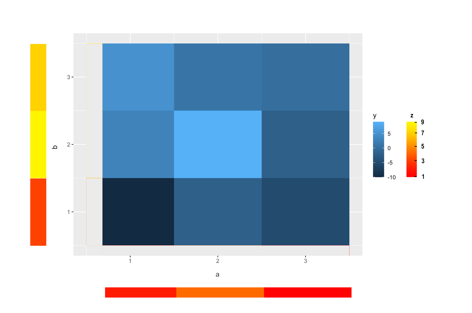
您可以通过绘制超出限制的图,而不是裁剪数据,将条子“放在”绘图的“外部”。这有两个缺点:
- 你需要连续的尺度而不是离散的尺度。如果有必要的话,你可以重新标记连续刻度,就好像它们是离散的。
,
- ,你必须手动平衡条形图的精确位置和绘图边距。如何平衡这一点取决于设备窗口的大小,而且我还没有找到针对每一种情况的解决方案。
例子如下:
df <- data.frame(
  a = paste0("a", c(1,1,1,2,2,2,3,3,3)),
  b = paste0("b", c(1,2,3,1,2,3,1,2,3)),
  c = c(-10, 3, 5, -2, 9, 1, -5, -2, 0)
)

# From discrete to continuous
df$a <- match(df$a, sort(unique(df$a)))
df$b <- match(df$b, sort(unique(df$b)))
z <- c(2, 4, 1, 7, 9, 3)

library(tidyverse)
library(ggnewscale)

ggplot(df) +
  geom_tile(aes(a, b, fill = c)) +
  scale_fill_continuous(guide = guide_legend(order = 1)) +
  new_scale_fill() +
  geom_tile(data = tibble(a = 1:3, # <- continuous
                          d = z[1:3]),
            aes(x = a, y = 0, fill = d, height = 0.1)) +
  geom_tile(data = tibble(b = 1:3, # <- continuous
                          d = z[4:6]),
            aes(x = 0, y = b, fill = d, width = 0.1)) +
  scale_fill_viridis_c(option = "D",
                       guide = guide_legend(order = 2)) +
  # Here be the extra bit
  coord_cartesian(clip = "off", xlim = c(0.5, NA), ylim = c(0.5, NA)) +
  theme(
    aspect.ratio = 1,
    plot.margin = margin(5.5, 5.5, 25, 55, "pt")
  )
编辑:更新示例的代码:
library(ggnewscale)
library(tidyverse)
library(colorspace)
library(ggplot2)

df <- data.frame(
  a = paste0("a", c(1,1,1,2,2,2,3,3,3)),
  b = paste0("b", c(1,2,3,1,2,3,1,2,3)),
  c = c(-10, 3, 5, -2, 9, 1, -5, -2, 0)
)

df$a <- match(df$a, sort(unique(df$a)))
df$b <- match(df$b, sort(unique(df$b)))

z <- c(2, 4, 1, 7, 9, 3)

pal <- rev(diverging_hcl(palette = "Blue-Red", n = 11))
palEdge <- rev(sequential_hcl(palette = "Plasma", n = 11))

ggplot(df, aes(a, b)) +
  geom_tile(aes(fill = c)) +
  scale_fill_gradientn(
    colors = pal,
    guide = guide_colorbar(
      frame.colour = "black",
      ticks.colour = "black"
    ),
    name = "c"
  ) +
  theme_classic() +
  labs(x = "A", y = "B") +
  new_scale_fill() +
  geom_tile(
    data = tibble(a = 1:3, z = z[1:3]),
    aes(x = a, y = 0, fill = z, height = 0.1)
  ) +
  geom_tile(
    data = tibble(b = 1:3, z = z[4:6]),
    aes(x = 0, y = b, fill = z, width = 0.1)
  ) +
  scale_fill_gradientn(
    colors = palEdge,
    guide = guide_colorbar(
      frame.colour = "black",
      ticks.colour = "black"
    ),
    name = "Main\neffects"# for beta hat symbol
  ) +
  coord_cartesian(clip = "off", xlim = c(0.5, NA), ylim = c(0.5, NA)) +
  theme(
    aspect.ratio = 1,
    plot.margin = margin(5.5, 5.5, 25, 55, "pt")
)页面原文内容由Stack Overflow提供。腾讯云小微IT领域专用引擎提供翻译支持
原文链接:
https://stackoverflow.com/questions/66304713
复制相关文章
相似问题
腾讯云开发者

Copyright © 2013 - 2026 Tencent Cloud. All Rights Reserved. 腾讯云 版权所有
深圳市腾讯计算机系统有限公司 ICP备案/许可证号:粤B2-20090059 ![]() 粤公网安备44030502008569号
粤公网安备44030502008569号
腾讯云计算(北京)有限责任公司 京ICP证150476号 | 京ICP备11018762号