
用dplyr、broom和ggplot注释分组线性模型
我开始深入研究扫帚,以便在dplyr/ggplot中可视化简单的统计分析。我想出了如何通过分组来获得线性模型,以便很好地工作,并通过捆绑在扫帚::增强中使用。
我有三个问题:
用什么优雅的方式将每组的fits (r平方、截取、vals)的汇总信息与原始数据联系起来(在这种情况下,组中的所有值都是identical)?
- How,可以用一个单独的值来显示r平方和可能的曲线拟合)来注释每个组的回归线吗?特别是,如何使对齐/颜色正确,以便清楚哪条文本注释与哪条回归线一致?
- 在我根据一些较老的答案进行分组分析之后,我了解到
do现在已经被across()取代了,但是我很难弄清楚如何用across()重写do(fit_carb = augment(lm(drat ~ mpg, data = .)))
#// library and data prep
library(tidyverse)
library(broom)
data <- mtcars
data$carb <- as.factor(data$carb)
#// generate scatter plot
plot <-
ggplot() +
geom_point(data = data, aes(x = mpg, y = drat, color = carb))
#// use lm function to generate linear regression model
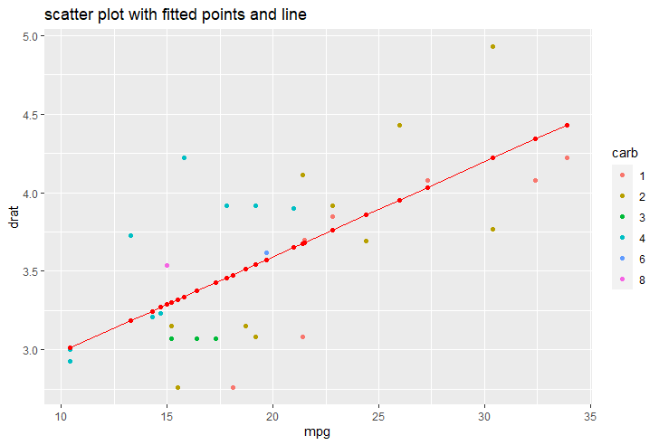
fit <- lm(formula = drat ~ mpg, data = data)
#// tie results back into dataframe
lm_data <- augment(fit)
#// add fitted points and line
plot +
ggtitle("scatter plot with fitted points and line") +
#// add geom_point and geom_line with lm_data
geom_point(data = lm_data, aes(x = mpg, y = .fitted), color = "red") +
geom_line(data = lm_data, aes(x = mpg, y = .fitted), color = "red")
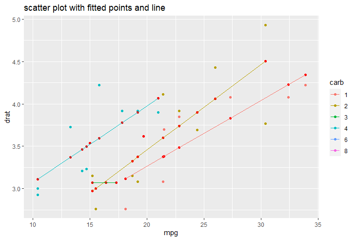
#// linear model by group
lm_data <- data %>%
#// group by factor
group_by(carb) %>%
#// `.` notation means that object gets piped into that place
do(fit_carb = augment(lm(drat ~ mpg, data = .))) %>%
#// unnest table by the augment results
unnest(fit_carb)
#// add fitted points and line grouped by carb
plot +
ggtitle("scatter plot with fitted points and line") +
#// add geom_point and geom_line with lm_data
geom_point(data = lm_data, aes(x = mpg, y = .fitted, group = carb), color = "red") +
geom_line(data = lm_data, aes(x = mpg, y = .fitted, group = carb, color = carb))
回答 1
Stack Overflow用户
发布于 2021-01-02 15:35:30
您可以省略do dplyr动词,只需选择mutate或summarise。根据您的图表,您不喜欢broom::glance吗?
data %>%
  group_by(carb) %>%
  mutate(glance(lm(mpg ~ drat))) %>%
  dplyr::select(mpg:carb,adj.r.squared,p.value)
## A tibble: 32 x 13
## Groups:   carb [6]
#     mpg   cyl  disp    hp  drat    wt  qsec    vs    am  gear carb  adj.r.squared p.value
#   <dbl> <dbl> <dbl> <dbl> <dbl> <dbl> <dbl> <dbl> <dbl> <dbl> <fct>         <dbl>   <dbl>
# 1  21       6  160    110  3.9   2.62  16.5     0     1     4 4             0.539 0.00943
# 2  21       6  160    110  3.9   2.88  17.0     0     1     4 4             0.539 0.00943
# 3  22.8     4  108     93  3.85  2.32  18.6     1     1     4 1             0.643 0.0185
# 4  21.4     6  258    110  3.08  3.22  19.4     1     0     3 1             0.643 0.0185
# ...至于作图,我知道这不是你真正期望的,但如果你的主要目的是图表,在我看来,最简单的方法是利用ggpubr::stat_regline_equation。
library(ggpubr)
ggplot(data = data, aes(x = mpg, y = drat, color = carb)) +
  ggtitle("Scatter plot with fitted points and line") +
  geom_point() +
  geom_smooth(method = "lm", se = FALSE) +
  stat_regline_equation(label.x = with(data,tapply(mpg,carb,quantile,.6)),
                        label.y = with(data,tapply(drat,carb,max) - 0.2),
                        aes(label = ..adj.rr.label..),
                        show.legend = FALSE)
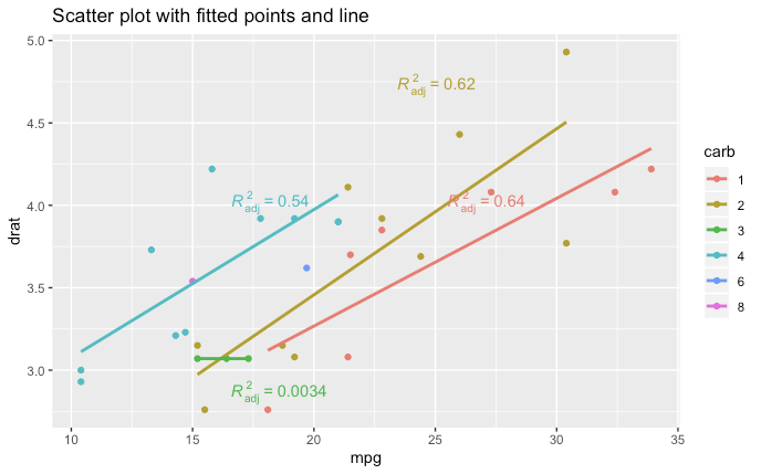
您可以使用geom_smooth的附加参数来调整回归。如果你需要方程,你可以做一些像label = paste(..eq.label.., ..adj.rr.label.., sep = "~~~")这样的事情
对于简单的情况,手动指定label.x和label.y通常更容易,但对于更复杂的情况,可以使用基R tapply动态计算位置。position =为stat_regline_equation提供了一个论据,但我从未让它起作用。
https://stackoverflow.com/questions/65540350
复制相似问题
腾讯云开发者

Copyright © 2013 - 2026 Tencent Cloud. All Rights Reserved. 腾讯云 版权所有
深圳市腾讯计算机系统有限公司 ICP备案/许可证号:粤B2-20090059 ![]() 粤公网安备44030502008569号
粤公网安备44030502008569号
腾讯云计算(北京)有限责任公司 京ICP证150476号 | 京ICP备11018762号