
向海运条形图中添加标签
向海运条形图中添加标签
提问于 2020-12-25 16:57:58
我试图在哈伯曼数据集(https://www.kaggle.com/gilsousa/habermans-survival-data-set)中回答
- 有多少人在不同年龄的人群中生存?
在获得熊猫数据“数据”之后,我采取了以下步骤。无法创建“%幸免于难”的计算列。该年龄组成活率=总成活率/总成活率。
print(data.head(3))

   age  year  nodes  status
0   30    64      1       1
1   30    62      3       1
2   30    65      0       1

data['age group'] = pd.cut(data.age,range(25,85,5))

table = data.pivot_table(index =['age group'], columns = ['status'], values='year',aggfunc=np.count_nonzero).fillna(0)
table.reset_index(level=0, inplace=True)

table['surv_pc'] = table.iloc[:,1]/(table.iloc[:,1]+table.iloc[:,2])*100

sns.set_theme(style="whitegrid")
bar = sns.barplot(data=table, x='age group',y='surv_pc')
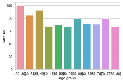
图的类型是matplotlib.axes._subplots.AxesSubplot
如何访问条形高度,以便按照plot.text()方法放置标签?根据api.html?highlight=matplotlib#matplotlib.axes.Axes的文档,它只返回Axes对象。请帮助理解..。
回答 1
Stack Overflow用户
发布于 2020-12-25 18:20:04
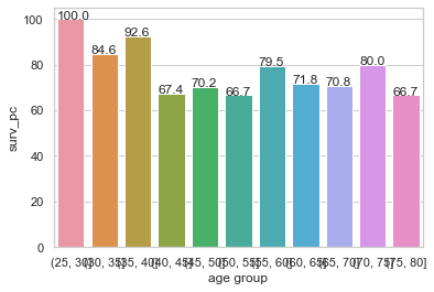
通过对@ForceBru提出的其他问题的研究,我所理解的是,所有matlplot对象都有类“修补程序”,其中包含图形内容。阅读更多api.html?highlight=patches
为了进行实验,我尝试迭代这些补丁。
for bars in bar.patches:
    print(bars)

Rectangle(xy=(-0.4, 0), width=0.8, height=100, angle=0)
Rectangle(xy=(0.6, 0), width=0.8, height=84.6, angle=0)
Rectangle(xy=(1.6, 0), width=0.8, height=92.6, angle=0)
Rectangle(xy=(2.6, 0), width=0.8, height=67.4, angle=0)
Rectangle(xy=(3.6, 0), width=0.8, height=70.2, angle=0)
...
...
然后我进行了实际实现,如下所示:
(请参阅这里)
for bars in bar.patches:
    bar.text(bars.get_x(),bars.get_height(),bars.get_height())
我得到了如下的图表
页面原文内容由Stack Overflow提供。腾讯云小微IT领域专用引擎提供翻译支持
原文链接:
https://stackoverflow.com/questions/65450032
复制相关文章
相似问题
腾讯云开发者

Copyright © 2013 - 2026 Tencent Cloud. All Rights Reserved. 腾讯云 版权所有
深圳市腾讯计算机系统有限公司 ICP备案/许可证号:粤B2-20090059 ![]() 粤公网安备44030502008569号
粤公网安备44030502008569号
腾讯云计算(北京)有限责任公司 京ICP证150476号 | 京ICP备11018762号