
反应本机图表套件-从上到下每个条形的BarChart褪色
反应本机图表套件-从上到下每个条形的BarChart褪色
提问于 2020-10-26 07:17:12
我使用react本机图表工具包yarn add react-native-chart-kit来可视化数据,这是我的代码:
import React from "react";
import { View, Text, Dimensions } from "react-native";
import RandomColor from "randomcolor";
import {
  LineChart,
  BarChart,
  PieChart,
  ProgressChart,
  ContributionGraph,
  StackedBarChart,
} from "react-native-chart-kit";

const Chart = ({ classList }) => {
  return (
    <View>
      <Text>Bezier Line Chart</Text>
      <BarChart
        data={{
          labels: classList.map((classItem) => {
            return classItem.classname;
          }),
          datasets: [
            {
              data: classList.map((classItem) => {
                return classItem.studentList.length;
              }),
            },
          ],
        }}
        width={Dimensions.get("window").width}
        height={220}
        yAxisInterval={1}
        chartConfig={{
          backgroundColor: "#ffffff",
          backgroundGradientFrom: "#ffffff",
          backgroundGradientTo: "#ffffff",
          decimalPlaces: 2,
          color: () => "blue",
          labelColor: () => "black",
          style: {
            borderRadius: 16,
          },
          propsForDots: {
            r: "6",
            strokeWidth: "1",
            stroke: "#ffa726",
          },
        }}
        bezier
        style={{
          marginVertical: 8,
          borderRadius: 16,
        }}
      />
    </View>
  );
};

export default Chart;
它就是这样回来的:
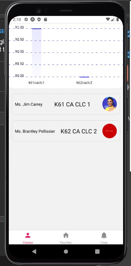
正如你所看到的,它起了作用,但并不完美。每个条形的颜色从上到下逐渐褪色,与白色backgroundColor不太好。所以,我想让每个酒吧的颜色都是实心的。有办法解决吗?
回答 2
Stack Overflow用户
发布于 2022-02-15 01:58:24
使用flatColor={true}和withCustomBarColorFromData={true}
像这样
 const data = {
        labels: ["label1", "label2", "label3"],
        datasets: [{
                data: [50, 45, 28],
                colors: [
                    () => "blue"
                ]}]
 };
<BarChart

     data={data}
     width={Dimensions.get("window").width - 20}
     height={220}
     chartConfig={{
       //....
     }}
     withCustomBarColorFromData={true}
     flatColor={true}
/>Stack Overflow用户
发布于 2022-03-17 10:40:52
使用上述答案后,flatColor={true} & withCustomBarColorFromData={true}
如果希望在dataset中以动态颜色显示颜色,请使用以下代码:
 const data = {
        labels: ["label1", "label2", "label3"],
        datasets: [
                  {
                     data: [50, 45, 28],
                    colors: data.colorName.map(item => {
                      return () => item.color;
                    }),
                  },
                ],
};页面原文内容由Stack Overflow提供。腾讯云小微IT领域专用引擎提供翻译支持
原文链接:
https://stackoverflow.com/questions/64532846
复制相关文章
相似问题
腾讯云开发者

Copyright © 2013 - 2026 Tencent Cloud. All Rights Reserved. 腾讯云 版权所有
深圳市腾讯计算机系统有限公司 ICP备案/许可证号:粤B2-20090059 ![]() 粤公网安备44030502008569号
粤公网安备44030502008569号
腾讯云计算(北京)有限责任公司 京ICP证150476号 | 京ICP备11018762号