
Flexbox,盒子里的盒子
我忙着做一个非常简单的CSS。假设我有四个正方形,在另一个正方形里面。我希望我的布局看起来像这样:
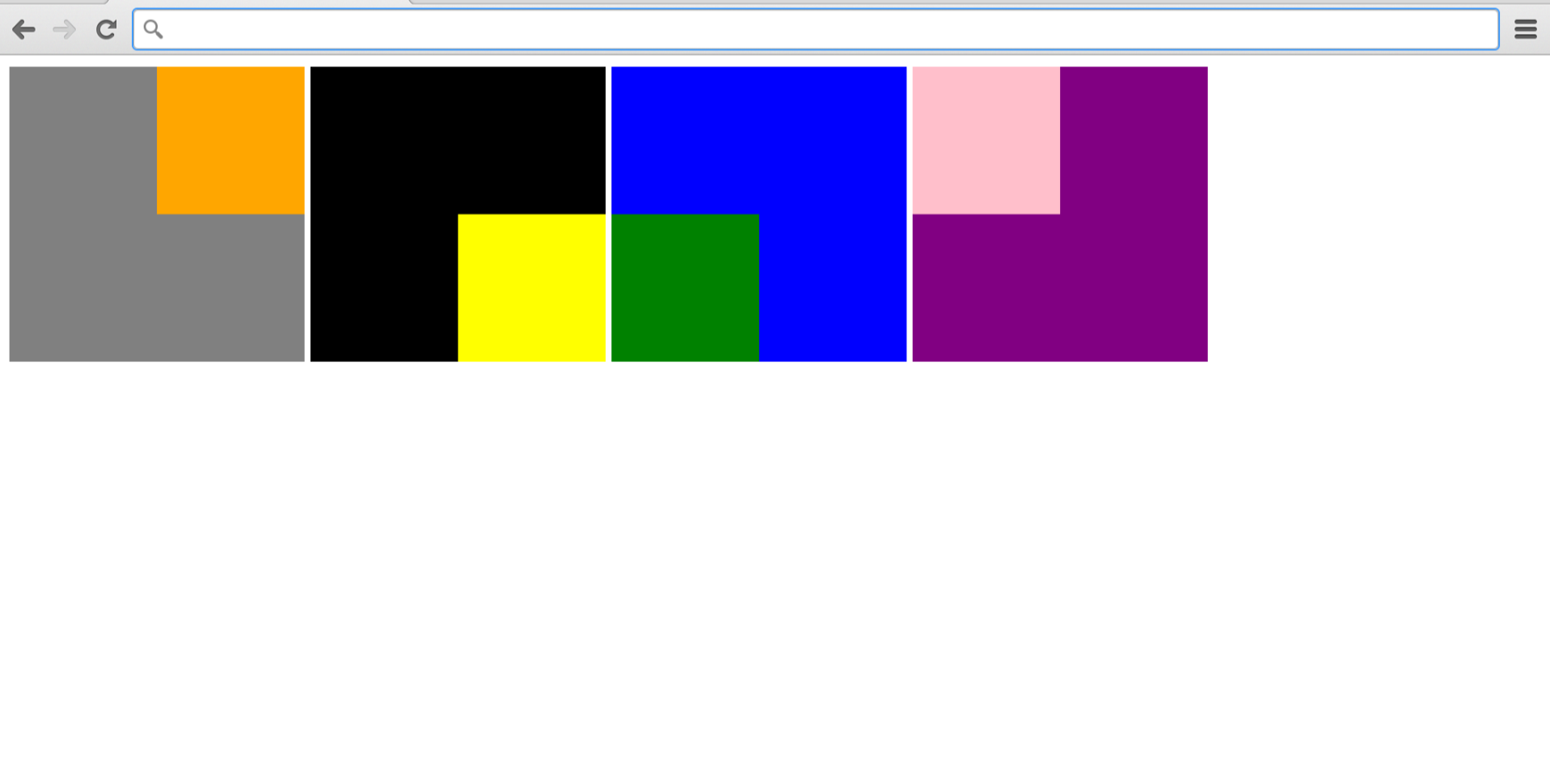
但看起来是这样的:
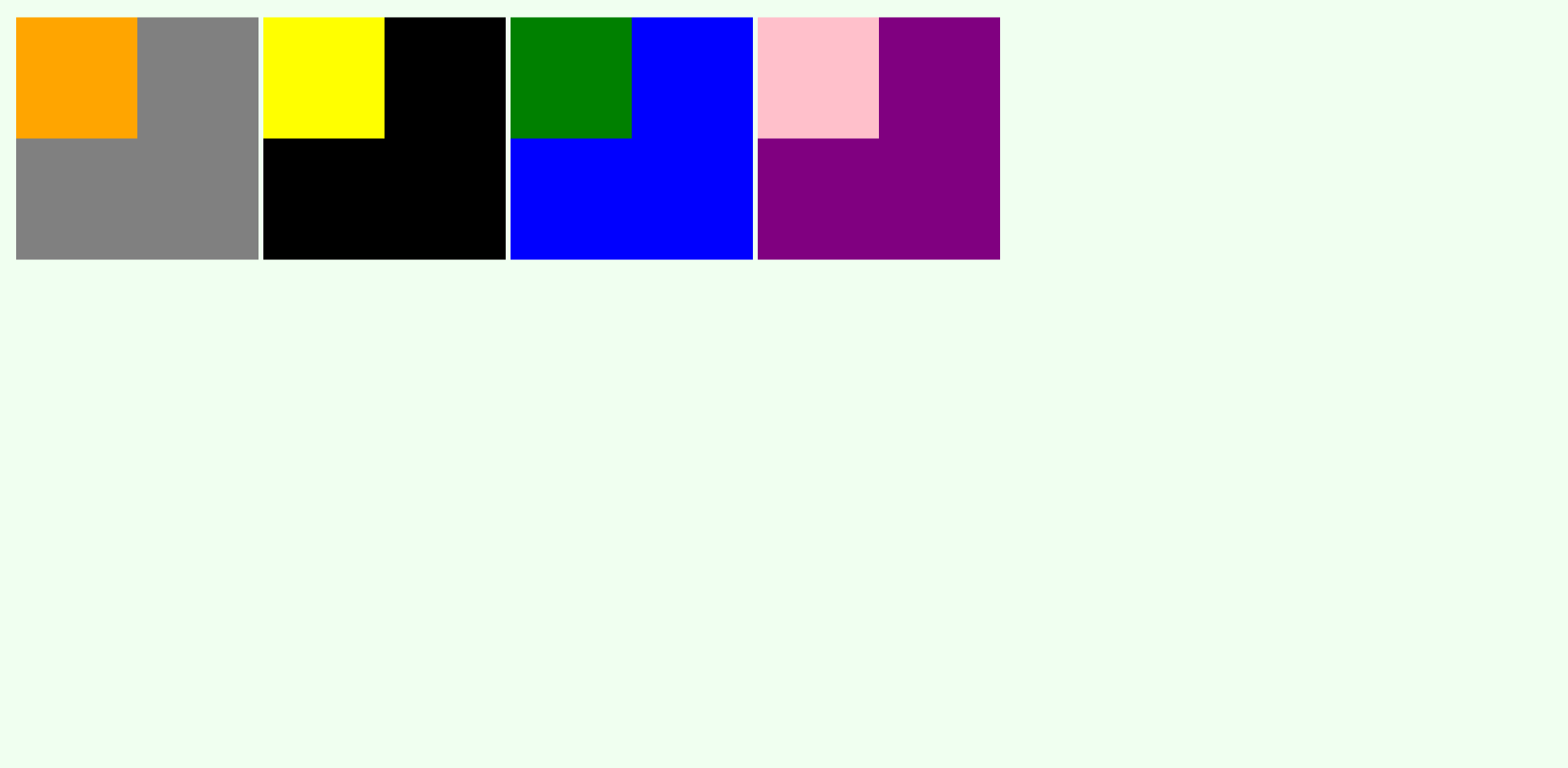
但我搞错了。这四个方块被组合成一个元素,显示被设置为内联块。我想移动他们父母里面的小盒子,我想我应该用"display: flex“和”their content: flex-end“来做,比如下面的代码。我在HTML和CSS中的代码如下所示。
{
    box-sizing: border-box;
    margin: 0;
    padding: 0;
}

body {
    background-color: honeydew;
    margin: 15px;
    width: 100%;

}

.big {
    height: 200px;
    width: 200px;
    display: flex;
}

.small {
    height: 100px;
    width: 100px;
}

.block {
    display: inline-block;
}

#small-1 {
    display: flex;
    justify-content: flex-end;
    align-items: flex-end;
}

#small-2 {
    display: flex;
    justify-content: flex-end;
    align-items: flex-end;
}


#small-3 {
    display: flex;
    justify-content: flex-end;
    align-items: flex-start;
}


#small-4 {
    display: flex;
    justify-content: flex-start;
    align-items: flex-start;
}<!doctype html>
<html>
<head>
<link rel="stylesheet" href="stylesheet.css">
<title>Boxes</title>
</head>
<body>
<div class="block" id="block">
<div class="big" style="background-color: grey">
<div class="small" id="small-1" style="background-color:orange"></div>
</div>
</div>
<div class="block" id="block">
<div class="big" style="background-color: black">
<div class="small" id="small-2" style="background-color: yellow"></div>
</div>
</div>
<div class="block" id="block">
<div class="big" style="background-color: blue">
<div class="small" id="small-3" style="background-color: green"></div>
</div>
</div>
<div class="block" id="block">
<div class="big" style="background-color: purple">
<div class="small" id="small-4" style="background-color: pink"></div>
</div>
</div>
</body>
</html>
有人能帮我吗?这看起来很明显,也很基本,但不知怎么不起作用。
回答 2
Stack Overflow用户
发布于 2020-10-02 17:45:32
编辑
div.block:nth-child(1) > div:nth-child(1) {
  align-items: start; // to vertically align to start
}
div.block:nth-child(4) > div:nth-child(1) {
  justify-content: start;// to horizontally align to start
  align-items: start; // to vertically align to start
}
div.block:nth-child(3) > div:nth-child(1) {
  justify-content: start; // to horizontally align to start
}
body{
  display:flex;
}
justify-content:
start:项目被打包到writing-mode的start,direction.end:项被打包到写入模式方向的end。
align-items:
flex-start / start / self-start:项放置在交叉轴的start上。两者之间的区别是微妙的,是关于尊重灵活的方向规则或写作模式规则。flex-end / end / self-end:项放置在交叉轴的端上。区别再次是微妙的,是关于尊重灵活的方向规则与写作模式规则。
* {
    box-sizing: border-box;
    margin: 0;
    padding: 0;
}

body {
    background-color: honeydew;
    margin: 15px;
    width: 100%;
    display: flex;

}

.big {
    height: 200px;
    width: 200px;
    display: flex;
    justify-content: flex-end;
    align-items: flex-end;
}

.small {
    height: 100px;
    width: 100px;
}

.block {
    display: inline-block;
}
div.block:nth-child(1) > div:nth-child(1) {
  align-items: start;
}
div.block:nth-child(4) > div:nth-child(1) {
  justify-content: start;
  align-items: start;
}
div.block:nth-child(3) > div:nth-child(1) {
  justify-content: start;
}<!doctype html>
<html>
<body>
<div class="block" id="block">
<div class="big" style="background-color: grey">
<div class="small" id="small-1" style="background-color:orange"></div>
</div>
</div>
<div class="block" id="block">
<div class="big" style="background-color: black">
<div class="small" id="small-2" style="background-color: yellow"></div>
</div>
</div>
<div class="block" id="block">
<div class="big" style="background-color: blue">
<div class="small" id="small-3" style="background-color: green"></div>
</div>
</div>
<div class="block" id="block">
<div class="big" style="background-color: purple">
<div class="small" id="small-4" style="background-color: pink"></div>
</div>
</div>
</body>
</html>
Stack Overflow用户
发布于 2020-10-02 17:30:24
justify-content和align-items应该放在容器级,所以#small不一定是道具,而是.big。
我创建了一支笔作为例子:https://codepen.io/alecell-the-lessful/pen/qBZeBEx
编辑我只是意识到我没有回答你的问题,也许这个链接对你有帮助:在CSS中,为什么没有“正当性-项”和“正当性-自我”属性?
要点是,您应该使用item level选择器(如align-self和margin )来达到所需的行为。
如前所述,我为示例提供了一支笔:https://codepen.io/alecell-the-lessful/pen/zYqgYvd
https://stackoverflow.com/questions/64175842
复制相似问题
腾讯云开发者

Copyright © 2013 - 2026 Tencent Cloud. All Rights Reserved. 腾讯云 版权所有
深圳市腾讯计算机系统有限公司 ICP备案/许可证号:粤B2-20090059  粤公网安备44030502008569号
腾讯云计算(北京)有限责任公司 京ICP证150476号 | 京ICP备11018762号