
Python (孪生图)奇异图
Python (孪生图)奇异图
提问于 2020-09-16 16:11:53
编辑:这个图表现在是固定的,但是我在绘制这个传说时遇到了麻烦。它只显示了其中一个情节的传说。如下图所示
我试图用双轴绘制双轴图,但我正面临一些困难,如下图所示。
欢迎任何意见!如果您需要任何额外的信息,我很高兴提供给您。
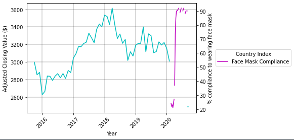
与绘制z轴之前的原始图相比。
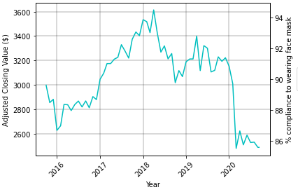
我不知道为什么我的图是这样的,在绘制我的第二个y轴(粉红色线)之前,可以很好地看到结束值图,但现在它似乎被剪切了。
这可能是由于我的数据如下所述。
链接到testing1.csv:https://filebin.net/ou93iqiinss02l0g
我目前的代码:
# read csv into variable
sg_df_merged = pd.read_csv("testing1.csv", parse_dates=[0], index_col=0)

# define figure
fig = plt.figure()

fig, ax5 = plt.subplots()
ax6 = ax5.twinx()

x = sg_df_merged.index
y = sg_df_merged["Adj Close"]
z = sg_df_merged["Singapore"]

curve1 = ax5.plot(x, y, label="Singapore", color = "c")
curve2 = ax6.plot(x, z, label = "Face Mask Compliance", color = "m")
curves = [curve1, curve2]

# labels for my axis
ax5.set_xlabel("Year")
ax5.set_ylabel("Adjusted Closing Value ($)")
ax6.set_ylabel("% compliance to wearing face mask")
ax5.grid #not sure what this line does actually

# set x-axis values to 45 degree angle
for label in ax5.xaxis.get_ticklabels():
    label.set_rotation(45)
ax5.grid(True, color = "k", linestyle = "-", linewidth = 0.3)

plt.gca().legend(loc='center left', bbox_to_anchor=(1.1, 0.5), title = "Country Index")
plt.show(); 最初,我认为这是因为我的excel有完整的空行,但后来我删除了可以找到here的行。
另外,我也尝试过插值,但不知怎么的,它不起作用。任何有关这方面的建议都是非常欢迎的。
回答 1
Stack Overflow用户
回答已采纳
发布于 2020-09-16 16:28:21
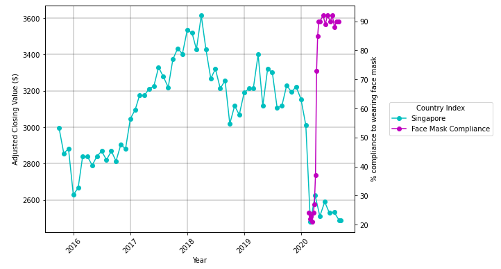
- 只删除所有
NaN的行。仍然有很多行使用NaN. - In命令在两个数据点之间绘制连接线,这些点必须是consecutive.
- The绘图API没有连接
NaN值 - 之间的数据--这可以通过将
pandas.Series转换为DataFrame来处理,并且使用已删除x的.dropna. - See,因为它将与
y或z的索引长度不匹配。在.dropna. y现在是一个单独的数据帧之后,它们变得更短了,其中.dropnais used.z也是一个单独的dataframe,其中使用了.dropna。
# read csv into variable
sg_df_merged = pd.read_csv("test.csv", parse_dates=[0], index_col=0)

# define figure
fig, ax5 = plt.subplots(figsize=(8, 6))
ax6 = ax5.twinx()

# select specific columns to plot and drop additional NaN
y = pd.DataFrame(sg_df_merged["Adj Close"]).dropna()
z = pd.DataFrame(sg_df_merged["Singapore"]).dropna()

# add plots with markers
curve1 = ax5.plot(y.index, 'Adj Close', data=y, label="Singapore", color = "c", marker='o')
curve2 = ax6.plot(z.index, 'Singapore', data=z, label = "Face Mask Compliance", color = "m", marker='o')

# labels for my axis
ax5.set_xlabel("Year")
ax5.set_ylabel("Adjusted Closing Value ($)")
ax6.set_ylabel("% compliance to wearing face mask")

# rotate xticks
ax5.xaxis.set_tick_params(rotation=45)

# add a grid to ax5
ax5.grid(True, color = "k", linestyle = "-", linewidth = 0.3)

# create a legend for both axes
curves = curve1 + curve2
labels = [l.get_label() for l in curves]
ax5.legend(curves, labels, loc='center left', bbox_to_anchor=(1.1, 0.5), title = "Country Index")

plt.show()
页面原文内容由Stack Overflow提供。腾讯云小微IT领域专用引擎提供翻译支持
原文链接:
https://stackoverflow.com/questions/63924063
复制相关文章
相似问题
腾讯云开发者

Copyright © 2013 - 2026 Tencent Cloud. All Rights Reserved. 腾讯云 版权所有
深圳市腾讯计算机系统有限公司 ICP备案/许可证号:粤B2-20090059 ![]() 粤公网安备44030502008569号
粤公网安备44030502008569号
腾讯云计算(北京)有限责任公司 京ICP证150476号 | 京ICP备11018762号