
用多指标标注散点图
用多指标标注散点图
提问于 2020-09-07 01:46:40
我使用具有多个索引的DataFrame的数据构建了一个散点图。指标是国家和年份。
fig,ax=plt.subplots(1,1)
rel_pib=welfare["rel_pib_pc"].loc[:,1960:2010].groupby("country").mean()
rel_lambda=welfare["Lambda"].loc[:,1960:2010].groupby("country").mean()
ax.scatter(rel_pib,rel_lambda)
ax.set_ylim(0,2)
ax.set_ylabel('Bienestar(Lambda)')
ax.set_xlabel('PIBPc')
ax.plot([0,1],'red', linewidth=1)
我想用国家名称(如果可能的话,用Lambda值)注释每一点。我有以下代码
for i, txt in enumerate(welfare.index):
plt.annotate(txt, (welfare["rel_pib_pc"].loc[:,1960:2010].groupby("country").mean()[i], welfare["Lambda"].loc[:,1960:2010].groupby("country").mean()[i]))我不知道如何表示我想要国家名,因为给定国家的所有lambda和pib_pc值都是作为一个值给出的,因为我使用的是.mean()函数。
我试过使用.xs(),但我尝试的所有组合都无法工作。
回答 1
Stack Overflow用户
回答已采纳
发布于 2020-09-07 06:44:23
我使用了以下测试数据:
               rel_pib_pc  Lambda
country  year
Country1 2007         260    1.12
         2008         265    1.13
         2009         268    1.10
Country2 2007         230    1.05
         2008         235    1.07
         2009         236    1.04
Country3 2007         200    1.02
         2008         203    1.07
         2009         208    1.05
然后,为了生成散点图,我使用了以下代码:
fig, ax = plt.subplots(1, 1)
ax.scatter(rel_pib,rel_lambda)
ax.set_ylabel('Bienestar(Lambda)')
ax.set_xlabel('PIBPc')
ax.set_xlim(190,280)
annot_dy = 0.005
for i, txt in enumerate(rel_lambda.index):
    ax.annotate(txt, (rel_pib.loc[txt], rel_lambda.loc[txt] + annot_dy), ha='center')
plt.show()
并得到以下结果:
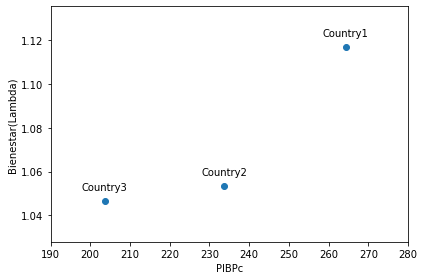
正确生成注释的诀窍是:
annot_dy.
- 枚举已经生成的Series对象之一的索引,以便txt包含国家名称。
- 从已经生成的Series对象中获取值(不要再计算这些值)。
- 通过当前的索引值定位两个坐标。
- 将这些注释放在各自点的上方,使用:
H 112ha(水平对齐)作为‘中心’,H 213H 114移位y坐标一点向上(如果需要的话,使用of值进行实验)。
我还添加了ax.set_xlim(190,280),以便将注释保留在图片矩形中。也许你不需要它。
页面原文内容由Stack Overflow提供。腾讯云小微IT领域专用引擎提供翻译支持
原文链接:
https://stackoverflow.com/questions/63770443
复制相关文章
相似问题
腾讯云开发者

Copyright © 2013 - 2026 Tencent Cloud. All Rights Reserved. 腾讯云 版权所有
深圳市腾讯计算机系统有限公司 ICP备案/许可证号:粤B2-20090059 ![]() 粤公网安备44030502008569号
粤公网安备44030502008569号
腾讯云计算(北京)有限责任公司 京ICP证150476号 | 京ICP备11018762号