
如何在海上用YearMonth对X轴进行排序
如何在海上用YearMonth对X轴进行排序
提问于 2020-09-02 13:13:00
我使用当前版本的http://archive.ics.uci.edu/ml/datasets/Air+quality,我的问题是,我想要创建一个由多个图上绘制的不同特性组成的月度汇总排序的图。
X轴YearMonth 的创建
INPUT:
df['DateTime'] = df['Date'].astype(str) + ' ' + df['Time'].astype(str)
df['DateTime'] = pd.to_datetime(df['DateTime'], format='%m/%d/%Y %H:%M:%S')
print(df['DateTime'].iloc[:2])

OUTPUT:
0   2004-11-23 19:00:00
1   2004-11-23 20:00:00
Name: DateTime, dtype: datetime64[ns]


INPUT:
df['Date'] = pd.to_datetime(df['Date'].astype(str), format='%m/%d/%Y')

df['Year'] = df['DateTime'].map(lambda x: x.year)
print(df['Year'].iloc[:2])

OUTPUT:
0    2004
1    2004
Name: Year, dtype: int64


INPUT:
df['YearMonth'] = pd.to_datetime(df.DateTime).dt.to_period('m')
print(df['YearMonth'].iloc[:2])

OUTPUT:
0    2004-11
1    2004-11
Name: YearMonth, dtype: period[M]目标项目具有相同的结果、格式
我的绘图
plt.figure(figsize=(30,60))
#fig, axes = plt.subplots(1, 1, figsize=(30, 60), dpi=100)

gasList = ['CO_GT', 'C6H6_GT', 'Nox_GT', 'NO2_GT']
for i, col in enumerate(gasList, start=1):
    plt.subplot(len(showList), 1, i)
    sns.pointplot(x='YearMonth', y=col, hue='Year', data=df)
    plt.title(col, y=0.5, loc='right')
    #axes.set_xticks(year_month_day)
plt.show()
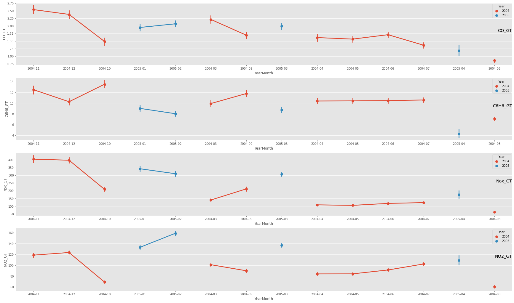
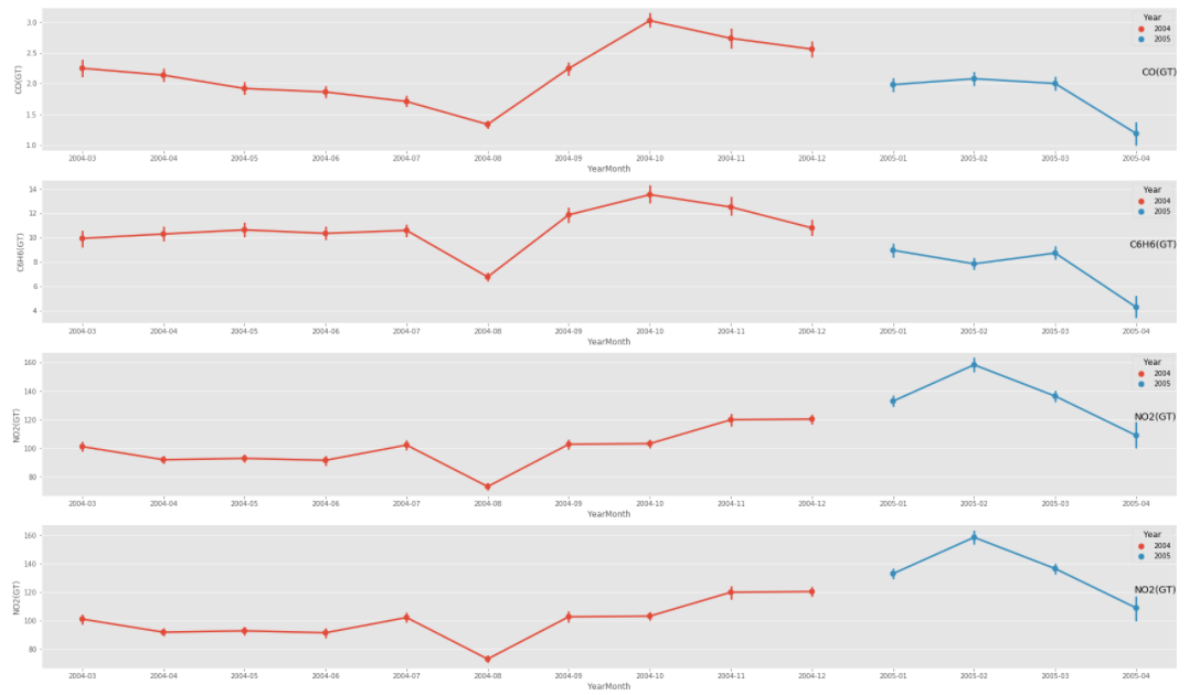
理想绘图
我正努力实现和这个项目一样的功能
试图解决这个问题,
- 如果我只使用DateTime,而不是它来安排日期,但这会使情节变得人烟稠密
- 我有与创建YearMonth相同的数据格式
<class 'pandas.core.frame.DataFrame'>
Int64Index: 9357 entries, 0 to 9356
Data columns (total 17 columns):
 #   Column        Non-Null Count  Dtype
---  ------        --------------  -----
 0   Date          9357 non-null   datetime64[ns]
 1   Time          9357 non-null   object
 2   CO_GT         9357 non-null   float64
 3   PT08_S1_CO    9357 non-null   float64
 4   C6H6_GT       9357 non-null   float64
 5   PT08_S2_NMHC  9357 non-null   float64
 6   Nox_GT        9357 non-null   float64
 7   PT08_S3_Nox   9357 non-null   float64
 8   NO2_GT        9357 non-null   float64
 9   PT08_S4_NO2   9357 non-null   float64
 10  PT08_S5_O3    9357 non-null   float64
 11  T             9357 non-null   float64
 12  RH            9357 non-null   float64
 13  AH            9357 non-null   float64
 14  DateTime      9357 non-null   datetime64[ns]
 15  Year          9357 non-null   int64
 16  YearMonth     9357 non-null   period[M]
dtypes: datetime64[ns](2), float64(12), int64(1), object(1), period[M](1)
memory usage: 1.3+ MB- 他的数据集的时间格式是Y,我的是m,但我已经更改回了他的数据集。
- 我试过使用海运的订单参数。它负载了很长一段时间,但什么也不回。
col_one_list = df['YearMonth'].tolist()
plt.figure(figsize=(30,60))

gasList = ['CO_GT', 'C6H6_GT', 'Nox_GT', 'NO2_GT']
for i, col in enumerate(gasList, start=1):
    plt.subplot(len(showList), 1, i)
    sns.pointplot(x='YearMonth', y=col, hue='Year', data=df, order = col_one_list )
    plt.title(col, y=0.5, loc='right')

plt.show()- 我自己创建了一个uniq值列表,但它也崩溃了。输出:正确的年月x轴刻度,正确的绘图外部元素,但没有绘制数据点.
plt.figure(figsize=(30,60))

col_two_list = ['2004-03','2004-04', '2004-05', '2004-06', '2004-07', '2004-08', '2004-09', '2004-10', '2004-11','2004-12', '2005-01','2005-02','2005-03', '2005-04']

gasList = ['CO_GT', 'C6H6_GT', 'Nox_GT', 'NO2_GT']
for i, col in enumerate(gasList, start=1):
    plt.subplot(len(showList), 1, i)
    sns.pointplot(x='YearMonth', y=col, hue='Year', data=df, order = col_two_list )
    plt.title(col, y=0.5, loc='right')

plt.show()回答 1
Stack Overflow用户
回答已采纳
发布于 2020-09-03 11:46:28
简短回答
生成切入点时,传递排序的 DataFrame (按YearMonth),打印输出应该按照您的意愿进行。
如果没有上述类型的图片,就像你所呈现的那样(错误)。
长答案
我只为2列准备了一个测试输入文件,如下所示:
DateTime    CO_GT  C6H6_GT
2004-11-01  2.7    12.4
2004-12-01  2.6    10.6
2004-10-01  3.0    13.8
2005-01-01  2.0    9.0
2005-02-01  2.2    8.0
2004-03-01  2.2    10.0
2004-09-01  2.2    12.0
2005-03-01  2.0    8.6
2004-04-01  2.1    10.2
2004-05-01  1.95   10.5
2004-06-01  1.85   10.4
2004-07-01  1.7    10.5
2005-04-01  1.3    4.5
2004-08-01  1.4    6.8
然后,我读取它,将DateTime列转换为日期时间类型(尽早,即仅在读取时):
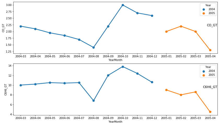
df = pd.read_fwf('Input.csv', widths=[12, 7, 7], parse_dates=[0])第一步是创建“辅助”列:
df['Year'] = df.DateTime.dt.year
df['YearMonth'] = df.DateTime.dt.to_period('m')
为了生成图片,我跑了:
gasList = ['CO_GT', 'C6H6_GT']
plt.figure(figsize=(14, 8))
for i, col in enumerate(gasList, start=1):
    plt.subplot(len(gasList), 1, i)
    sns.pointplot(x='YearMonth', y=col, hue='Year', data=df.sort_values('DateTime'))
    plt.title(col, y=0.5, loc='right')
plt.show()
结果是:
页面原文内容由Stack Overflow提供。腾讯云小微IT领域专用引擎提供翻译支持
原文链接:
https://stackoverflow.com/questions/63706303
复制相关文章
相似问题
腾讯云开发者

Copyright © 2013 - 2026 Tencent Cloud. All Rights Reserved. 腾讯云 版权所有
深圳市腾讯计算机系统有限公司 ICP备案/许可证号:粤B2-20090059 ![]() 粤公网安备44030502008569号
粤公网安备44030502008569号
腾讯云计算(北京)有限责任公司 京ICP证150476号 | 京ICP备11018762号