
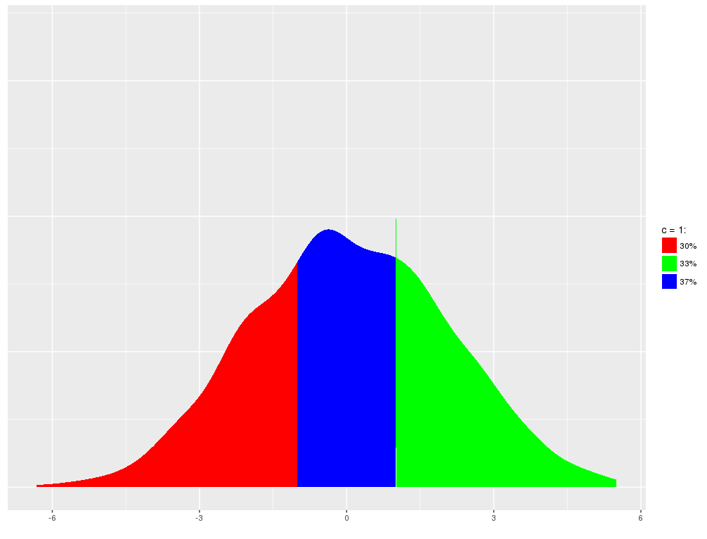
密度图的彩色段
密度图的彩色段
提问于 2020-08-06 17:49:45
警告,我对R是全新的!我有一个R错误,并有一个可能性的发挥,但变得非常迷路。我想试着用一个条件colour '>‘>来表示垃圾箱的密度图的颜色段.在我的脑海里,它看起来像是:
...but不是四分位数或%更改依赖项。
我的数据显示;x=持续时间(天数)和y=频率。我希望该地块以3个月为间隔,以12个月为限,在其后(使用工作天,即63 =3个月)再涂上一种颜色。
我已经试过了,但真的不知道从哪里开始!
ggplot(df3, aes(x=Investigation.Duration))+
geom_density(fill = W.S_CleanNA$Investigation.Duration[W.S_CleanNA$Investigation.Duration>0],
fill = W.S_CleanNA$Investigation.Duration[W.S_CleanNA$Investigation.Duration>63], color = "white",
fill = W.S_CleanNA$Investigation.Duration[W.S_CleanNA$Investigation.Duration>127], color = "light Grey",
fill = W.S_CleanNA$Investigation.Duration[W.S_CleanNA$Investigation.Duration>190], color = "medium grey",
fill = W.S_CleanNA$Investigation.Duration[W.S_CleanNA$Investigation.Duration>253], color = "dark grey",
fill = W.S_CleanNA$Investigation.Duration[W.S_CleanNA$Investigation.Duration>506], color = "black")+
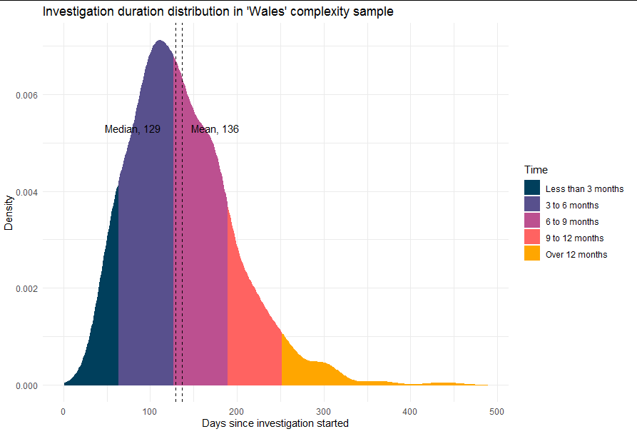
ggtitle ("Investigation duration distribution in 'Wales' complexity sample")+
geom_text(aes(x=175, label=paste0("Mean, 136"), y=0.0053))+
geom_vline(xintercept = c(136.5), color = "red")+
geom_text(aes(x=80, label=paste0("Median, 129"), y=0.0053))+
geom_vline(xintercept = c(129.5), color = "blue")任何真正简单的帮助都很感激。
回答 1
Stack Overflow用户
回答已采纳
发布于 2020-08-06 22:09:52
不幸的是,您不能直接用geom_density来完成这个任务,因为“幕后”是用一个多边形构建的,而一个多边形只能有一个填充。唯一的方法是有多个多边形,你需要自己构建它们。
幸运的是,这比听起来容易得多。
问题中没有样本数据,所以我们将用同样的中值和平均值创建一个合理的分布:
#> Simulate data
set.seed(69)
df3 <- data.frame(Investigation.Duration = rgamma(1000, 5, 1/27.7))

round(median(df3$Investigation.Duration))
#> [1] 129
round(mean(df3$Investigation.Duration))
#> [1] 136

# Get the density as a data frame
dens <- density(df3$Investigation.Duration)
dens <- data.frame(x = dens$x, y = dens$y)

# Exclude the artefactual times below zero
dens <- dens[dens$x > 0, ]

# Split into bands of 3 months and group > 12 months together
dens$band <- dens$x %/% 63
dens$band[dens$band > 3] <- 4

# This us the complex bit. For each band we want to add a point on
# the x axis at the upper and lower ltime imits:
dens <- do.call("rbind", lapply(split(dens, dens$band), function(df) {
  df <- rbind(df[1,], df, df[nrow(df),])
  df$y[c(1, nrow(df))] <- 0
  df
}))
现在我们有了多边形,这只是一个适当地绘制和标记的例子:
library(ggplot2)

ggplot(dens, aes(x, y)) +
  geom_polygon(aes(fill = factor(band), color = factor(band))) +
  theme_minimal() +
  scale_fill_manual(values = c("#003f5c", "#58508d", "#bc5090",
                               "#ff6361", "#ffa600"),
                    name = "Time",
                    labels = c("Less than 3 months",
                               "3 to 6 months",
                               "6 to 9 months",
                               "9 to 12 months",
                               "Over 12 months")) +
  scale_colour_manual(values = c("#003f5c", "#58508d", "#bc5090",
                               "#ff6361", "#ffa600"),
                      guide = guide_none()) +
  labs(x = "Days since investigation started", y = "Density") +
  ggtitle ("Investigation duration distribution in 'Wales' complexity sample") +
  geom_text(aes(x = 175, label = paste0("Mean, 136"), y = 0.0053),
            check_overlap = TRUE)+
  geom_vline(xintercept = c(136.5), linetype = 2)+
  geom_text(aes(x = 80, label = paste0("Median, 129"), y = 0.0053),
            check_overlap = TRUE)+
  geom_vline(xintercept = c(129.5), linetype = 2)
页面原文内容由Stack Overflow提供。腾讯云小微IT领域专用引擎提供翻译支持
原文链接:
https://stackoverflow.com/questions/63289154
复制相关文章
相似问题
腾讯云开发者

Copyright © 2013 - 2026 Tencent Cloud. All Rights Reserved. 腾讯云 版权所有
深圳市腾讯计算机系统有限公司 ICP备案/许可证号:粤B2-20090059 ![]() 粤公网安备44030502008569号
粤公网安备44030502008569号
腾讯云计算(北京)有限责任公司 京ICP证150476号 | 京ICP备11018762号