
离散x的geom_dotplot连续填充
离散x的geom_dotplot连续填充
提问于 2020-07-08 20:43:28
我可以让这个可视化处理mpg数据集,但是无法用我自己的数据重新创建,并且不知所措。
看上去很适合mpg:
ggplot(mpg, aes(class, hwy, group= factor(displ)))+
 geom_dotplot(aes(fill = displ), binaxis = "y", stackdir = "center", binwidth = 0.5)
当我尝试用我自己的数据重新创建时,我就失去了沿x轴的分类。如果我删除“输入”分组,它看起来很好,但我真的想让点被输入阴影。
x <- structure(list(model = c(rep("MODEL_PRED_180", 5),rep("MODEL_PRED_280", 5)),
size = c(170L, 179L, 183L, 181L, 186L, 244L, 236L, 239L, 230L, 247L),
input = c(750.2, 673.2, 770, 970.2, 601.7, 750.2, 673.2, 770, 970.2, 601.7)), class = "data.frame", row.names = c(NA, -10L))
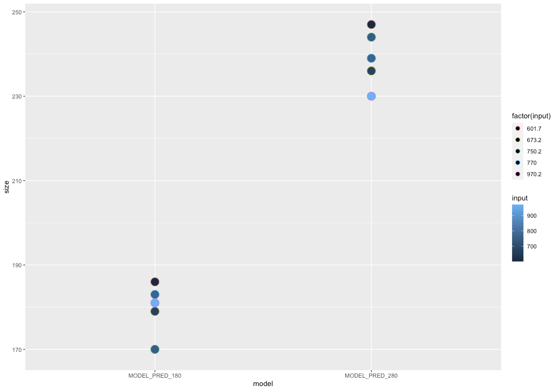
ggplot(x, aes(model, size, group = factor(input)))+
geom_dotplot(aes(fill = input), binaxis = "y", stackdir = "center", binwidth = 0.5)我是一个相对的R新手,所以任何建议都将不胜感激。
更新:我越来越接近..。我不想用单独的颜色来勾画这些点,但是更改以下代码的任何部分都会导致填充阴影的完全丢失。
ggplot(x, aes(model, size, color = factor(input)))+
     geom_dotplot(aes(fill = input), binaxis = "y", stackdir = "center", binwidth = 2)
回答 1
Stack Overflow用户
回答已采纳
发布于 2020-07-08 21:09:26
你可以试试这个:
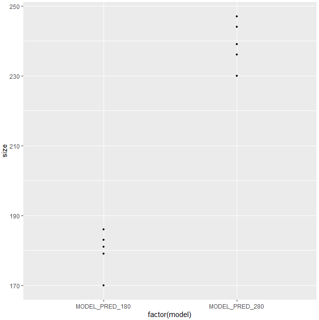
ggplot(x, aes(factor(model), size, group = factor(model)))+
    geom_dotplot(aes(fill = input), binaxis = "y", stackdir = "center", binwidth = 0.5)
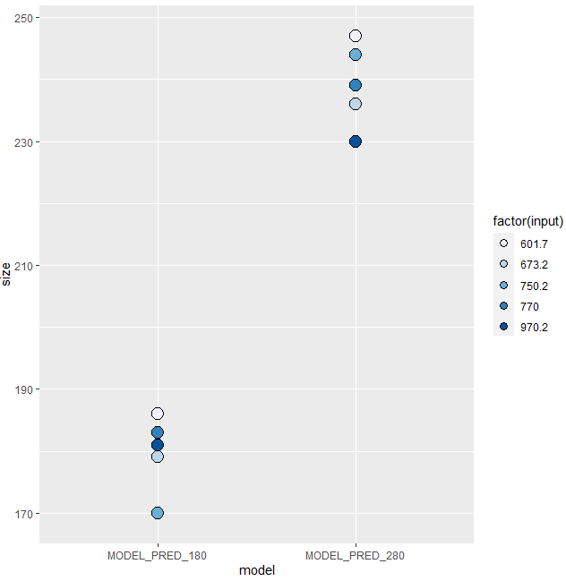
更新
我包括这个更新,可能会有帮助。
ggplot(x, aes(model, size, fill = factor(input)))+
  geom_dotplot(binaxis = "y", stackdir = "center", binwidth = 2)+
  scale_fill_brewer(palette="Blues")
页面原文内容由Stack Overflow提供。腾讯云小微IT领域专用引擎提供翻译支持
原文链接:
https://stackoverflow.com/questions/62803351
复制相关文章
相似问题
腾讯云开发者

Copyright © 2013 - 2026 Tencent Cloud. All Rights Reserved. 腾讯云 版权所有
深圳市腾讯计算机系统有限公司 ICP备案/许可证号:粤B2-20090059 ![]() 粤公网安备44030502008569号
粤公网安备44030502008569号
腾讯云计算(北京)有限责任公司 京ICP证150476号 | 京ICP备11018762号