
热图绘制时间与日期格图
热图绘制时间与日期格图
提问于 2020-05-25 14:11:11
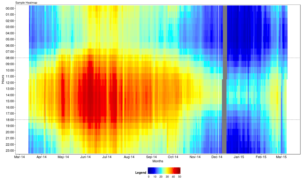
我想用ggplot制作一个热图。结果应该是这样的(y轴需要反转):
下面是示例数据的子集。在实际应用中,1000+用户不是只有3个,而是基于用户的值进行梯度填充。
Date <- seq(
  from = as.POSIXct("2016-01-01 00:00"),
  to  = as.POSIXct("2016-12-31 23:00"),
  by = "hour"
)
user1 <- runif(length(Date), min = 0, max = 10)
user2 <- runif(length(Date), min = 0, max = 10)
user3 <- runif(length(Date), min = 0, max = 10)
example <- data.frame(Date, user1, user2, user3)

example$hour <- format(example$Date, format = "%H:%M")
example$total <- rowSums(example[,c(2:4)])
我结合geom_tile、geom_raster和stat_density2d (如这里类似的文章中的建议)使用了(fill = total)参数,尝试了几种方法。下面是一个例子:
ggplot(plotHuishoudens, aes(Date, hour, fill = Total)) +
  geom_tile() +
  scale_fill_gradient(low = "blue", high = "red")
哪个变量只显示单个点,而不像连续变量那样显示y轴(scale_y_continuous也没有帮助这一点),尽管变量是连续的?
如何创建像上面提供的示例一样的热图?我怎么能在y轴上做一个很好的切断(例如每3小时而不是每小时)?
回答 1
Stack Overflow用户
回答已采纳
发布于 2020-05-25 14:36:18
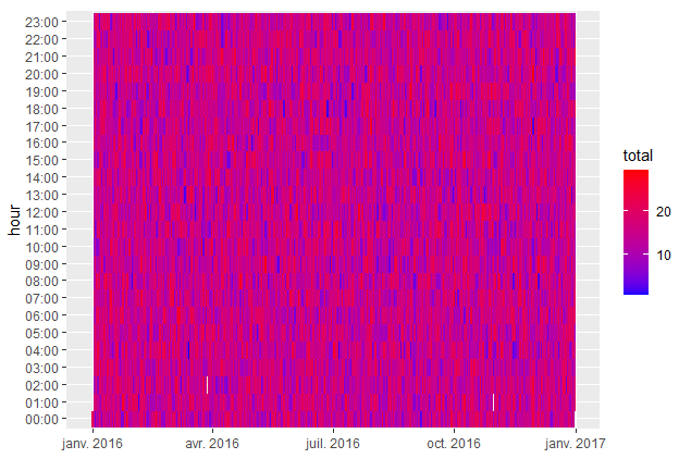
按照定义数据的方式,您不会得到所需的输出,因为example$Date是一个POSIXct对象,即日期和一个小时。
因此,您必须将您的图表映射到当天:
ggplot(data = example) +
  geom_raster(aes(x=as.Date(Date, format='%d%b%y'), y=hour, fill=total)) +
  scale_fill_gradient(low = "blue", high = "red")
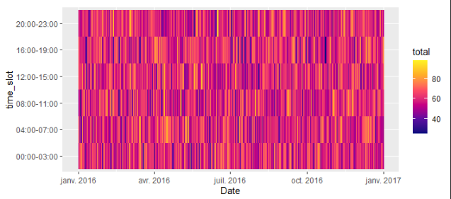
对于你的第二个问题,你可以这样分组:
example <- example %>%
  group_by(grp = rep(row_number(), length.out = n(), each = 4)) %>%
  summarise(Date = as.Date(sample(Date, 1), format='%d%b%y'),
            total = sum(total),
            time_slot = paste(min(hour), max(hour), sep = "-"))

ggplot(data = example) +
  geom_raster(aes(x = Date, y = time_slot, fill = total)) +
  scale_fill_gradientn(colours = (cet_pal(6, name = "inferno"))) # I like gradients from "cetcolor" package
页面原文内容由Stack Overflow提供。腾讯云小微IT领域专用引擎提供翻译支持
原文链接:
https://stackoverflow.com/questions/62004172
复制相关文章
相似问题
腾讯云开发者

Copyright © 2013 - 2026 Tencent Cloud. All Rights Reserved. 腾讯云 版权所有
深圳市腾讯计算机系统有限公司 ICP备案/许可证号:粤B2-20090059 ![]() 粤公网安备44030502008569号
粤公网安备44030502008569号
腾讯云计算(北京)有限责任公司 京ICP证150476号 | 京ICP备11018762号