
matplotlib中的偏移次轴
我试图在matplotlib中将不同的情节设置结合在一起。我在matplotlib示例库/文档库和堆栈中为每个示例找到了很好的示例,但是我找不到关于我的具体问题的任何东西。
因此,到目前为止,我所知道的是,如何添加一个或多个具有偏移y轴的轴,以便使用ax.twinx()绘制关于同一个x轴的不同数据。在示例寄生虫轴演示中,第三个y轴称为寄生虫轴.但是,如果您想要添加一个附加的轴(它只是现有轴的一个缩放版本),您可以使用ax.secondary_yaxis(),如二轴演示所示。没有更多的数据要绘制。
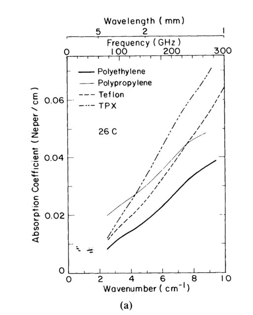
到目前为止,我无法实现的是第二个y轴,它与原来的y轴相抵。这对于提高整个科学界的地块可读性非常有帮助。例如,一些科学家用频率作为电磁光谱的参考,而另一些科学家则使用波长或波数。Afsar 1使用了一个非常方便的轴标记,其中包含了同一地块中的所有三个变量:
我想要类似的东西,就在y轴上,而不是x轴上。是否有办法使第二轴与主轴相距?我试了几个参数,但弄不清楚。
谢谢你的帮助!
1 Afsar,Mohammed Nurul。精密毫米波测量普通聚合物的复折射率、复介电常数和损耗切线。IEEE仪器和测量交易IM-36,第2号(1987年6月):530-36。https://doi.org/10.1109/TIM.1987.6312733。
1
回答 2
Stack Overflow用户
发布于 2020-05-04 18:01:36
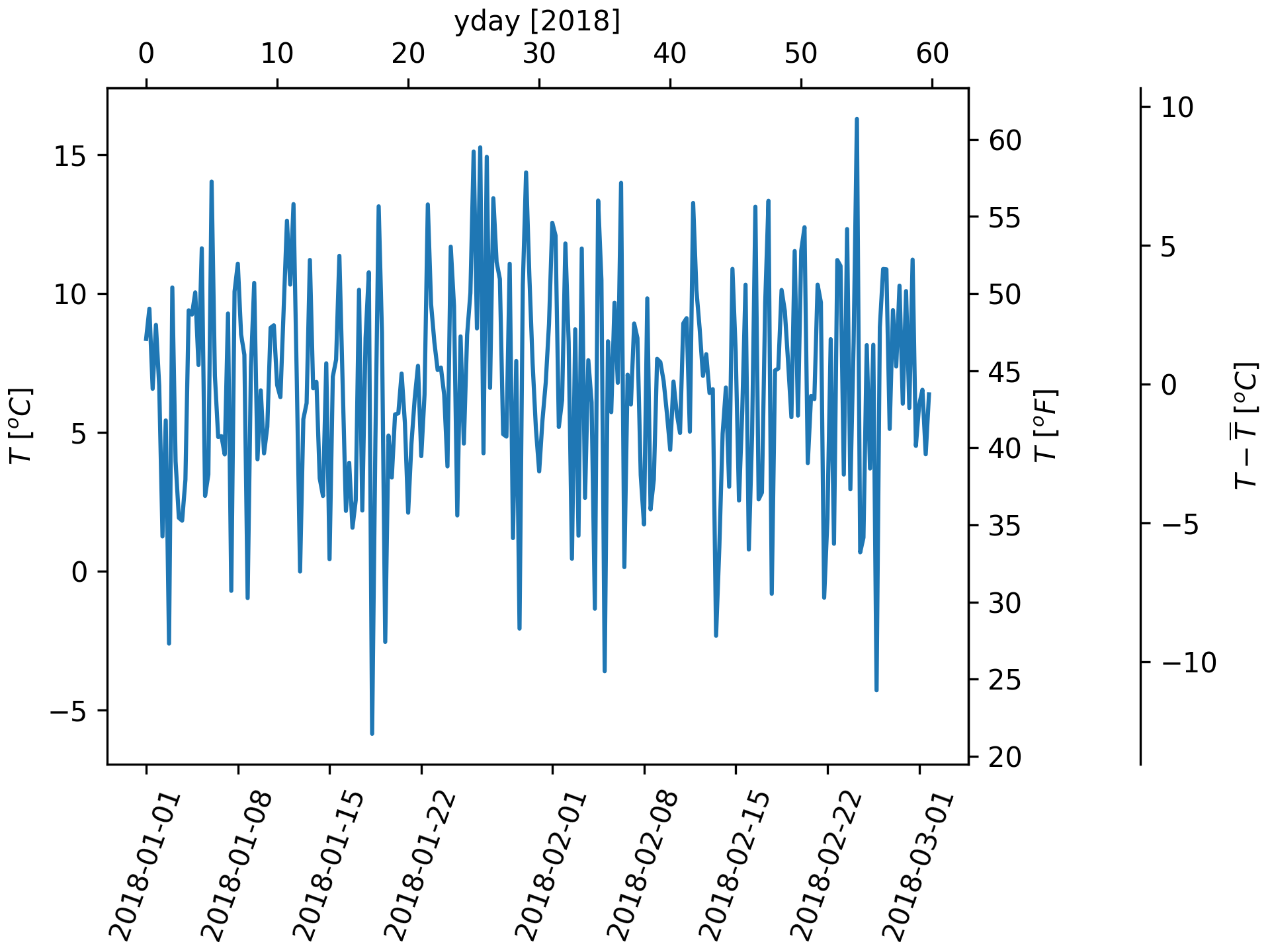
一个完整的例子。第三行到最后一行是相关的。
import matplotlib.pyplot as plt
import numpy as np
import datetime

dates = [datetime.datetime(2018, 1, 1) + datetime.timedelta(hours=k * 6)
         for k in range(240)]
temperature = np.random.randn(len(dates)) * 4 + 6.7
fig, ax = plt.subplots(constrained_layout=True)

ax.plot(dates, temperature)
ax.set_ylabel(r'$T\ [^oC]$')
plt.xticks(rotation=70)


def date2yday(x):
    """Convert matplotlib datenum to days since 2018-01-01."""
    y = x - mdates.date2num(datetime.datetime(2018, 1, 1))
    return y


def yday2date(x):
    """Return a matplotlib datenum for *x* days after 2018-01-01."""
    y = x + mdates.date2num(datetime.datetime(2018, 1, 1))
    return y


secax_x = ax.secondary_xaxis('top', functions=(date2yday, yday2date))
secax_x.set_xlabel('yday [2018]')


def celsius_to_fahrenheit(x):
    return x * 1.8 + 32


def fahrenheit_to_celsius(x):
    return (x - 32) / 1.8


secax_y = ax.secondary_yaxis(
    'right', functions=(celsius_to_fahrenheit, fahrenheit_to_celsius))
secax_y.set_ylabel(r'$T\ [^oF]$')


def celsius_to_anomaly(x):
    return (x - np.mean(temperature))


def anomaly_to_celsius(x):
    return (x + np.mean(temperature))


# document use of a float for the position:
secax_y2 = ax.secondary_yaxis(
    1.2, functions=(celsius_to_anomaly, anomaly_to_celsius))
secax_y2.set_ylabel(r'$T - \overline{T}\ [^oC]$')


plt.show()
Stack Overflow用户
发布于 2020-05-04 16:41:52
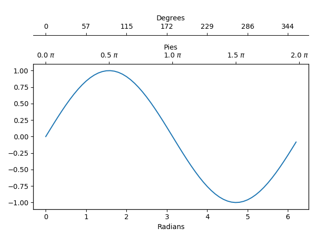
下面是另一种方法,尽管它可能更像是一种黑客:
import numpy as np
import matplotlib.pyplot as plt
from matplotlib.ticker import FuncFormatter


@FuncFormatter
def twin1_formatter(x, pos):
    return f'{x/np.pi*180:.0f}'


@FuncFormatter
def twin2_formatter(x, pos):
    return f'{x/np.pi:.1f} $\pi$'


data = np.arange(0, 2*np.pi, 0.1)

fig, ax = plt.subplots()

twin1 = ax.twiny()
twin1.spines['top'].set_position(('axes', 1.2))
twin1.set_xlabel('Degrees')
twin1.xaxis.set_major_formatter(FuncFormatter(twin1_formatter))

twin2 = ax.twiny()
twin2.set_xlabel('Pies')
twin2.xaxis.set_major_formatter(FuncFormatter(twin2_formatter))
twin2.xaxis.set_ticks(np.array([0, 1/2, 1, 3/2, 2])*np.pi)

ax.plot(data, np.sin(data))
ax.set_xlabel('Radians')
twin1.set_xlim(ax.get_xlim())
twin2.set_xlim(ax.get_xlim())
fig.show()
https://stackoverflow.com/questions/61596813
复制相似问题
腾讯云开发者

Copyright © 2013 - 2026 Tencent Cloud. All Rights Reserved. 腾讯云 版权所有
深圳市腾讯计算机系统有限公司 ICP备案/许可证号:粤B2-20090059 ![]() 粤公网安备44030502008569号
粤公网安备44030502008569号
腾讯云计算(北京)有限责任公司 京ICP证150476号 | 京ICP备11018762号