
防止内容增加CSS网格列的大小
防止内容增加CSS网格列的大小
提问于 2020-01-26 21:46:22
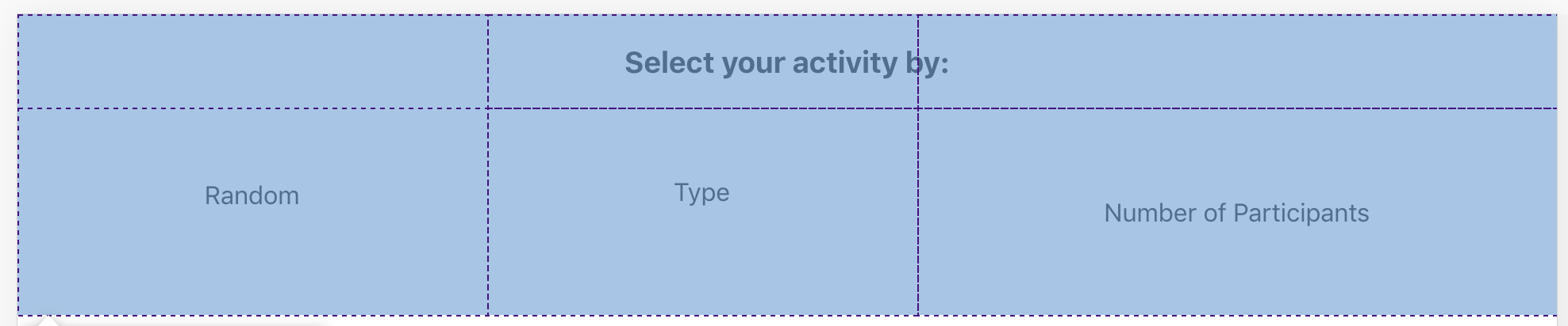
我目前有一个2行3列的网格。我希望所有3列的大小相等。然而,与前两列相比,第三列中有更多的文本内容。这将导致第三列的宽度展开。我查看了类似的问题,张贴到堆栈溢出,并试图解决这个问题,将该网格项的最小宽度设置为0。那不起作用。我该如何解决这个问题。下面我已经包含了这个页面的截图,它说明了这个问题。我也从相关的CSS文件中复制和粘贴了代码。
CSS文件:
.App {
  text-align: center;
  box-sizing: border-box;
}

.App-logo {
  height: 40vmin;
  pointer-events: none;
}

@media (prefers-reduced-motion: no-preference) {
  .App-logo {
    animation: App-logo-spin infinite 20s linear;
  }
}

.App-header {
  background-color: #282c34;
  min-height: 100vh;
  display: flex;
  flex-direction: column;
  align-items: center;
  justify-content: center;
  font-size: calc(10px + 2vmin);
  color: white;
}

.App-link {
  color: #61dafb;
}

@keyframes App-logo-spin {
  from {
    transform: rotate(0deg);
  }
  to {
    transform: rotate(360deg);
  }
}

.criteria-grid {
  width: 100%;
  display: grid;
  grid-template-areas:
    'header header header'
    'col1 col2 col3'
  ;
  justify-content: stretch;
  justify-items: stretch;
  min-height: 0;
  min-width: 0;
}

.criteria-header {
  grid-area: header;
}

.criteria-1 {
  list-style: none;
  padding: 10%;
  grid-area: col1;
}

.criteria-2 {
  list-style: none;
  padding: 10%;
  grid-area: col2;
}

.criteria-3 {
  list-style: none;
  padding: 10%;
  grid-area: col3;
  min-width: 0;
}回答 2
Stack Overflow用户
回答已采纳
发布于 2020-01-27 01:34:48
Shubh Sheth的回答是正确的,但也可能是另一种写作方式:
grid-template-columns: repeat(3, 1fr); 当您有许多列要布局时,就会派上用场。
尽管如此,您的错误是没有指定列,而只是指定区域。
 grid-template-areas:
    'header header header'
    'col1 col2 col3'
  ;
网格区域与网格模板列一起使用,而不是作为替代。
所以您的布局代码应该如下所示:
display: grid;
grid-template-columns: repeat(3, 1fr);
grid-template-areas:
 'header header header'
 'col1 col2 col3';
在这种情况下,您可以很好地删除模板区域代码,因为您没有改变任何位置。
Stack Overflow用户
发布于 2020-01-27 01:06:54
在您的.criteria-grid中添加以下样式
grid-template-columns: 1fr 1fr 1fr;页面原文内容由Stack Overflow提供。腾讯云小微IT领域专用引擎提供翻译支持
原文链接:
https://stackoverflow.com/questions/59923034
复制相关文章
相似问题
腾讯云开发者

Copyright © 2013 - 2026 Tencent Cloud. All Rights Reserved. 腾讯云 版权所有
深圳市腾讯计算机系统有限公司 ICP备案/许可证号:粤B2-20090059  粤公网安备44030502008569号
腾讯云计算(北京)有限责任公司 京ICP证150476号 | 京ICP备11018762号