
切换:在悬停时重命名工具提示
切换:在悬停时重命名工具提示
提问于 2019-09-28 09:40:06
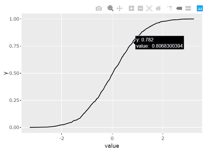
我有一张像上面这样的图表。可重用代码如下所示。
plotly::ggplotly(ggplot(dplyr::as_tibble(rnorm(1000)), aes(value)) + stat_ecdf(geom = 'line'))我想重命名和格式化工具提示在悬停。例如,x轴或'value‘(在图表中)可以是’单价泰铢‘,而y轴是累积分布。
所以当我在线上盘旋时,我想看到下面这样的东西
累积分布: 78.2% 单价:泰铢0.81泰铢
谢谢!
回答 2
Stack Overflow用户
回答已采纳
发布于 2019-09-28 10:29:35
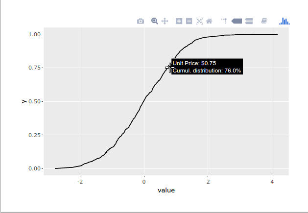
这里有个办法。
library(plotly)
library(scales) # for the number() function

gg <- ggplot(dplyr::as_tibble(rnorm(1000)), aes(value)) +
  stat_ecdf(geom = 'line')

ggly <- ggplotly(gg)

text_x <- number(
  ggly$x$data[[1]]$x,
  prefix = "Unit Price: $",
  accuracy = 0.01
)

text_y <- number(
  ggly$x$data[[1]]$y,
  scale = 100,
  accuracy = 0.1,
  prefix = "Cumul. distribution: ",
  suffix = "%"
)

ggly %>%
  style(text = paste0(text_x, "</br></br>", text_y), traces = 1)
Stack Overflow用户
发布于 2019-09-28 09:44:29
你可以巧妙地打包。下面是一篇介绍如何添加自定义工具提示普洛特利的文章
嗯,修改aes似乎是我们修改标签的唯一方法,而且它不支持你现在想要的东西
页面原文内容由Stack Overflow提供。腾讯云小微IT领域专用引擎提供翻译支持
原文链接:
https://stackoverflow.com/questions/58145084
复制相关文章
相似问题
腾讯云开发者

Copyright © 2013 - 2026 Tencent Cloud. All Rights Reserved. 腾讯云 版权所有
深圳市腾讯计算机系统有限公司 ICP备案/许可证号:粤B2-20090059 ![]() 粤公网安备44030502008569号
粤公网安备44030502008569号
腾讯云计算(北京)有限责任公司 京ICP证150476号 | 京ICP备11018762号