
Iframe与Viewport
我是从巴西写信的。我以葡萄牙语参加了这个论坛,但我没有解决我的问题。我希望我的英语不会太差。
经过大量的研究,我用Iframe做了我的惠普。
我知道一点Html,仅此而已。我尝试通过复制著名的“包括”来使用PHP,但是..。我放弃了。
我有许多页,菜单在一边使它很容易访问的另一边。
我的网站是由一个"index.html“页面组成的,该页面位于屏幕的左边,右边是内容,根据用户在菜单上单击的内容。
在台式机上,网站运行良好。
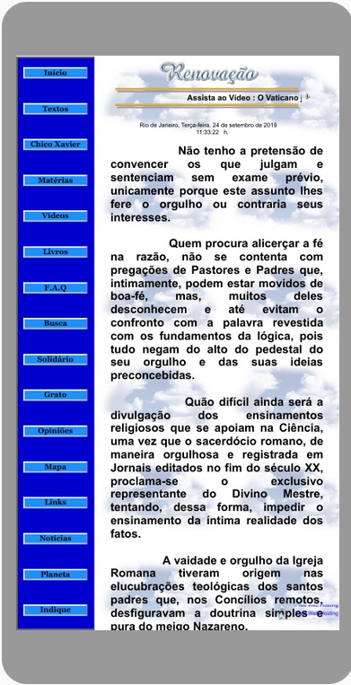
在智能手机中,它的外观甚至是合理的,其特点如下:
我读到谷歌已经宣布它将优先为移动友好型页面建立索引。
好吧,我把元标签放在index.html的头上:
<meta name="viewport" content="width=device-width, initial-scale=1, maximum-scale=1.0 maximum-scale=1.0">然后问题就开始了。这个网站是这样的:

同样的元标签也被放置在右边的所有内容上,但是.解决不了问题。
作为补充,左边包含蓝色菜单的"index.html“如下所示:
<?xml version="1.0"?>
<!DOCTYPE html PUBLIC "-//W3C//DTD HTML 4.01 Transitional//EN">

<html>
<head>

<title>Ciencia,Reportagens, Kardec</title>

<META http-equiv="Content-Language" CONTENT="pt-br">

<meta http-equiv="Content-Type" content="text/html; charset="utf-8">

<meta name="viewport" content="width=device-width, initial-scale=1, maximum-scale=1.0 maximum-scale=1.0">

(...)

<style type="text/css">

html, body {

    height: 100%;
    padding: 0;
    margin: 0;

}

 iframe { top:0; width:auto; left:auto; height:100%; border:none; background:#ffffff; }

div {
    width: 100%;
    list-style: none;
    margin: 0;
    padding: 0;
}

#navcontainer
{
position: fixed;
top: 2px;
bottom: 0px;
background: #0000CD; /*Edite a cor de fundo*/
border-right: 10px solid #696969;
width: 23.1%;
margin: 0;
padding: 0.9em 1;
font-family: georgia, serif;
font-size: 23px;
text-align: left;
font-weight: bold;
overflow-y: auto;
.contentFullFixed{
    position:fixed;
    width:100%;
    top: 0;
    left:0;
}
}

ul#navlist
{
text-align: center;
list-style: none;
padding: 0;
margin: 0 auto;
width: 90%;
}

ul#navlist li
{
display: block;
margin:  5;
padding: 0;
height: 6%;
padding-top: 0.1em;
}

ul#navlist li a
{
display: block;
width: 190px;

border-width: 4px;
border-color: #fff #8470FF #ccc #fff;
border-style: solid;
color: #000000;
text-decoration: none;
background: #1E90FF; /*Edite a cor de fundo*/
}

#navcontainer>ul#navlist li a { width: auto; }

ul#navlist li#active a
{
background: ##1E90FF; /*Edite a cor de fundo*/
color: #000000;
}

.selected {
    background-color : #fff000;
}

ul#navlist li a:hover {color: #FFFFFF}

ul#navlist li a:active
{
color: #FFF;
background: #B0C4DE;
border-color: #000000 #fff #fff #ccc;

}

#conteudo {
     width: 75.7%;
     position: relative;
     height: 100%;
     text-align: center;
}

    a:hover { color: green}
    A:link {text-decoration:none}
    A:visited {text-decoration:none}
    A:hover {text-decoration:underline}
    A:active {text-decoration:underline}

iframe {
    border: none;
    width: 100%;
    height: 100%;
    border: none;
}

img{
display: block;
margin: 30 auto;
}

</style>

</head>

<body>

(...)

<div id="navcontainer" style="border: 5px solid #696969; float: left;">

<ul id="navlist">

<li><a href="prin.html"  target="conteudo">Início</a></li>

<li><a href="textos.html"  target="conteudo">Textos</a></li>

(...)

(...)

</ul>
</div>

<!--  I THINK THE PROBLEM IS HERE :  -->

<div id="conteudo" style="float: right;" class="spaceWrap">

<iframe class="viewPort" name="conteudo" src="prin.html" align="right"></iframe></div>

</body>
</html>
你能帮忙吗?
提前谢谢你。
杰夫
回答 1
Stack Overflow用户
发布于 2019-11-28 14:15:46
经过大量的研究,我最终为那些没有多少经验,最终使用Iframes的人找到了解决方案。
我们知道,GoogleBot在其索引中一直给予移动优先级。
Google自己推荐的是包含Meta标签:
<meta name=viewport content="width=device-width, initial-scale=1">但这只适用于做而不是有Iframes的站点。
经过几个月的研究,我发现了一个非常简单的附加,它确实解决了这个问题。
只需在上面的Meta标记末尾添加以下内容:viewport=over..net。(!!)
然后它会是这样的:
<meta name=”viewport” content=”width=device-width, initial-scale=1, viewport-fit=cover”>我只是不明白为什么谷歌没有警告你这件事。花了几个月的研究、与论坛的联系、给专家的电子邮件等等,但我只能在博客评论中找到答案。
在这个站点上,他们甚至建议放置高度调整大小:高度=设备高度。
因此,我们为Iframes提供了完整的带有Viewport的Meta标记:
<meta name=”viewport” content=”width=device-width, initial-scale=1, height=device-height, viewport-fit=cover”>我希望有这么多的时间给其他经历过这件事的人。
谢谢。
杰夫
https://stackoverflow.com/questions/58204506
复制相似问题
腾讯云开发者

Copyright © 2013 - 2026 Tencent Cloud. All Rights Reserved. 腾讯云 版权所有
深圳市腾讯计算机系统有限公司 ICP备案/许可证号:粤B2-20090059  粤公网安备44030502008569号
腾讯云计算(北京)有限责任公司 京ICP证150476号 | 京ICP备11018762号