
我需要使用ggplot2更改每个图形的网格高度和大小。
我需要使用ggplot2更改每个图形的网格高度和大小。
提问于 2019-10-06 04:44:08
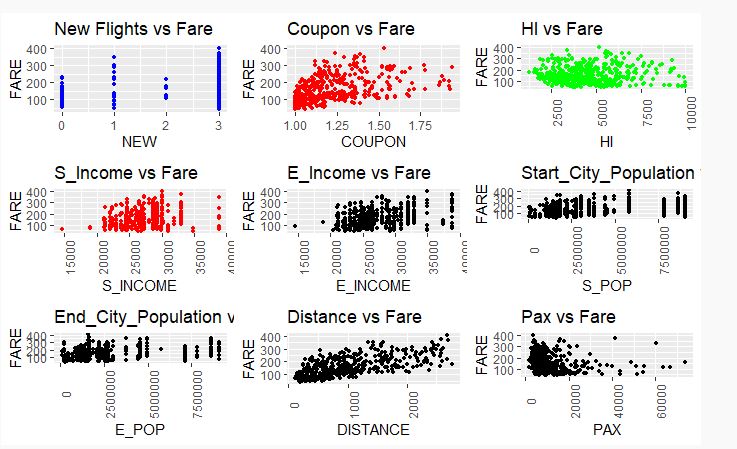
我是R程序的新手。我正在尝试使用多个图形创建一个网格,但我希望更改图形的高度和宽度,因为图中的内容并不清楚。
我得到了这个情节,但我需要对它做一些修改,使它有意义。
plot_1 <- ggplot(data_airfares ) +
geom_point(aes(x= NEW, y = FARE ), size = 1,colour="blue") + ggtitle("New Flights vs Fare")

plot_2 <- ggplot(data_airfares )+
geom_point(aes(x= COUPON, y = FARE ), size = 1,colour="red") + ggtitle("Coupon vs Fare")


plot_3 <- ggplot(data_airfares )+
geom_point(aes(x= HI, y = FARE ), size = 1,colour="green")+ ggtitle("HI vs Fare")+
theme(axis.text.x = element_text(angle = 90))

plot_4 <- ggplot(data_airfares )+
geom_point(aes(x= S_INCOME, y = FARE ), size = 1,colour="red")+ ggtitle("S_Income vs Fare")+
theme(axis.text.x = element_text(angle = 90))

plot_5 <- ggplot(data_airfares )+
geom_point(aes(x= E_INCOME, y = FARE ), size = 1)+ ggtitle("Income(E)vs Fare")+
theme(axis.text.x = element_text(angle = 90))

plot_6 <- ggplot(data_airfares )+
geom_point(aes(x= S_POP, y = FARE ), size = 1)+ ggtitle("Start_City_Population vs Fare")+
theme(axis.text.x = element_text(angle = 90))

plot_7 <- ggplot(data_airfares )+
geom_point(aes(x= E_POP, y = FARE ), size = 1)+ ggtitle("End_City_Population vs Fare")+
theme(axis.text.x = element_text(angle = 90))

plot_8 <- ggplot(data_airfares )+
geom_point(aes(x= DISTANCE, y = FARE ), size = 1)+ggtitle("Distance vs Fare")+
theme(axis.text.x = element_text(angle = 90))

plot_9 <- ggplot(data_airfares )+
geom_point(aes(x= PAX, y = FARE ), size = 1)+ ggtitle("Pax vs Fare")+
theme(axis.text.x = element_text(angle = 90))

grid.arrange(plot_1, plot_2, plot_3, plot_4, plot_5, plot_6, plot_7, plot_8,
 plot_9, nrow = 3)
使用ggplot2更改网格中每个地块的高度和宽度
回答 1
Stack Overflow用户
回答已采纳
发布于 2019-10-06 13:43:39
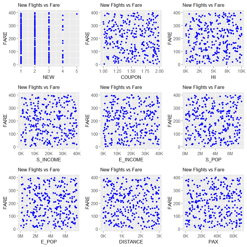
我的建议是对x轴使用不同的勾标,并减少标题和轴的字体大小。
library(ggplot2)
library(gridExtra)
library(scales)
# Generate data for the example
n <- 300
data_airfares <- data.frame(NEW = rbinom(n,4,0.25)+1,
                            FARE=runif(n,0,400),
                            COUPON=runif(n,1,2),
                            HI=runif(n,0,10000),
                            S_INCOME=runif(n,0,40000),
                            E_INCOME=runif(n,0,40000),
                            S_POP=runif(n,0,7500000),
                            E_POP=runif(n,0,7500000),
                            DISTANCE=runif(n,0,3000),
                            PAX=runif(n,0,70000))
# Create plots using a loop
plots <- NULL
var_names <- names(data_airfares)[-2]
for (k in 1:length(var_names)) {
  var_name <- var_names[k]
  df <- data_airfares[, c("FARE", var_name)]
  p <- ggplot(data=df, aes_string(x=var_name, y="FARE")) +
   geom_point(size = 1,colour="blue") +
   ggtitle("New Flights vs Fare") +
   theme(plot.title = element_text(size = 10), axis.title = element_text(size = 10))
  if (var_name %in% c("S_POP","E_POP")) {
    plots[[k]] <- p +
      scale_x_continuous(labels = comma_format(accuracy=1, scale=10^(-6), suffix = "M"))
  } else if (var_name %in% c("NEW","COUPON")) {
    plots[[k]] <- p
  } else {
    plots[[k]] <- p +
      scale_x_continuous(labels = comma_format(accuracy=1, scale=10^(-3), suffix = "K"))
  }
}

grid.arrange(grobs=plots, nrow = 3)
页面原文内容由Stack Overflow提供。腾讯云小微IT领域专用引擎提供翻译支持
原文链接:
https://stackoverflow.com/questions/58254285
复制相关文章
相似问题
腾讯云开发者

Copyright © 2013 - 2026 Tencent Cloud. All Rights Reserved. 腾讯云 版权所有
深圳市腾讯计算机系统有限公司 ICP备案/许可证号:粤B2-20090059 ![]() 粤公网安备44030502008569号
粤公网安备44030502008569号
腾讯云计算(北京)有限责任公司 京ICP证150476号 | 京ICP备11018762号