
在使用Flexbox时隐藏伪元素之后
在使用Flexbox时隐藏伪元素之后
提问于 2019-11-08 20:07:46
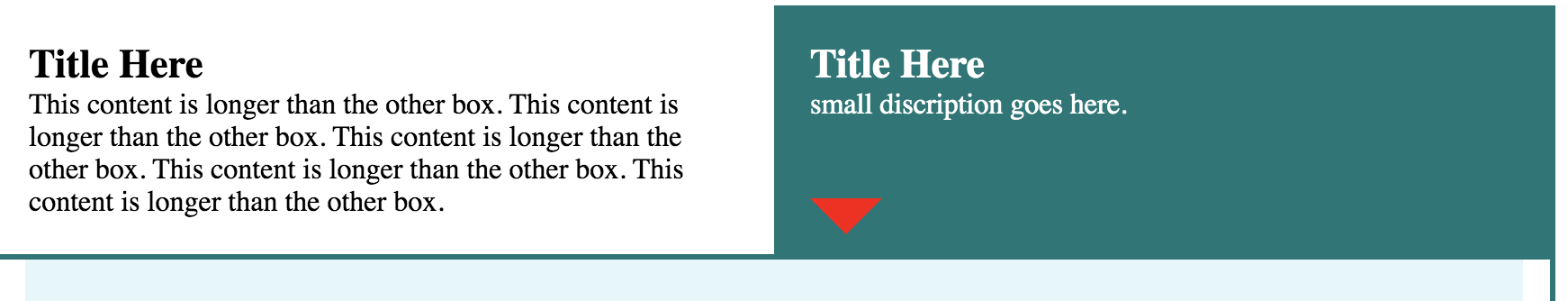
我需要两个div占100%的宽度,理想的50%每个(但我是灵活的)。在活动选项卡上显示下面的箭头。
挠曲盒的弹性增长特性似乎并不影响后伪元素箭头的位置。在全屏上,你可以看到箭头,但是当弹性增长时,箭头中的踢会保持不变,并被背景色所隐藏。
https://codepen.io/sherrylking/pen/MWWXEBv
.qo-tab-section {
    display: flex;
}

.qo-tab-section div {
    padding: 20px 20px 20px 20px;
    flex-basis: 50%;
}

.qo-active-tab:after {
    content:'';
    position: relative;
    border-style: solid;
    border-width: 20px 20px 0;
    border-color: #027777 transparent;
    display: block;
    width: 0;
    z-index: 1;
    top: 43px;
}
回答 1
Stack Overflow用户
回答已采纳
发布于 2019-11-08 20:22:17
问题在于您使用了top: 43px,它作为一个固定位置,防止箭头在调整大小时调整其相对于flex项的位置。
相反,使用箭头上的绝对定位和相对定位来设置包含的块。
将此添加到代码中:
.qo-tab-section div {
    padding: 20px 20px 20px 20px;
    flex-basis: 50%;

    /*new */
    position: relative;
}

.qo-active-tab:after {
    content:'';
    /* position: relative; */
    border-style: solid;
    border-width: 20px 20px 0;
    border-color: #027777 transparent;
    /* display: block; */ /* not necessary */
    width: 0;
    z-index: 1;
    /* top: 43px; */

    /* new */
    position: absolute;
    top: 100%;
    left: 0;
}
.qo-tab-section {
  display: flex;
}

.qo-tab-section div {
  padding: 20px 20px 20px 20px;
  flex-basis: 50%;
  /*new */
  position: relative;
}

.qo-active-tab {
  color: white;
  background-color: #027777;
}

.qo-active-tab:after {
  content: '';
  /* position: relative; */
  border-style: solid;
  border-width: 20px 20px 0;
  border-color: #027777 transparent;
  /* display: block; */ /* not necessary */
  width: 0;
  z-index: 1;
  /* top: 43px; */
  /* new */
  position: absolute;
  top: 100%;
  left: 0;
}

.qo-purchase-area {
  background-color: #E4F6F9;
  overflow: auto;
  padding: 25px 15px 15px 15px;
  margin-top: -15px;
}

.qo-purchase-amount {
  font-weight: bold;
  font-size: 2em;
}

.float-l {
  float: left;
}

.float-r {
  float: right;
}

.qo-container {
  border: solid 3px #027777;
  padding: 15px;
}

.h1-small {
  font-size: .6em;
}

.main-button-not-selected {
  background-color: #EDEDED;
  color: #999999;
  border: solid 1px #999999;
}

.margin-r-15 {
  margin-right: 15px;
}

.qo-helptip {
  width: 20px;
  margin-bottom: 5px;
}

.qo-coverage-amount {
  background-color: #F7F6F6;
  padding-top: 15px;
  padding-bottom: 15px;
}

.qo-coverage-amount input {
  font-size: 2.35em;
  width: 6em;
  text-align: center;
}

.qo-coverage-alignment {
  float: left;
}

.qo-coverage-clear {
  padding: 5px;
  line-height: 45px;
}

.cov-a-warning:before {
  content: url("exclamation-triangle.svg");
  width: 20px;
  position: absolute;
  left: 13px;
}

.cov-a-warning {
  margin-left: 26px;
}

.qo-coverage-title {
  font-size: 1.4em;
  font-weight: bold;
}

.qo-section-body {
  font-size: 1.7em;
  padding-bottom: 120px;
  text-align: center;
}<div class="qo-tab-section">
<div><span class="qo-coverage-title">Title Here</span>
<br> This content is longer than the other box. This content is longer than the other box. This content is longer than the other box. This content is longer than the other box. This content is longer than the other box. </div>
<div class="qo-active-tab"><span class="qo-coverage-title">Title Here </span><br> small discription goes here.</div>
</div>
<div class="qo-container">
<div class="row form-group qo-purchase-area">
<div class="float-l qo-purchase-amount margin-r-15">$134.67 / month
</div>
<div class="float-l margin-r-15">please note that the arrows shows under the active tab in full screen but when the flexgrow kicks into effect the possitioning of the after not longer works well. The extra growth is not considered.
</div>
<div class="float-r">
<button class="main-button" type="button">Purchase</button>
</div>
</div>
</div>
页面原文内容由Stack Overflow提供。腾讯云小微IT领域专用引擎提供翻译支持
原文链接:
https://stackoverflow.com/questions/58773148
复制相关文章
相似问题
腾讯云开发者

Copyright © 2013 - 2026 Tencent Cloud. All Rights Reserved. 腾讯云 版权所有
深圳市腾讯计算机系统有限公司 ICP备案/许可证号:粤B2-20090059  粤公网安备44030502008569号
腾讯云计算(北京)有限责任公司 京ICP证150476号 | 京ICP备11018762号