
如何使用DataFrame在matplotlib中创建图例?
如何使用DataFrame在matplotlib中创建图例?
提问于 2019-12-03 08:41:11
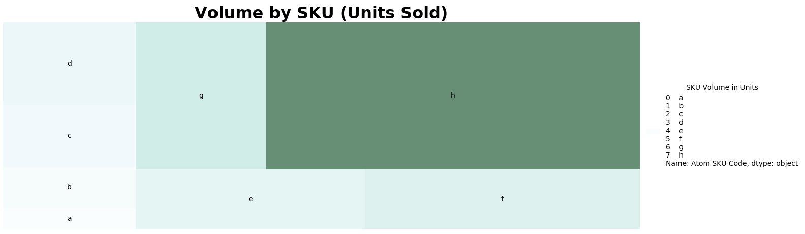
我用squarify创建了一个树地图,现在我尝试创建一个图例来显示图表旁边的树状图中的数据。
内置的图例函数没有生成我想要的图例(它目前正在显示数据帧的第一列和每一行的索引),所以我一直试图使用它,但没有成功。我希望这个传说是:
SKU体积单位
A 1
B2
C_3
D 4
E-5
F 6
G7
H 20
import matplotlib as mpl
import squarify
import matplotlib.cm
import pandas as pd
import matplotlib.pyplot as plt
import numpy as np

#create figure
fig = plt.gcf()
fig.set_size_inches(16, 5)

#set data values
data = [['a',1],['b',2],['c',3],['d',4],['e',5],['f',6],['g',7],['h',20]]
data_slice = pd.DataFrame(data, columns=['Atom SKU Code','Total Volume'])

print(data_slice)

#create color set
norm = mpl.colors.Normalize(vmin=min(data_slice['Total Volume']), vmax=max(data_slice['Total Volume']))
colors = [mpl.cm.BuGn(norm(value)) for value in data_slice['Total Volume']]

#plot figure
ax1 = squarify.plot(label=data_slice['Atom SKU Code'], sizes=data_slice['Total Volume'], color=colors, alpha=.6)
plt.title("Volume by SKU (Units Sold)", fontsize=23, fontweight="bold")
plt.axis('off')
plt.legend(title='SKU Volume in Units', loc='center left',bbox_to_anchor=(1, 0.5),frameon=False)
plt.tight_layout()
plt.show()
回答 1
Stack Overflow用户
回答已采纳
发布于 2019-12-04 10:12:01
想出办法来做这件事。我删除了标签,并使用plt.table创建了一个我的图例版本。此外,利用我创造的颜色,使传奇看起来更好。
def genereate_legend_table(ax,colors,no_of_skus_to_graph,data_slice):
# ___________________________________________________________________________________
# DESCRIPTION
# This functions generates a legend table to be plotted with the treemap plots

#------------------------------------------------------------------------------------
# ARGUMENTS
# ax: subplot axis where the table is to be plotted

# colors: color list object generated by matplotlibs color library

# no_of_skus_to_graph: how many skus are being represented in the tree map

# data_slice: the data to be written in the table
# ___________________________________________________________________________________
# Create hex color list from normalized color object
hex_list = []
for n in range(len(colors)):
    hex_list.append(mpl.colors.to_hex(colors[n]))


# Create table object on desired axis
legend_table = ax.table(cellText=data_slice.values,
                          colLabels=data_slice.columns,
                          loc='right',
                          colLoc='right',
                          colWidths=[0.2, 0.2],
                          edges='')

# Change table text color
i = 0
while i <= no_of_skus_to_graph - 1:
    legend_table[(i + 1, 0)].get_text().set_color(hex_list[i])
    legend_table[(i + 1, 1)].get_text().set_color(hex_list[i])
    s = '¥{:,.2f}'.format(float(legend_table[(i + 1, 1)].get_text().get_text()))
    legend_table[(i + 1, 1)].get_text().set_text(s)
    i = i + 1

# Return table
return legend_table页面原文内容由Stack Overflow提供。腾讯云小微IT领域专用引擎提供翻译支持
原文链接:
https://stackoverflow.com/questions/59153082
复制相关文章
相似问题
腾讯云开发者

Copyright © 2013 - 2026 Tencent Cloud. All Rights Reserved. 腾讯云 版权所有
深圳市腾讯计算机系统有限公司 ICP备案/许可证号:粤B2-20090059 ![]() 粤公网安备44030502008569号
粤公网安备44030502008569号
腾讯云计算(北京)有限责任公司 京ICP证150476号 | 京ICP备11018762号