
分割数据,用Python绘制实线和虚线。
分割数据,用Python绘制实线和虚线。
提问于 2019-12-05 02:44:54
我想将以下数据分成两部分:observed从2018-09到2019-11,predicted从2019-12到date列,用实线和虚线分别绘制matplotlib、plotly或seaborn等。
       date             price    pct
0   2018-09      10.599  0.020
1   2018-10      10.808  0.020
2   2018-11      10.418 -0.036
3   2018-12      10.166 -0.024
4   2019-01       9.995 -0.017
5   2019-02      10.663  0.067
6   2019-03      10.559 -0.010
7   2019-04      10.055 -0.048
8   2019-05      10.691  0.063
9   2019-06      10.766  0.007
10  2019-07      10.667 -0.009
11  2019-08      10.504 -0.015
12  2019-09      10.284 -0.021
13  2019-10      10.047 -0.023
14  2019-11       9.717 -0.033
15  2019-12       9.908 -0.029
16  2020-01       9.570 -0.045
17  2020-02       9.754 -0.023
18  2020-03       9.779 -0.025
19  2020-04       9.777 -0.031
20 2020-05 9.932 -0.020我尝试了如下代码,第一,我得到一个错误,第二,我还没有绘制pct。有人能帮忙吗?谢谢。
df = df.set_index('date')
plt.plot('date', 'price', data=df.loc['2018-09':'2019-11'], marker='o', color='green', linewidth=2)
plt.plot('date', 'price', data=df.loc['2019-12':], marker='o', color='green', linewidth=2, linestyle = '--')它生成ValueError: x and y must have same first dimension, but have shapes (1,) and (15,)
编辑:--这段代码已经成功地为price绘制了绘图,但我需要在相同的绘图上绘制pct。
df['date'] = pd.to_datetime(df['date'])

# https://stackoverflow.com/questions/46230864/split-dataframe-on-the-basis-of-date
split_date ='2019-12-01'
plt.figure(figsize=(10, 5))
plt.plot('date', 'rent_price', data = df.loc[df['date'] <= split_date], marker='o', color='red', linewidth=2)
plt.plot('date', 'rent_price', data = df.loc[df['date'] >= split_date], marker='o', color='green', linewidth=2, linestyle = '--')回答 2
Stack Overflow用户
回答已采纳
发布于 2019-12-05 09:45:25
我认为你所描述的最好用这样的手法来描述:
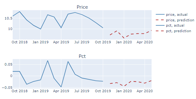
完整代码:
# imports
from plotly.subplots import make_subplots
import plotly.graph_objects as go
import pandas as pd

# your data
df = pd.DataFrame({'date': {0: '2018-09',
                          1: '2018-10',
                          2: '2018-11',
                          3: '2018-12',
                          4: '2019-01',
                          5: '2019-02',
                          6: '2019-03',
                          7: '2019-04',
                          8: '2019-05',
                          9: '2019-06',
                          10: '2019-07',
                          11: '2019-08',
                          12: '2019-09',
                          13: '2019-10',
                          14: '2019-11',
                          15: '2019-12',
                          16: '2020-01',
                          17: '2020-02',
                          18: '2020-03',
                          19: '2020-04',
                          20: '2020-05'},
                         'price': {0: 10.599,
                          1: 10.808,
                          2: 10.418,
                          3: 10.166,
                          4: 9.995,
                          5: 10.663,
                          6: 10.559000000000001,
                          7: 10.055,
                          8: 10.690999999999999,
                          9: 10.765999999999998,
                          10: 10.667,
                          11: 10.504000000000001,
                          12: 10.284,
                          13: 10.047,
                          14: 9.717,
                          15: 9.908,
                          16: 9.57,
                          17: 9.754,
                          18: 9.779,
                          19: 9.777000000000001,
                          20: 9.932},
                         'pct': {0: 0.02,
                          1: 0.02,
                          2: -0.036000000000000004,
                          3: -0.024,
                          4: -0.017,
                          5: 0.067,
                          6: -0.01,
                          7: -0.048,
                          8: 0.063,
                          9: 0.006999999999999999,
                          10: -0.009000000000000001,
                          11: -0.015,
                          12: -0.021,
                          13: -0.023,
                          14: -0.033,
                          15: -0.028999999999999998,
                          16: -0.045,
                          17: -0.023,
                          18: -0.025,
                          19: -0.031,
                          20: -0.02}})

# make timestamp to make plotting easier
df['timestamp']=pd.to_datetime(df['date'])
df=df.set_index('timestamp')

# split data
df_predict = df.loc['2019-11':]
df_actual = df[~df.isin(df_predict)].dropna()


# plotly setup
fig = make_subplots(rows=2,
                    cols=1,
                    subplot_titles=('Price',  'Pct'))

# Price, actual
fig.add_trace(go.Scatter(x=df_actual.index, y=df_actual['price'],
                         name = "price, actual",
                         mode='lines',
                         line=dict(color='steelblue', width=2)
                        )
              ,row=1, col=1)

# Price, prediction
fig.add_trace(go.Scatter(x=df_predict.index, y=df_predict['price'],
                         name = "price, prediction",
                         mode='lines',
                         line=dict(color='firebrick', width=2, dash='dash')
                        ),
                         row=1, col=1)

# pct actual
fig.add_trace(go.Scatter(x=df_actual.index, y=df_actual['pct'],
                         mode='lines',
                         name = "pct, actual",
                         line=dict(color='steelblue', width=2)
                        )
              ,row=2, col=1)

# pct prediction
fig.add_trace(go.Scatter(x=df_predict.index, y=df_predict['pct'],
                         name="pct, prediction",
                         mode='lines',
                         line=dict(color='firebrick', width=2, dash='dash')
                        ),
                         row=2, col=1)

fig.show()Stack Overflow用户
发布于 2019-12-05 05:21:43
如果尺寸不同,可以尝试使用子图分别打印数据。在matplotlib网站上有关于子图的文档和教程。
df = df.set_index('date')
plt.subplot(211)
plt.plot('date', 'rent_price', data=df.loc['2018-09':'2019-11'], marker='o', color='green', linewidth=2)
plt.xlabel('Observed')
plt.subplot(212)
plt.plot('date', 'rent_price', data=df.loc['2019-12':], marker='o', color='green', linewidth=2, linestyle = '--')
plt.xlabel('Predicted')
plt.show()页面原文内容由Stack Overflow提供。腾讯云小微IT领域专用引擎提供翻译支持
原文链接:
https://stackoverflow.com/questions/59187441
复制相关文章
相似问题
腾讯云开发者

Copyright © 2013 - 2026 Tencent Cloud. All Rights Reserved. 腾讯云 版权所有
深圳市腾讯计算机系统有限公司 ICP备案/许可证号:粤B2-20090059 ![]() 粤公网安备44030502008569号
粤公网安备44030502008569号
腾讯云计算(北京)有限责任公司 京ICP证150476号 | 京ICP备11018762号