
一个完美的角度材料底部肚脐。有我遗漏的部件吗?
我正在尝试实现一个移动风格的底部导航栏。为此,我使用了mat工具栏,并使用css将其固定在底部,如下所示:
component.html:
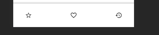
<mat-toolbar class="toolbarNav">
    <mat-icon class="material-icons color_blue" (click)="getTopArtists('long_term' , 0 , 100)">
        star_border</mat-icon>
    <mat-icon class="material-icons color_blue" (click)="getTopTracks('long_term' , 0 , 100)">favorite_border
    </mat-icon>
    <mat-icon class="material-icons color_blue" (click)="recentlyPlayed()">history</mat-icon>
</mat-toolbar>
component.css
.toolbarNav{
    position: fixed;
    bottom: 0;
    z-index: 1000;
    display: flex;
    justify-content: space-between;
    padding: 2em;
    background-color: white;

  -webkit-box-shadow: 3px 3px 5px 6px #ccc;  /* Safari 3-4, iOS 4.0.2 - 4.2, Android 2.3+ */
  -moz-box-shadow:    3px 3px 5px 6px #ccc;  /* Firefox 3.5 - 3.6 */
   box-shadow:        2px 2px 4px 5px #ccc;  /* Opera 10.5, IE 9, Firefox 4+, Chrome 6+, iOS 5 */
}
以下是呈现:
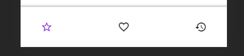
当用户悬停在图标上时,我使用css :hover突出显示图标,如下所示:
.material-icons.color_blue:hover {
  color: blueviolet;
}
渲染:
我想达到的目标是:
- 当我单击/悬停在一个图标上时,它应该突出显示,我确实通过上面的代码实现了这一点,但是,当单击/悬停在任何其他地方时,除了工具栏中的其他图标之外,它不应该取消突出显示。
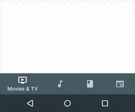
- 我希望在图标下面显示一些文本,如:
我尝试使用<span>并使用css定位文本,但是它看起来很奇怪,而且没有正确地对齐。另外,使用css是做上述事情的唯一方法吗?我对任何其他方式都持开放态度。也许是一个具有类似组件的UI库?
对我想要达到的目标进行类似的渲染:
回答 3
Stack Overflow用户
发布于 2021-09-07 22:19:40
只是在stackblitz中添加一个示例,这应该是这样的一个好的开始。
我不是百分之百肯定你想要的第一点,但我认为你想要活动按钮有一个颜色来表示这一点。为了做到这一点,我使用了Abhishek的建议使用RouterLink和RouterLinkActive。通过添加routerLinkActive="active-link",这意味着当路径匹配时,类将被添加到该元素中,并且可以相应地进行样式设置。
对于图标下的文本,我只是让它始终显示,与提供的示例不同,但是如果您希望它仅在活动时显示,则可以对其进行修改。这是通过使按钮成为具有flex方向的列的flex容器来完成的。
https://stackblitz.com/edit/angular-9-material-starter-par7le?file=src/app/app.component.html
.toolbarNav {
  position: fixed;
  bottom: 0;
  z-index: 1000;
  display: flex;
  justify-content: space-around;
  padding: 2em;
  background-color: white;

  -webkit-box-shadow: 3px 3px 5px 6px #ccc; /* Safari 3-4, iOS 4.0.2 - 4.2, Android 2.3+ */
  -moz-box-shadow: 3px 3px 5px 6px #ccc; /* Firefox 3.5 - 3.6 */
  box-shadow: 2px 2px 4px 5px #ccc; /* Opera 10.5, IE 9, Firefox 4+, Chrome 6+, iOS 5 */

  button {
    display: flex;
    flex-direction: column;
    align-items: center;
    width: 100%;
    span {
      display: block;
    }
  }
}

button:hover,
.active-link {
  color: blueviolet;
}<mat-toolbar class="toolbarNav">
<button mat-flat-button routerLink="/top-artists" routerLinkActive="active-link">
<mat-icon class="material-icons color_blue">
star_border</mat-icon>
<span>Top Artists</span>
</button>
<button mat-flat-button routerLink="/top-tracks" routerLinkActive="active-link">
<mat-icon class="material-icons color_blue">favorite_border
</mat-icon>
<span>Top Tracks</span>
</button>
<button mat-flat-button routerLink="/history" routerLinkActive="active-link">
<mat-icon class="material-icons color_blue">history</mat-icon>
<span>History</span>
</button>
</mat-toolbar>
Stack Overflow用户
发布于 2020-08-31 04:09:36
而不是调用函数在路由之间导航,而是使用用于导航的路由链接和routerlinkActive来检查激活的路由并相应地编写css。
Stack Overflow用户
发布于 2021-03-16 22:47:39
您可以使用事件检测和一些js。这是这个概念的一个超级简单的例子:
const icons = document.getElementsByClassName('iconX')
const clearIcons = () =>{
  for (const icon of icons) {
    icon.classList.remove('active')
  }
}
for (const icon of icons) {
  icon.addEventListener('mouseenter', (event)=>{
     clearIcons();
     event.target.classList.add('active')
  })
}.iconX{
width: fit-content;
}
.iconX.active{
color: red;
}<div class="iconX">HELLO</div>
<div class="iconX">HELLO</div>
<div class="iconX">HELLO</div>
<div class="iconX">HELLO</div>
<div class="iconX">HELLO</div>
<div class="iconX">HELLO</div>
<div class="other content">This is different content , not a tab icon</div>
<button class="non important button">If you click me, you don´t loose the active status of your tabs</div>
https://stackoverflow.com/questions/59517796
复制相似问题
腾讯云开发者

Copyright © 2013 - 2026 Tencent Cloud. All Rights Reserved. 腾讯云 版权所有
深圳市腾讯计算机系统有限公司 ICP备案/许可证号:粤B2-20090059  粤公网安备44030502008569号
腾讯云计算(北京)有限责任公司 京ICP证150476号 | 京ICP备11018762号