
单细胞分析中的叠加条形图
我正试图用下面的代码用ggplot2绘制一个堆叠的桶形图
barplot <- ggplot() + geom_bar(aes(y = percentage, x = TBD, fill = TBD), data = charts.data, stat="identity")我想为我的单细胞分析创建一个条形图,它有两个条件,一个是经过处理的,一个是未经处理的。我想要显示的是,在每个条件下,不同的单元格类型所占的百分比,看看处理后是否会对不同的单元类型产生影响。
如何在每种情况下确定每种单元格类型的百分比,然后再绘制桶形图?
dput(head(comparison))的输出
structure(c(6051L, 1892L, 1133L, 893L, 148L, 868L, 5331L, 3757L,
1802L, 1061L, 2786L, 704L), .Dim = c(6L, 2L), .Dimnames = structure(list(c("Fibroblast", "T cell", "Macrophage", "Stellate", "Acinar", "Endothelial"), c("treated", "untreated")), .Names = c("",
"")), class = "table")dput(head(cell_cycle_data))的输出
structure(list(orig.ident = c("treated", "treated", "treated",
    "treated", "treated", "treated"), nCount_RNA = c(1892, 307, 1348,
    3699, 4205, 4468), nFeature_RNA = c(960L, 243L, 765L, 1612L,
    1341L, 1644L), percent.mt = c(0.211416490486258, 1.62866449511401,
    4.45103857566766, 4.4065963773993, 0.0713436385255648, 3.87197851387645
    ), RNA_snn_res.0.5 = structure(c(11L, 11L, 5L, 6L, 11L, 13L), .Label = c("0", "1", "2", "3", "4", "5", "6", "7", "8", "9", "10", "11", "12",
    "13", "14", "15", "16", "17", "18", "19"), class = "factor"), seurat_clusters = structure(c(11L, 11L, 5L, 6L, 11L, 13L), .Label = c("0", "1", "2", "3", "4", "5", "6", "7", "8", "9", "10", "11", "12", "13", "14", "15", "16", "17", "18", "19"), class = "factor"), S.Score = c(0.476893835992198, -0.0200784617568548, -0.0335915198305002, -0.0247184276246385, 0.010785196602457, 0.0190008903712199), G2M.Score = c(0.204441469200986, 0.173804859670862, -0.0313235510969097, -0.0376796363661889, -0.0559526905696905, -0.0122031631356698), Phase = structure(c(3L, 2L, 1L, 1L, 3L, 3L), .Label = c("G1", "G2M", "S"), class = "factor"), old.ident = structure(c(7L,7L, 1L, 4L, 7L, 9L), .Label = c("Fibroblast", "T cell", "Macrophage", "Stellate", "Acinar", "Endothelial", "Tumor", "B cell", "Mast cell", "Ductal", "Islets of Langerhans"), class = "factor")), row.names = c("treated_AAACGCTAGCGGGTTA-1", "treated_AAAGGTAAGTACAGAT-1", "treated_AAAGTGAGTTTGATCG-1", "treated_AAATGGACAAAGTGTA-1",
"treated_AACAAAGGTCGACTTA-1", "treated_AACAGGGTCCTAGCCT-1"), class = "data.frame")dput(tail(comparison))的输出
structure(list(orig.ident = c("untreated", "untreated", "untreated",
"untreated", "untreated", "untreated"), nCount_RNA = c(901, 823,
1184, 1835, 1147, 1407), nFeature_RNA = c(482L, 479L, 649L, 1043L,
604L, 709L), percent.mt = c(1.77580466148724, 2.91616038882138,
4.22297297297297, 3.86920980926431, 2.0052310374891, 4.05117270788913
), RNA_snn_res.0.5 = structure(c(7L, 7L, 7L, 14L, 7L, 7L), .Label = c("0",
"1", "2", "3", "4", "5", "6", "7", "8", "9", "10", "11", "12",
"13", "14", "15", "16", "17", "18", "19"), class = "factor"),
    seurat_clusters = structure(c(7L, 7L, 7L, 14L, 7L, 7L), .Label = c("0",
    "1", "2", "3", "4", "5", "6", "7", "8", "9", "10", "11",
    "12", "13", "14", "15", "16", "17", "18", "19"), class = "factor"),
    S.Score = c(-0.0320858200243315, 0.0304725660342869, 0.0215996091745327,
    0.0384166213301423, 0.144956251122548, -0.0242770509986111
    ), G2M.Score = c(0.0904224391544142, 0.050148242050667, -0.0178041670730754,
    -0.0112596867977946, -0.0519554524339088, -0.0136533184257381
    ), Phase = structure(c(2L, 2L, 3L, 3L, 3L, 1L), .Label = c("G1",
    "G2M", "S"), class = "factor"), old.ident = structure(c(5L,
    5L, 5L, 5L, 5L, 5L), .Label = c("Fibroblast", "T cell", "Macrophage",
    "Stellate", "Acinar", "Endothelial", "Tumor", "B cell", "Mast cell",
    "Ductal", "Islets of Langerhans"), class = "factor")), row.names = c("untreated_TTTGGTTGTCTAATCG-18",
"untreated_TTTGGTTTCCCGAGGT-18", "untreated_TTTGTTGAGAACTGAT-18",
"untreated_TTTGTTGAGCTCGGCT-18", "untreated_TTTGTTGAGTGCCTCG-18",
"untreated_TTTGTTGCACGGTGCT-18"), class = "data.frame")回答 1
Stack Overflow用户
发布于 2020-01-12 05:53:14
如果不知道数据的结构,就很难猜出示例的好代码是什么。
但是,如果我们假设每个条件都有,那么您就有一个单个单元格的列表,每个单元格都有对应于它们的单元格类型的特定标签,如下面的示例:
set.seed(123)
Untreated <- data.frame(Cell_Type = sample(LETTERS[1:4],10, replace = TRUE))
Treated <- data.frame(Cell_Type =sample(LETTERS[1:4],25, replace = TRUE))

  Cell_Type
1         C
2         C
3         C
4         B
5         C
6         B
... ...您可以使用dplyr进行第一次bind_rows
library(dplyr)
Untreated <- Untreated %>% mutate(Condition = "Untreated")
Treated <- Treated %>% mutate(Condition = "Treated")
DF <- bind_rows(Untreated, Treated)
Cell_Type Condition
1 C Untreated
2 C Untreated
3 C Untreated
4 B Untreated
5 C Untreated
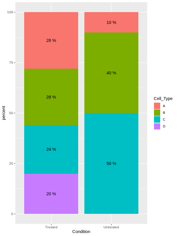
6 B Untreated然后,您可以将每个单元格类型的数量计数到每个条件中,并将其表示为百分比:
DF <- DF %>% group_by(Condition, Cell_Type) %>%
  summarise(Nb = n()) %>%
  mutate(C = sum(Nb)) %>%
  mutate(percent = Nb/C*100)

# A tibble: 7 x 5
# Groups:   Condition [2]
  Condition Cell_Type    Nb     C percent
  <chr>     <chr>     <int> <int>   <dbl>
1 Treated   A             7    25     28.
2 Treated   B             7    25     28.
3 Treated   C             6    25     24
4 Treated   D             5    25     20
5 Untreated A             1    10     10
6 Untreated B             4    10     40
7 Untreated C             5    10     50
然后,您可以将结果绘制为每个条件的叠加条形图,并根据Cell_Type填充每种颜色:
library(ggplot2)
ggplot(DF, aes(x = Condition, y = percent, fill = Cell_Type))+
  geom_bar(stat = "identity")+
  geom_text(aes(label = paste(percent,"%")), position = position_stack(vjust = 0.5))
编辑:使用OP提供的数据绘图
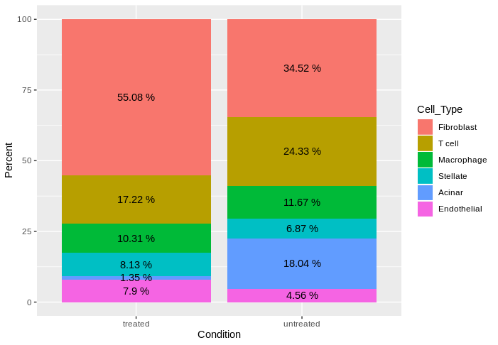
使用您在问题中提供的数据,您可以:
df <- structure(c(6051L, 1892L, 1133L, 893L, 148L, 868L, 5331L, 3757L,
            1802L, 1061L, 2786L, 704L), .Dim = c(6L, 2L), .Dimnames = structure(list(c("Fibroblast", "T cell", "Macrophage", "Stellate", "Acinar", "Endothelial"), c("treated", "untreated")), .Names = c("",
                                                                                                                                                                                                          "")), class = "table")
df <- data.frame(df)
它提供了以下数据:
          Var1      Var2 Freq
1   Fibroblast   treated 6051
2       T cell   treated 1892
3   Macrophage   treated 1133
4     Stellate   treated  893
5       Acinar   treated  148
6  Endothelial   treated  868
7   Fibroblast untreated 5331
8       T cell untreated 3757
9   Macrophage untreated 1802
10    Stellate untreated 1061
11      Acinar untreated 2786
12 Endothelial untreated  704
然后,您可以重命名列,为每个条件计算每种单元格类型的百分比:
library(dplyr)
DF <- df %>% rename(Cell_Type = Var1, Condition = Var2) %>%
  group_by(Condition) %>%
  mutate(Percent = Freq / sum(Freq)*100)

# A tibble: 12 x 4
# Groups:   Condition [2]
   Cell_Type   Condition  Freq Percent
   <fct>       <fct>     <int>   <dbl>
 1 Fibroblast  treated    6051   55.1
 2 T cell      treated    1892   17.2
 3 Macrophage  treated    1133   10.3
 4 Stellate    treated     893    8.13
 5 Acinar      treated     148    1.35
 6 Endothelial treated     868    7.90
 7 Fibroblast  untreated  5331   34.5
 8 T cell      untreated  3757   24.3
 9 Macrophage  untreated  1802   11.7
10 Stellate    untreated  1061    6.87
11 Acinar      untreated  2786   18.0
12 Endothelial untreated   704    4.56
然后,对于作图部分:
library(ggplot2)
ggplot(DF, aes(x = Condition, y = Percent, fill = Cell_Type))+
  geom_bar(stat = "identity")+
  geom_text(aes(label = paste(round(Percent,2),"%")), position = position_stack(vjust =  0.5))
它能回答你的问题吗?
https://stackoverflow.com/questions/59699523
复制相似问题
腾讯云开发者

Copyright © 2013 - 2026 Tencent Cloud. All Rights Reserved. 腾讯云 版权所有
深圳市腾讯计算机系统有限公司 ICP备案/许可证号:粤B2-20090059 ![]() 粤公网安备44030502008569号
粤公网安备44030502008569号
腾讯云计算(北京)有限责任公司 京ICP证150476号 | 京ICP备11018762号