
plt.imshow()图形的yticks标签对齐
plt.imshow()图形的yticks标签对齐
提问于 2020-01-18 18:04:26
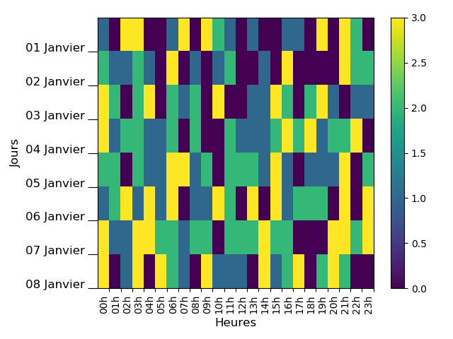
我有一个pb与刻度的标签对齐一个不显眼的数字。我想把标签集中在两个Y-蜱之间,但我没有成功.我知道我们可以找到很多例子(包括在StackOverflow中),但是我没有找到我想要的东西。
import datetime
dateFMT = '%Y-%m-%d %H:%M:%S'
import pandas as pd
import numpy as np

import matplotlib.pyplot as plt
# Fontsize
ftsize = 12

# - Months in French
tabMois=['Janvier','Fevrier','Mars','Avril','Mai','Juin','Juillet','Aout','Septembre',
 'Octobre','Novembre','Decembre']

# - Nb of Days of Measurements
NbOfDays = 7.99

# - Generating a DateTimeIndex from January the 1st and during ~8 days
start = datetime.datetime.strptime('2020-01-01 00:00:00', dateFMT)
end = start + datetime.timedelta(days=NbOfDays)
times = pd.date_range(freq='60Min', start=start, end=end)

# - Total number of values
NbOfDates = len (times)

# - Creating the dataframe with random values
df = pd.DataFrame(np.random.randint(0,4,size=(NbOfDates, 1)),
                  columns=['Temperature'], index=times)

# - Creating 2 columns for referencing dates and hours
date = [d.strftime('%d/%m') for d in df.index]
df['jour'] = date
heure = [d.strftime('%H') for d in df.index]
df['heure'] = heure

# - Creating a new DataFrame (dfPivot) containing the matrix of the previous
# Dataframe
dfPivot = df.pivot(index='jour', columns='heure', values='Temperature')

# - X Labels for the plot
XTicksLabels = [ str(i)+'h' for i in dfPivot.columns ]

# - Small function to split days and monthes and to translate in French
def splitDate( i ):
    day = i.split('/')[0]
    month = int(i.split('/')[1])
    monthInFrench = tabMois[month-1]
    label = str(day)+' '+monthInFrench
    return label

# - Y Labels for the plot
YTicksLabels = [ splitDate( i ) for i in dfPivot.index ]

# - Plot
fig, ax = plt.subplots()

im = ax.imshow(dfPivot, aspect = 'auto', interpolation='None')

ax.xaxis.set(ticks=np.arange(0.5, len(XTicksLabels)), ticklabels=XTicksLabels)
ax.set_xticklabels(XTicksLabels, rotation=90, ha='right', minor=False)

ax.yaxis.set(ticks=np.arange(0.5, len(YTicksLabels)), ticklabels=YTicksLabels)
ax.set_yticklabels(YTicksLabels, rotation=0, ha='right', va = 'baseline',
                   minor=False, fontsize=ftsize)

ax.tick_params('y', length=10)
fig.colorbar(im)

plt.ylabel('Jours', size=ftsize)
plt.xlabel('Heures', size=ftsize)

plt.tight_layout()
plt.show()
由代码生成的图像。
回答 2
Stack Overflow用户
回答已采纳
发布于 2020-01-18 19:00:10
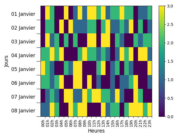
基于this的答案,您应该能够使用,
# Create offset transform by 5 points in y direction
dx = 0/72.; dy = 10/72.
offset = matplotlib.transforms.ScaledTranslation(dx, dy, fig.dpi_scale_trans)

# apply offset transform to all x ticklabels.
for label in ax.yaxis.get_majorticklabels():
    label.set_transform(label.get_transform() + offset)
作为一个使用您的数据的完整示例,
import datetime
dateFMT = '%Y-%m-%d %H:%M:%S'
import pandas as pd
import numpy as np
import matplotlib.transforms
import matplotlib.pyplot as plt
# Fontsize
ftsize = 12

# - Months in French
tabMois=['Janvier','Fevrier','Mars','Avril','Mai','Juin','Juillet','Aout','Septembre','Octobre','Novembre','Decembre']

# - Nb of Days of Measurements
NbOfDays = 7.99

# - Generating a DateTimeIndex from January the 1st and during ~8 days
start = datetime.datetime.strptime('2020-01-01 00:00:00', dateFMT)
end = start + datetime.timedelta(days=NbOfDays)
times = pd.date_range(freq='60Min', start=start, end=end)

# - Total number of values
NbOfDates = len (times)

# - Creating the dataframe with random values
df = pd.DataFrame(np.random.randint(0,4,size=(NbOfDates, 1)), columns=['Temperature'], index=times)

# - Creating 2 columns for referencing dates and hours
date = [d.strftime('%d/%m') for d in df.index]
df['jour'] = date
heure = [d.strftime('%H') for d in df.index]
df['heure'] = heure

# - Creating a new DataFrame (dfPivot) containing the matrix of the previous
# Dataframe
dfPivot = df.pivot(index='jour', columns='heure', values='Temperature')

# - X Labels for the plot
XTicksLabels = [ str(i)+'h' for i in dfPivot.columns ]

# - Small function to split days and monthes and to translate in French
def splitDate( i ):
    day = i.split('/')[0]
    month = int(i.split('/')[1])
    monthInFrench = tabMois[month-1]
    label = str(day)+' '+monthInFrench
    return label

# - Y Labels for the plot
YTicksLabels = [ splitDate( i ) for i in dfPivot.index ]

# - Plot
fig, ax = plt.subplots()

im = ax.imshow(dfPivot, aspect = 'auto', interpolation='None')

ax.xaxis.set(ticks=np.arange(0.5, len(XTicksLabels)), ticklabels=XTicksLabels)
ax.set_xticklabels(XTicksLabels, rotation=90, ha='right', minor=False)

ax.yaxis.set(ticks=np.arange(0.5, len(YTicksLabels)), ticklabels=YTicksLabels)
ax.set_yticklabels(YTicksLabels, rotation=0, ha='right', va = 'baseline', minor=False, fontsize=ftsize)

ax.tick_params('y', length=10)
fig.colorbar(im)

plt.ylabel('Jours', size=ftsize)
plt.xlabel('Heures', size=ftsize)

# Create offset transform by 5 points in y direction
dx = 0/72.; dy = 10/72.
offset = matplotlib.transforms.ScaledTranslation(dx, dy, fig.dpi_scale_trans)

# apply offset transform to all x ticklabels.
for label in ax.yaxis.get_majorticklabels():
    label.set_transform(label.get_transform() + offset)

plt.tight_layout()
plt.show()
这给了,
Stack Overflow用户
发布于 2020-01-18 19:09:35
这样试一试:
- 将挠号移高一点(例如0.1)。
- 使用小滴答在两天之间进行更大的间隔,将它们放置在主要蜱类之前的位置。
- 通过将它们的长度设置为零来去除主要的滴答记号。
ax.yaxis.set(ticks=np.arange(0.1, len(YTicksLabels)), ticklabels=YTicksLabels)
ax.set_yticks(ticks=np.arange(0.5, len(YTicksLabels)), minor=True)
ax.tick_params(axis='y', which='minor', length=10)
ax.tick_params(axis='y', which='major', length=0)页面原文内容由Stack Overflow提供。腾讯云小微IT领域专用引擎提供翻译支持
原文链接:
https://stackoverflow.com/questions/59803396
复制相关文章
相似问题
腾讯云开发者

Copyright © 2013 - 2026 Tencent Cloud. All Rights Reserved. 腾讯云 版权所有
深圳市腾讯计算机系统有限公司 ICP备案/许可证号:粤B2-20090059 ![]() 粤公网安备44030502008569号
粤公网安备44030502008569号
腾讯云计算(北京)有限责任公司 京ICP证150476号 | 京ICP备11018762号