
如何用Excel在R中绘制多行数据
我对R有点陌生,有没有办法把ColA画成X轴,把ColB画成y轴,把ColC画成X轴,把ColD画成y轴等等。所有配对的科尔都有相同的名字(例如,ColA=Dis和Colb = hard,ColC=Dis和COLd= hard等等)。基本上,我所做的是,我把不同的表格中的所有Dis和硬数据合并成一个数据表,然后我想我可以用excel来绘制它,然而,excel只能以一个图形显示255条曲线,而我可能有1000条曲线。然后我的数据集看起来如下:
A、B、C、D、E、F、G、H.
很难..。
1 3 4 6 9 11 15 20
3 4 6 9 11 22 25
依此类推,我尝试了以下代码:
nwb1<-read.xlsx("newresult.xlsx")
nwb1<-as.data.frame(nwb1)
ggplot(data=nwb1, aes(x=displacement, y=hardness)) + geom_line() + geom_point( size=4, shape=21, fill="white")
错误消息告诉我,“数据`必须唯一命名,但有重复的列”
回答 1
Stack Overflow用户
发布于 2020-01-20 00:05:28
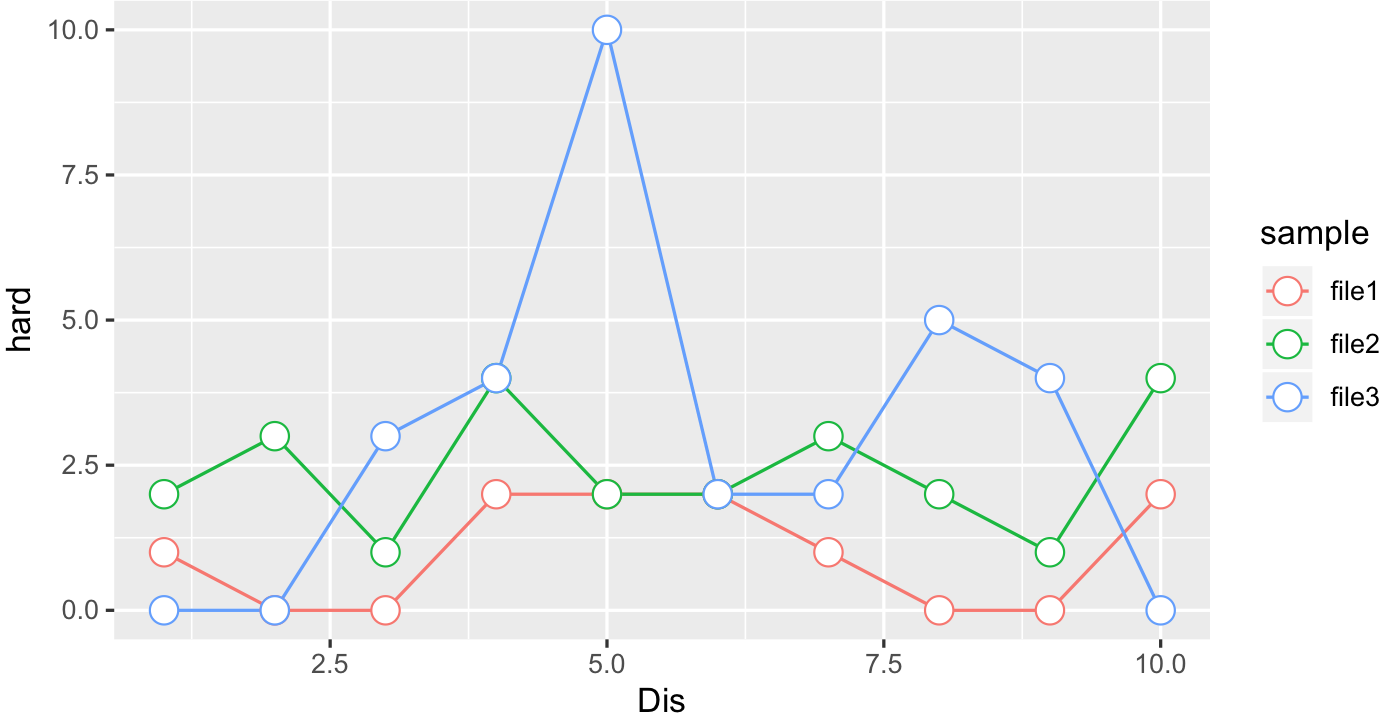
让我们尝试这样的方法,我没有您的数据,所以为了举例说明,我首先创建了3个excel文件,每个文件都有一个列调用Dis,另一个调用很难:
library(openxlsx)
for(i in 1:3){
df = data.frame(Dis=1:10,hard=rpois(10,i))
write.xlsx(df,file=paste("file",i,".xlsx",sep=""))
}
现在,我们从创建所有要绘制的excel文件的向量开始:
fl = c("file1.xlsx","file2.xlsx","file3.xlsx")
df = lapply(fl,function(i){
x = read.xlsx(i)
x$sample=sub(".xlsx","",i)
x
})

df = do.call(rbind,df)
head(df)
  Dis hard sample
1   1    1  file1
2   2    0  file1
3   3    0  file1
4   4    2  file1
5   5    2  file1
6   6    2  file1
dataframe是从所有excel文件中连接起来的,并且有一个额外的列调用示例来表示它来自的文件。如果读取/组合文件有更多问题,也可以在excel中创建这样的表。一旦你有了这样的东西,我们就会策划:
ggplot(data=df, aes(x=Dis, y=hard,col=sample)) + geom_line() +
geom_point( size=4, shape=21, fill="white")
如果您已经将数据与excel合并,您将在一个非常奇怪的data.frame中读取,您可以尝试以下操作,即not推荐的:
values = do.call(cbind,lapply(1:5,function(i)cbind(1:10,1:10+rnorm(10))))
df = data.frame(rbind(rep(c("Dis","hard"),5),values))
colnames(df)=LETTERS[1:10]
head(df)
    A                B   C                 D   E                 F   G
1 Dis             hard Dis              hard Dis              hard Dis
2   1 1.09836250501178   1 0.350206285061174   1 0.620196066920137   1
3   2 1.81400395465058   2   4.2990376623795   2  1.00810320999903   2
4   3 3.94001753647332   3  3.32736042411927   3  3.23285030270875   3
5   4 3.93795305230344   4  4.14948397718842   4  3.88849871990867   4
6   5 5.08952019766558   5  5.18257115670042   5  4.72275692563252   5
                 H   I                J
1             hard Dis             hard
2 1.08603311982134   1 0.51876628213101
3 1.38614529438877   2 1.73020370187464
4 2.70650988128661   3 4.65143843701136
5 3.26676976653313   4 5.17606099966858
6 5.00453246607507   5 6.72671659884557

newdf = data.frame(
Dis=as.numeric(unlist(lapply(df[-1,df[1,] == "Dis"],as.character))),
hard=as.numeric(unlist(lapply(df[-1,df[1,] == "hard"],as.character))),
group = rep(1:(ncol(df)/2),each=nrow(df)-1)
)
ggplot(newdf,aes(x=Dis,y=hard,group=group))+geom_line()https://stackoverflow.com/questions/59814860
复制相似问题
腾讯云开发者

Copyright © 2013 - 2026 Tencent Cloud. All Rights Reserved. 腾讯云 版权所有
深圳市腾讯计算机系统有限公司 ICP备案/许可证号:粤B2-20090059 ![]() 粤公网安备44030502008569号
粤公网安备44030502008569号
腾讯云计算(北京)有限责任公司 京ICP证150476号 | 京ICP备11018762号