
使用R中usmap包中的plot_usmap绘制同一地图上的州和县边界
我想要创建一个美国地图,显示州和县的边界(即不同颜色的州边界)。我通常使用导入的形状文件或使用ggplot2的map_data函数来实现这一点,但是,我面临三个障碍。
1)我无法在我的计算环境中安装gdal和geos,以避免使用任何形状文件或GeoJSON文件(我使用fastshp加载的县级形状文件的映射尝试没有成功,但我愿意使用任何解决方案来复制下面的地图,但包含州边界)。
2)我需要包括夏威夷和阿拉斯加,这样ggplot2就不允许使用ggplot2了。
3)我需要地图同时包含州和县边界,这使得usmap包的使用成为ggplot2的包装函数,但不具备定制到原始ggplot2对象级别的方便和通用能力。
4)另外,不能使用sf包bc,它具有非R库依赖关系(units包依赖于C库libudunits2)。
我需要的是:一张地图,可以投射阿拉斯加和夏威夷,并使用对比颜色显示州和县的边界,我需要完成所有这一切,而不需要使用任何依赖rgeos、rgdal和/或units的包。
到目前为止,我尝试过从plot_usmap包中提取usmap:
library(dplyr)
library(stringr)
library(ggplot2)
library(usmap)
library(mapproj)
devtools::install_github("wmurphyrd/fiftystater")
library(fiftystater)

county_data<-read.csv("https://www.ers.usda.gov/webdocs/DataFiles/48747/PovertyEstimates.csv?v=2529") %>% #
  filter(Area_name != "United States") %>%
  select(FIPStxt, Stabr, Area_name, PCTPOVALL_2017) %>%
  rename(fips = FIPStxt)
crimes <- data.frame(state = tolower(rownames(USArrests)), USArrests)
state_map <- map_data("state")

plot_usmap(data = county_data, values = "PCTPOVALL_2017", color = "white") +
  geom_map(data = crimes, aes(map_id = state), map = fifty_states, color= "red") +
  geom_path(data = state_map, aes(x =long , y=lat), color= "red")+
  expand_limits(x = fifty_states$long, y = fifty_states$lat) +
  theme(legend.position = "none") +
  theme_map() #no go

plot_usmap(data = county_data, values = "PCTPOVALL_2017", color = "white") +
  geom_map(data = crimes, aes(map_id = state), map = fifty_states, color= "red") +
  expand_limits(x = fifty_states$long, y = fifty_states$lat) +
  theme(legend.position = "none") +
  theme_map() #no go

plot_usmap(data = county_data, values = "PCTPOVALL_2017", color = "white") +
  geom_map(data = crimes, aes(map_id = state, color= "red"), map = fifty_states) +
  expand_limits(x = fifty_states$long, y = fifty_states$lat) +
  theme(legend.position = "none") +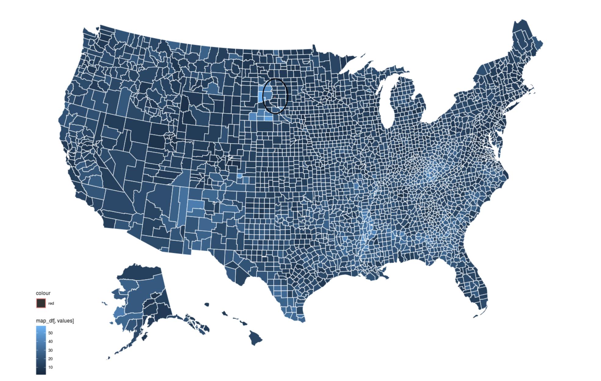
theme_map() #no go我怀疑发生的情况是,一个层(原始的ggplot代码)是使用与另一层-generated不同的plot_usmap系统投射的。第二层的结果是一个很小的红色点(见下图中的圆圈)。不确定如何在没有安装geos/gdal的情况下重新设计。请参阅下面的地图,黑圈突出显示红点所在的位置。
回答 1
Stack Overflow用户
发布于 2020-02-05 22:10:58
好吧,经过一些来自包作者的建议和我自己的一些修补,我终于能够得到我想要的输出。
这种方法是理想的,人们希望生成美国地图w/阿拉斯加和夏威夷,包括谁.
1)无法在其R引擎运行的环境中安装非R包(例如缺少管理权限)
( 2)需要用对比颜色来绘制县和州的边界。
library(dplyr)
library(ggplot2)
library(usmap)

#Example data (poverty rates)
county_data<-read.csv("https://www.ers.usda.gov/webdocs/DataFiles/48747/PovertyEstimates.csv?v=2529") %>% #
  filter(Area_name != "United States") %>%
  select(FIPStxt, Stabr, Area_name, PCTPOVALL_2018) %>%
  rename(fips = FIPStxt)

states <- plot_usmap("states",
                     color = "red",
                     fill = alpha(0.01)) #this parameter is necessary to get counties to show on top of states
counties <- plot_usmap(data = county_data,
                       values = "PCTPOVALL_2018",
                       color = "black",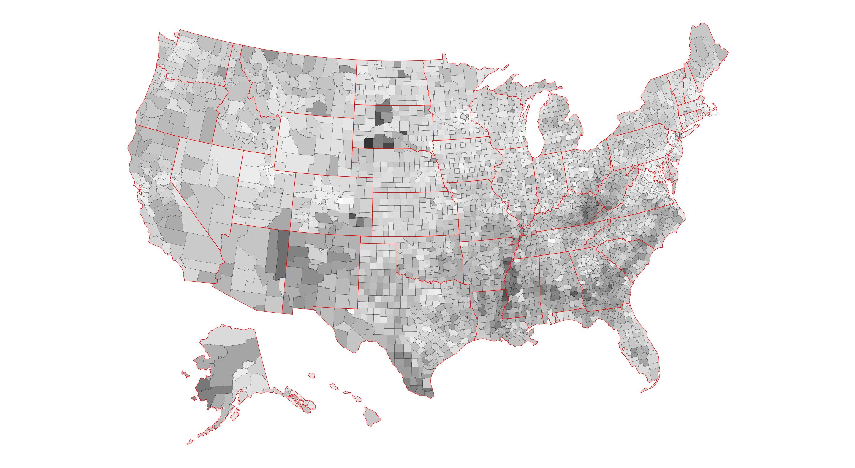
size = 0.1)使用已嵌入us_map数据中的图层元信息
ggplot() +
  counties$layers[[1]] + #counties needs to be on top of states for this to work
  states$layers[[1]] +
  counties$theme +
  coord_equal() +
  theme(legend.position="none") +
scale_fill_gradient(low='white', high='grey20') #toggle fill schema using vanilla ggplot scale_fill function仅使用从us_map包获得的原始数据
ggplot() +
  geom_polygon(data=counties[[1]],
               aes(x=x,
                   y=y,
                   group=group,
                   fill = counties[[1]]$PCTPOVALL_2018),
               color = "black",
               size = 0.1) +
  geom_polygon(data=states[[1]],
               aes(x=x,
                   y=y,
                   group=group),
               color = "red",
               fill = alpha(0.01)) +
  coord_equal() +
  theme_map() +
  theme(legend.position="none") +
  scale_fill_gradient(low='white', high='grey20')
https://stackoverflow.com/questions/59851823
复制相似问题
腾讯云开发者

Copyright © 2013 - 2026 Tencent Cloud. All Rights Reserved. 腾讯云 版权所有
深圳市腾讯计算机系统有限公司 ICP备案/许可证号:粤B2-20090059 ![]() 粤公网安备44030502008569号
粤公网安备44030502008569号
腾讯云计算(北京)有限责任公司 京ICP证150476号 | 京ICP备11018762号