
在角谷歌图中向烛台添加散点图
在角谷歌图中向烛台添加散点图
提问于 2020-01-27 14:22:27
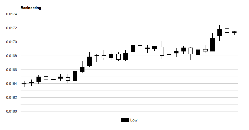
我用角谷歌图来显示烛台图表。目前的情况如下:
我想为我的回溯增加代表买卖订单的积分。就像这样:
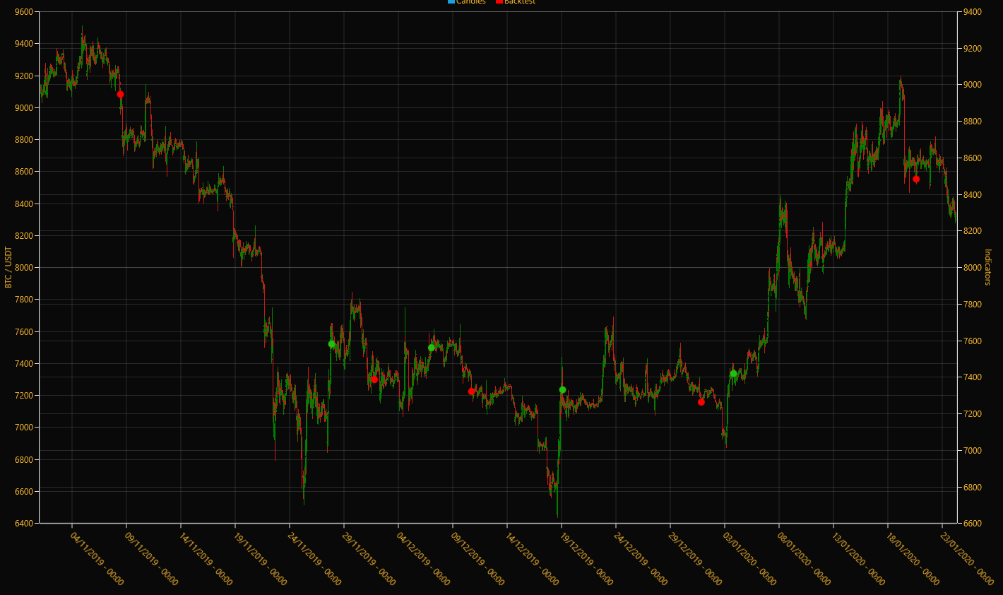
注意红色/绿色的点。基本上,这家伙做了一个额外的意甲:
我有两个静态层,第一个是蜡烛(蜡烛系列),第二个是回测结果(气泡系列)。
谷歌的图表允许我使用代表这些点的散射图。然而,我不知道如何在我的烛台图中添加一个新的散点图。有人做过了吗?下面的代码。
import { Component, OnInit, OnDestroy } from '@angular/core';
import { Observable, Subject } from 'rxjs';
import { takeUntil } from 'rxjs/operators';

import { KlineInterval } from 'src/app/core/types/bot';
import { DatePipe } from '@angular/common';
import { BinanceKline } from 'src/app/core/types/binance';
import { BinanceService } from 'src/app/core/services/binance.service';

@Component({
  selector: 'app-backtesting',
  templateUrl: './backtesting.component.html',
  styleUrls: ['./backtesting.component.css']
})
export class BacktestingComponent implements OnInit, OnDestroy {
  binances$: Observable<BinanceKline[]>;

  private componentDestroyed$ = new Subject<boolean>();

  // Angular Google Charts
  chartDrawn = false;
  chartData = [];
  chartOptions = {
    tooltip: { isHtml: true },
    title: 'Backtesting',
    height: 500,
    chartArea: { width: '80%', height: '80%' },
    legend: { position: 'bottom', textStyle: { color: 'black', fontSize: 16 } },
    series: {
      0: { color: 'black', visibleInLegend: true },
      3: { color: 'red', visibleInLegend: true }
    }
  };
  chartColumnNames = ['Label', 'Low', 'Open', 'Close', 'High', { type: 'string', role: 'tooltip', p: { html: true } }];

  constructor(private binanceService: BinanceService) { }

  ngOnInit() {
    this.getAllKlines();
  }

  ngOnDestroy() {
    this.componentDestroyed$.next(true);
    this.componentDestroyed$.complete();
  }

  private customTooltip(candlestick: BinanceKline): string {
    let pipe = new DatePipe('en-US');
    let openTime = pipe.transform(candlestick.openTime, 'HH:mm');
    let closeTime = pipe.transform(candlestick.closeTime, 'HH:mm');

    return `<div style="font-size: 14px; white-space: nowrap; padding: 10px;">
    <b>Open Time:</b> ${openTime}<br /><b>Close Time:</b> ${closeTime}<br />
    <b>Open:</b> ${candlestick.open.toFixed(2)}<br /><b>Close:</b> ${candlestick.close.toFixed(2)}<br />
    <b>High:</b> ${candlestick.high.toFixed(2)}<br /><b>Low:</b> ${candlestick.low.toFixed(2)}<br />
    <b>VOL:</b> ${candlestick.volume.toFixed(2)}
    </div>`;
  }

  private getAllKlines() {
    this.binances$ = this.binanceService.getAllKlines("TRXUSDT", KlineInterval.OneHour);

    this.chartDrawn = false;
    this.chartData = [];

    this.binances$
      .pipe(takeUntil(this.componentDestroyed$))
      .subscribe(candlesticks => {
        for (let i = 0; i < candlesticks.length; i++) {
          this.chartData.push([
            null,
            candlesticks[i].low,
            candlesticks[i].open,
            candlesticks[i].close,
            candlesticks[i].high,
            this.customTooltip(candlesticks[i])
          ]);
        }

        this.chartDrawn = true;
      });
  }
}<section id="backtesting">
<div class="container">
<div class="row">
<ng-container *ngIf="chartDrawn">
<div class="col-lg-12">
<google-chart class="mb-1" type="CandlestickChart" [data]="chartData" [options]="chartOptions"
[columnNames]="chartColumnNames">
</google-chart>
</div>
</ng-container>
</div>
</div>
</section>回答 1
Stack Overflow用户
发布于 2020-01-27 14:58:19
Google角图提供了一种创建组合图表的方法。组合图表有助于在同一图表中将系列呈现为不同类型。有以下类型:线,面积,酒吧,烛台和阶梯区。下面是下面的文档:
https://developers.google.com/chart/interactive/docs/gallery/combochart
我认为正确的组合应该是烛台+线图,如果需要的话,你可以将图表中的线条改为不显示。
您可能会发现关于如何组合这两个这里的JS教程。
页面原文内容由Stack Overflow提供。腾讯云小微IT领域专用引擎提供翻译支持
原文链接:
https://stackoverflow.com/questions/59932998
复制相关文章
相似问题
腾讯云开发者

Copyright © 2013 - 2026 Tencent Cloud. All Rights Reserved. 腾讯云 版权所有
深圳市腾讯计算机系统有限公司 ICP备案/许可证号:粤B2-20090059 ![]() 粤公网安备44030502008569号
粤公网安备44030502008569号
腾讯云计算(北京)有限责任公司 京ICP证150476号 | 京ICP备11018762号