
实际上:如何在雷达或极图中将背景色分配给不同的范围?
实际上:如何在雷达或极图中将背景色分配给不同的范围?
提问于 2020-02-18 12:54:57
我试图用一种方式改变雷达图的背景色,不同的值范围会得到不同的颜色,例如,雷达图的范围从1到5,其中1-3得到红色的背景色,3-5得到绿色的背景色。有可能改变颜色,但只适用于整个圆圈。
你有什么想法吗?
编辑
这是我使用的示例代码,我找到了添加颜色的唯一可能性。
import plotly.graph_objects as go

categories = ['processing cost','mechanical properties','chemical stability',
              'thermal stability', 'device integration']

fig = go.Figure()

fig.add_trace(go.Scatterpolar(
      r=[1, 5, 2, 2, 3],
      theta=categories,
      fill='toself',
      name='Product A'
))
fig.add_trace(go.Scatterpolar(
      r=[4, 3, 2.5, 1, 2],
      theta=categories,
      fill='toself',
      name='Product B'
))

fig.update_layout(
  paper_bgcolor="red",
  polar=dict(
    radialaxis=dict(
      color="red",
      visible=True,
      range=[0, 5]
    )),
  showlegend=False
)

fig.show()回答 1
Stack Overflow用户
回答已采纳
发布于 2020-02-20 10:02:37
没有直接的方法来为情节的不同部分指定不同的背景色。但是,如果我正确地理解了您在这里的目标,您可以使用一些go.Barpolar()和go.Scatterpolar()跟踪的正确组合来实现:
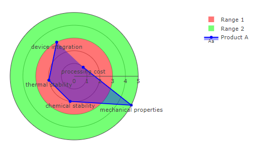
代码:
# imports
import plotly.graph_objects as go
import numpy as np

# categories:
categories = ['processing cost','mechanical properties','chemical stability',
              'thermal stability', 'device integration']

# values:
rVars1=[1, 5, 2, 2, 3]
rVars2=[4, 3, 2.5, 1, 2]

# colors
values = [3,5]
colors = ['rgba(255, 0, 0, 0.8)', 'rgba(0, 255, 0, 0.8)']

# some calcultations to place all elements
slices=len(rVars1)
fields=[max(rVars1)]*slices
circle_split = [360/slices]*(slices)
theta= 0
thetas=[0]
for t in circle_split:
    theta=theta+t
    thetas.append(theta)
thetas

# plotly
fig = go.Figure()

# "background"
for t in range(0, len(colors)):
    fig.add_trace(go.Barpolar(
        r=[values[t]],
        width=360,
        marker_color=[colors[t]],
        opacity=0.6,
        name = 'Range ' + str(t+1)
        #showlegend=False,
    ))
    t=t+1

# trace 1
fig.add_trace(go.Scatterpolar(
       text = categories,
        r = rVars1,
        mode = 'lines+text+markers',
        fill='toself',
        fillcolor='rgba(0, 0, 255, 0.4)',
        textposition='bottom center',
        marker = dict(color = 'blue'),
        name = 'Product A'))

# adjust layout
fig.update_layout(
    template=None,
    polar = dict(radialaxis = dict(gridwidth=0.5,
                               range=[0, max(fields)],
                              showticklabels=True, ticks='', gridcolor = "grey"),
                 angularaxis = dict(showticklabels=False, ticks='',
                               rotation=45,
                               direction = "clockwise",
                               gridcolor = "white")))

fig.update_yaxes(showline=True, linewidth=2, linecolor='white')
fig.show()
编辑:多个跟踪
您的示例代码包含多个跟踪。这很快就会使我最初的方法变得一团糟。下面是一个涵盖多个跟踪的片段。为了让这个看起来更好,我把分类名放在圆圈的边缘,在它自己的跟踪中,加上不同的文本位置,使名字落在圆圈的外面。然后,我为每个产品A和B添加一个跟踪,我希望这将是有用的。
图2:
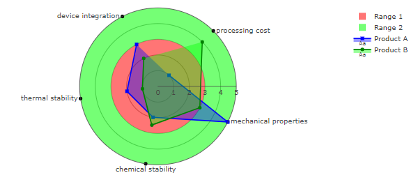
代码2:
# imports
import plotly.graph_objects as go
import numpy as np
import pandas as pd

# categories:
categories = ['processing cost','mechanical properties','chemical stability',
              'thermal stability', 'device integration']

# values:
rVars1=[1, 5, 2, 2, 3]
rVars2=[4, 3, 2.5, 1, 2]

rAllMax = max(rVars1+rVars2)

# colors
values = [3,5]
colors = ['rgba(255, 0, 0, 0.9)', 'rgba(0, 255, 0, 0.9)', ]

# some calcultations to place all elements
slices=len(rVars1)
fields=[max(rVars1)]*slices
circle_split = [360/slices]*(slices)
theta= 0
thetas=[0]
for t in circle_split:
    theta=theta+t
    thetas.append(theta)
thetas

# set up label positions
df_theta=pd.DataFrame({'theta':thetas, 'positions':['middle right', 'middle right',
                                                    'bottom center', 'middle left',
                                                    'middle left', 'middle left']})


# plotly
fig = go.Figure()

# "background"
for t in range(0, len(colors)):
    fig.add_trace(go.Barpolar(
        r=[values[t]],
        width=360,
        marker_color=[colors[t]],
        opacity=0.6,
        name = 'Range ' + str(t+1)
        #showlegend=False,
    ))
    t=t+1

for r, cat in enumerate(categories):
    #print(r, cat)
    fig.add_trace(go.Scatterpolar(
            text = cat,
            r = [rAllMax],
            theta = [thetas[r]],
            mode = 'lines+text+markers',
            fill='toself',
            fillcolor='rgba(255, 255, 255, 0.4)',
            line = dict(color='black'),
            #textposition='bottom center',
            textposition=df_theta[df_theta['theta']==thetas[r]]['positions'].values[0],
            marker = dict(line_color='white', color = 'black'),
            marker_symbol ='circle',
            name = cat,
            showlegend = False))


# trace 1
fig.add_trace(go.Scatterpolar(
        #text = categories,
        r = rVars1,
        mode = 'lines+text+markers',
        fill='toself',
        fillcolor='rgba(0, 0, 255, 0.4)',
        textposition='bottom center',
        marker = dict(color = 'blue'),
        marker_symbol ='square',
        name = 'Product A'))

# trace 2
fig.add_trace(go.Scatterpolar(
        #text = categories,
        r = rVars2,
        mode = 'lines+text+markers',
        fill='toself',
        fillcolor='rgba(0, 255, 0, 0.4)',
        textposition='bottom center',
        marker = dict(color = 'Green'),
        name = 'Product B'))


# adjust layout
fig.update_layout(
    template=None,
    polar = dict(radialaxis = dict(gridwidth=0.5,
                               range=[0, max(fields)],
                              showticklabels=True, ticks='', gridcolor = "grey"),
                 angularaxis = dict(showticklabels=False, ticks='',
                               rotation=45,
                               direction = "clockwise",
                               gridcolor = "white")))

fig.update_yaxes(showline=True, linewidth=2, linecolor='white')
fig.show()页面原文内容由Stack Overflow提供。腾讯云小微IT领域专用引擎提供翻译支持
原文链接:
https://stackoverflow.com/questions/60281382
复制相关文章
相似问题
腾讯云开发者

Copyright © 2013 - 2026 Tencent Cloud. All Rights Reserved. 腾讯云 版权所有
深圳市腾讯计算机系统有限公司 ICP备案/许可证号:粤B2-20090059 ![]() 粤公网安备44030502008569号
粤公网安备44030502008569号
腾讯云计算(北京)有限责任公司 京ICP证150476号 | 京ICP备11018762号