
如何在matplotlib.axes.Axes.stem图中显示时间线?
我正在做一个matplotlib.axes.Axes.stem图,其中x轴是一个显示日期的日期线。我的一些数据出现在特定的日子里。而在其他日子,它没有数据(因为这些信息在我的数据中不存在)。
问题1:如何制作一个时间轴图来显示我的数据,包括没有数据的日子?这个是可能的吗?有什么方法可以自动缩放数据x轴的外观来处理这种情况吗?
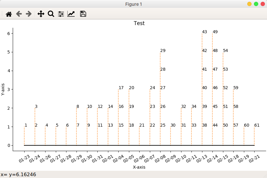
下面是一个名为test.txt的示例数据文件和我的python来读取它的数据,以显示一个时间轴干图供您考虑。下面也给出了这个脚本的输出。
Question2.演示问题。如何在每个注释中显示一个"-“符号?另外,如何将注释旋转30度?
test.txt
No. Date
1   23/01/2020
2   24/01/2020
3   24/01/2020
4   26/01/2020
5   27/01/2020
6   28/01/2020
7   29/01/2020
8   29/01/2020
9   30/01/2020
10  30/01/2020
11  31/01/2020
12  31/01/2020
13  01/02/2020
14  01/02/2020
15  04/02/2020
16  04/02/2020
17  04/02/2020
18  05/02/2020
19  05/02/2020
20  05/02/2020
21  06/02/2020
22  07/02/2020
23  07/02/2020
24  07/02/2020
25  08/02/2020
26  08/02/2020
27  08/02/2020
28  08/02/2020
29  08/02/2020
30  09/02/2020
31  10/02/2020
32  10/02/2020
33  11/02/2020
34  11/02/2020
38  13/02/2020
39  13/02/2020
40  13/02/2020
41  13/02/2020
42  13/02/2020
43  13/02/2020
44  14/02/2020
45  14/02/2020
46  14/02/2020
47  14/02/2020
48  14/02/2020
49  14/02/2020
50  15/02/2020
51  15/02/2020
52  15/02/2020
53  15/02/2020
54  15/02/2020
57  18/02/2020
58  18/02/2020
59  18/02/2020
60  19/02/2020
61  21/02/2020
stem_plot.py
import matplotlib.pyplot as plt
import numpy as np
import matplotlib.dates as mdates
from datetime import datetime

from pathlib import Path

#########################
#### DATA EXTRACTION ####
#########################
source = Path('./test.txt')
with source.open() as f:
  lines = f.readlines()
#print( lines )

# Store source data in dictionary with date shown as mm-dd.
data={}
for line in lines[1:]:
    case, cdate = line.strip().split()
    cdate = datetime.strptime(cdate, "%d/%m/%Y").strftime('%m-%d')
    data[case] = cdate
print( f'\ndata = {data}' )

# Collate data's y-axis for each date, i.e. history
history2={}
cdates = list(data.values())
sorted_dates = sorted( set( cdates ) )
for i in sorted_dates:
    cases=[]
    for case, date in data.items():
        if i == date:
            cases.append(case)
    #print( i, cases)
    history2[i] = cases
print( f'\nhistory2 = {history2}')

###########################
#### DATA PRESENTATION ####
###########################
# Create figure and plot a stem plot with the date
fig, ax = plt.subplots(figsize=(8.8, 5), constrained_layout=True)
ax.set(title="Test")

labels=list( history2.values() ) # For annotation
yy = [ len(i) for i in labels ]  # y-axis
xx = list(history2.keys())       # x-axis
markerline, stemline, baseline = ax.stem(
    xx, yy, linefmt="C1:", basefmt="k-", use_line_collection=True)

plt.setp(markerline, marker="None" )

# annotate stem lines
for ann_x, label in list(history2.items()):
    print(ann_x, label)
    each_count=1
    for each in label:
        ax.annotate( each, xy=(ann_x, each_count), xycoords='data')
        each_count += 1
        #print(f'each_count = {each_count}' )

# format xaxis
plt.setp( ax.get_xticklabels(), rotation=30 )

# remove top and right spines
for spine in ["top", "right"]:
    ax.spines[spine].set_visible(False)

# show axis name
ax.get_yaxis().set_label_text(label='Y-axis')
ax.get_xaxis().set_label_text(label='X-axis')

plt.show()
电流输出:
回答 2
Stack Overflow用户
发布于 2020-02-22 15:33:31
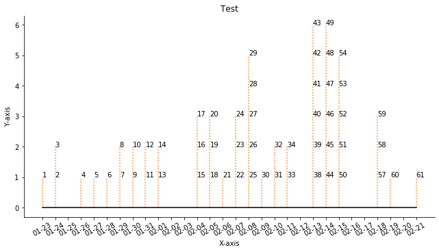
关于你的第一个问题基本上,你列出了在你使用的日子之间的所有日子,并使用它。因此,将以下内容添加到代码的开头:
import pandas as pd
alldays = pd.date_range(start="20200123",
                     end="20200221",
                     normalize=True)
dates = []
for i in alldays:
    dates.append(f"{i.month:02}-{i.day:02}")
这是因为它得到了熊猫在两个日期之间的数据范围,并将这个范围转换成一个月-日字符串列表。
然后像这样修改代码的这一部分:
# Collate data's y-axis for each date, i.e. history
history2={}
cdates = list(data.values())
sorted_dates = sorted( set( cdates ) )
for i in dates:  # This is the only change!
    cases=[]
    for case, date in data.items():
        if i == date:
            cases.append(case)
    #print( i, cases)
    history2[i] = cases
这个变化会给你这个:
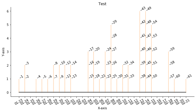
关于第二个问题,请将代码更改为:
# annotate stem lines
for ann_x, label in list(history2.items()):
    print(ann_x, label)
    each_count=1
    for each in label:
        ax.annotate(f"--{each}", xy=(ann_x, each_count), xycoords='data', rotation=30)
each_count += 1我刚换了ax.annotate线。这两项变动是:
希望这能让你得到你想要的:
Stack Overflow用户
发布于 2020-02-24 16:54:12
@SinanKurmus回答我的第一个问题:
Solution1:
使用matplotlib的方法,即丹兰治和num2date以及python,可以获得具有给定数据的整个历史间隔的时间轴。这里可以避免熊猫的使用。
首先,将时间轴的开始日期和结束日期表示为对象。注意,您需要将1天多添加到结束日期,否则将不包括上次日期的数据。接下来,使用python的datetime.timedelta对象将1天作为您的时间间隔。接下来,将它们提供给将返回一个matplotlib.date.drange数组的NumPy方法。Matplotlib的num2date方法依次将其转换回python对象。
def get_time_axis( data ):
    start = datetime.strptime(min(data.values()), "%Y-%m-%d")
    end = datetime.strptime(max(data.values()), "%Y-%m-%d") + timedelta(days=1)
    delta = timedelta(days=1)
    time_axis_md = mdates.drange( start, end, delta )
    time_axis_py = mdates.num2date( time_axis_md, tz=None ) # Add tz when required
    return time_axis_py
解决方案2:
显然,Matplotlib在如何跳过没有数据的日期上也有一个常见问题。我在下面包含了他们的示例代码示例。
import numpy as np
import matplotlib.pyplot as plt
import matplotlib.mlab as mlab
import matplotlib.ticker as ticker

r = mlab.csv2rec('../data/aapl.csv')
r.sort()
r = r[-30:]  # get the last 30 days

N = len(r)
ind = np.arange(N)  # the evenly spaced plot indices

def format_date(x, pos=None):
    thisind = np.clip(int(x+0.5), 0, N-1)
    return r.date[thisind].strftime('%Y-%m-%d')

fig = plt.figure()
ax = fig.add_subplot(111)
ax.plot(ind, r.adj_close, 'o-')
ax.xaxis.set_major_formatter(ticker.FuncFormatter(format_date))
fig.autofmt_xdate()

plt.show() https://stackoverflow.com/questions/60349371
复制相似问题
腾讯云开发者

Copyright © 2013 - 2026 Tencent Cloud. All Rights Reserved. 腾讯云 版权所有
深圳市腾讯计算机系统有限公司 ICP备案/许可证号:粤B2-20090059 ![]() 粤公网安备44030502008569号
粤公网安备44030502008569号
腾讯云计算(北京)有限责任公司 京ICP证150476号 | 京ICP备11018762号