
Mplcur标只显示y坐标。
Mplcur标只显示y坐标。
提问于 2020-02-24 16:19:37
我正在用pyqt做一个应用程序,有一个用matplotlib构建的绘图。我使用mplcur标来显示坐标,但它不显示x坐标:
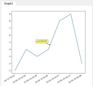
请看我的画布代码:
class Canvas(FigureCanvas):
    def __init__(self, parent=None, width=5, height=5, dpi=120):
        fig = Figure(figsize=(width, height), dpi=dpi)
        self.axes = fig.add_subplot(111)
        FigureCanvas.__init__(self, fig)
        self.setParent(parent)
        self.plot()


    def plot(self):
            x = ['22-02 11:16:15', '22-02 15:31:54', '22-02 15:32:30',
                 '22-02 15:32:45', '22-02 15:33:57', '22-02 15:34:13',
             '22-02 15:34:46']
            y = [1, 4, 3, 4, 8, 9, 2]
            self.figure.tight_layout()
            self.figure.autofmt_xdate()
            #mplcursors.Cursor()

            ax = self.figure.add_subplot(111)

            dt = ax.plot(x, y)
cursor = mplcursors.cursor(dt, hover = True)回答 1
Stack Overflow用户
回答已采纳
发布于 2020-02-24 17:43:59
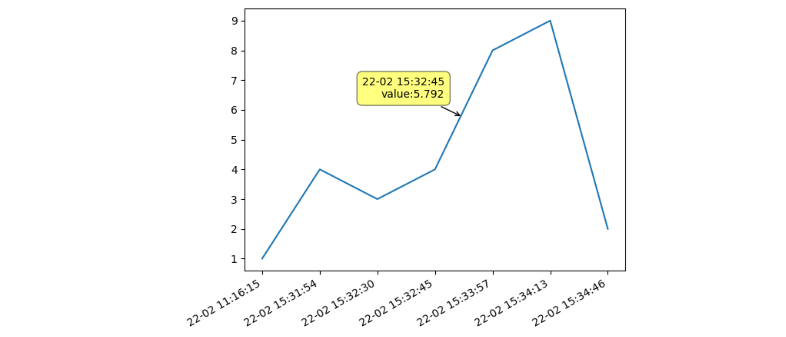
请注意,在示例中没有给出数字时间戳。Matplotlib将它们解释为文本标签,并将其编号为0、1、2、.、N-1。还要注意的是,时间的间隔并不相等,但是matplotlib显示了x轴上均匀间隔的精确x标签。
为了显示x轴,一个显式注释函数可以解释数字x坐标(在0到N1范围内),将它围在一起,并将其用作字符串列表中的索引。在这种情况下,x坐标将显示最近的x标签,而y值将被很好地插值。
下面是一些示例代码:
from matplotlib import pyplot as plt
import mplcursors

def show_annotation(sel):
    xi, yi = sel.target
    xi = int(round(xi))
    sel.annotation.set_text(f'{x[xi]}\nvalue:{yi:.3f}')

x = ['22-02 11:16:15', '22-02 15:31:54', '22-02 15:32:30',
     '22-02 15:32:45', '22-02 15:33:57', '22-02 15:34:13',
     '22-02 15:34:46']
y = [1, 4, 3, 4, 8, 9, 2]

figure, ax = plt.subplots()
dt = ax.plot(x, y)

cursor = mplcursors.cursor(dt, hover=True)
cursor.connect('add', show_annotation)

figure.tight_layout()
figure.autofmt_xdate() # has no effect, because matplotlib only encountered texts for the x-axis

plt.show()
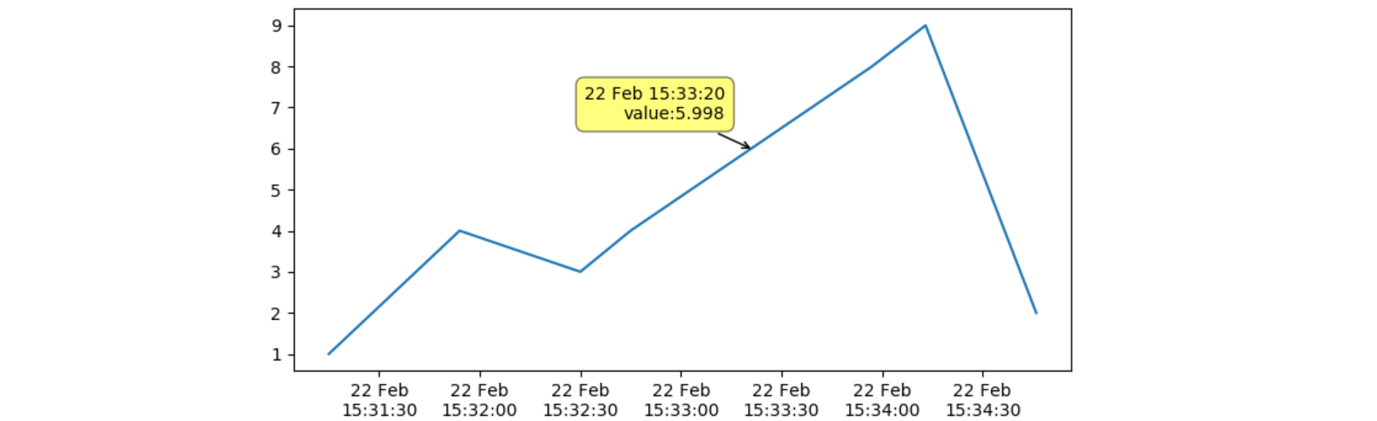
如果您还需要对x完全内插时间戳,则应该将x转换为数字时间戳。也要小心提供年份,因为默认年份是1901年,这可能会在闰年期间引起冲突。
在下面的示例代码中,将修改第一个时间戳以与其他时间戳一起执行。地块现在使用与时间成正比的距离。
from matplotlib import pyplot as plt
from matplotlib import dates as mdates
import mplcursors
from datetime import datetime

def show_annotation(sel):
    xi, yi = sel.target
    sel.annotation.set_text(f"{mdates.DateFormatter('%d %b %H:%M:%S')(xi)}\nvalue:{yi:.3f}")

x = ['22-02 15:31:15', '22-02 15:31:54', '22-02 15:32:30',
     '22-02 15:32:45', '22-02 15:33:57', '22-02 15:34:13',
     '22-02 15:34:46']
# first, convert the strings to datetime objects, and then convert to a numerical time
# as the day is put before the month, a specific format conversion needs to be supplied
# the year needs to be prepended to get the timestamps in the correct year
x = [mdates.date2num(datetime.strptime('2020-'+xi, '%Y-%d-%m %H:%M:%S')) for xi in x]
y = [1, 4, 3, 4, 8, 9, 2]

figure, ax = plt.subplots()
dt = ax.plot(x, y)
ax.xaxis_date()
# display the time on two lines: the day and the shortened month name, and then HH:MM:SS
ax.xaxis.set_major_formatter(mdates.DateFormatter('%d %b\n%H:%M:%S'))
# ax.set_xticks(x) # to set the input time stamps as xticks

figure.tight_layout()

cursor = mplcursors.cursor(dt, hover=True)
cursor.connect('add', show_annotation)

plt.show()
页面原文内容由Stack Overflow提供。腾讯云小微IT领域专用引擎提供翻译支持
原文链接:
https://stackoverflow.com/questions/60380004
复制相关文章
相似问题
腾讯云开发者

Copyright © 2013 - 2026 Tencent Cloud. All Rights Reserved. 腾讯云 版权所有
深圳市腾讯计算机系统有限公司 ICP备案/许可证号:粤B2-20090059 ![]() 粤公网安备44030502008569号
粤公网安备44030502008569号
腾讯云计算(北京)有限责任公司 京ICP证150476号 | 京ICP备11018762号